In my previous post, I demonstrated how to add distinct text to panels created with facet_wrap() or facet_grid(), and I proposed the following simple method. I first created a data frame containing the labels, which I then used to map the text to the corresponding panels.
text1= data.frame(Nitrogen="N0", STAT= "***",
Genotype="Cultivar_2", Yield=70)

Nitrogen	STAT	Genotype	Yield
N0	        ***	Cultivar_2	70
ggplot() +
geom_text(data=text1, aes(family="serif", x=Genotype, y=Yield, label=STAT),
size=5, color="red") +
Let’s practice using this method
if(!require(readr)) install.packages("readr")
if(!require(dplyr)) install.packages("dplyr")
library(readr)
library(dplyr)

github= paste0("https://raw.githubusercontent.com/agronomy4future/",
                "raw_data_practice/refs/heads/main/",
                "wheat_yield_trend_over_60_years_by_faostat.csv")
FAOSTAT=data.frame(read_csv(url(github),show_col_types = FALSE))
FAOSTAT=subset(data.frame(read_csv(url(github),show_col_types=FALSE)),
location!="S.Korea")
FAOSTAT=subset(FAOSTAT, year!="2021")
FAOSTAT$location=factor(FAOSTAT$location,
levels=c("World","EU","US","Canada"))
FAOSTAT$trend=factor(FAOSTAT$trend,
levels=c("1STWorld","2NDWorld","3RDWorld","1STEU","2NDEU","3RDEU",
"1STUS","2NDUS","3RDUS","1STCanada","2NDCanada","3RDCanada"))
FAOSTAT= FAOSTAT %>%
                 mutate(decade = case_when(
                 grepl("1ST", trend) ~ "1st_decade",
                 grepl("2ND", trend) ~ "2nd_decade",
                 grepl("3RD", trend) ~ "3rd_decade",
                 TRUE ~ NA_character_
  ))

df= FAOSTAT %>%
            group_by(location, year, trend, decade) %>%
            summarise(mean= mean(yield, na.rm= TRUE), .groups= "drop")
set.seed(100)
print(df[sample(nrow(df),5),])

  location  year trend      mean
1 Canada    1982 2NDCanada  2.13
2 EU        2002 3RDEU      4.56
3 EU        2012 3RDEU      4.80
4 Canada    1997 2NDCanada  2.13
5 Canada    1986 2NDCanada  2.21
.
.
.
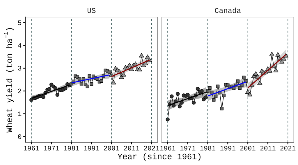
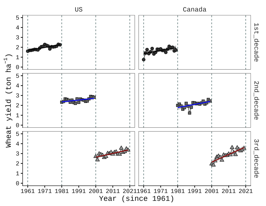
This data is from FAOSTAT. I organized wheat yield data starting from 1961 for the USA, Canada, the EU, and the world. I will present the wheat yield trends over time for the USA and Canada.
if(!require(ggplot2)) install.packages("ggplot2")
library(ggplot2)

NAmerica= subset(df, location=="Canada" | location=="US")

Fig1= ggplot(data=NAmerica, aes(x=year, y=mean))+
  geom_line(linewidth=0.5,linetype="solid")+
  geom_point(aes(fill=trend, shape=trend), size=3, stroke=0.7)+
  geom_smooth(aes(fill=trend, color=trend), method=lm, level=0.95,
              se=TRUE, linetype=1, size=1, formula=y~x)+
  scale_shape_manual(values=rep(c(21,22,24),4))+
  scale_fill_manual(values=rep(c("grey20","grey40","grey60"),4))+
  scale_color_manual(values=rep(c("Black","Blue","Dark red"),4))+
  scale_x_continuous(breaks=seq(1961,2021,10),limits=c(1961,2021))+
  scale_y_continuous(breaks=seq(0,5,1),limits=c(0,5))+
  geom_vline(xintercept=1961,linetype="dashed",
  color="darkslategray", linewidth=0.5)+
  geom_vline(xintercept=1981,linetype="dashed",
  color="darkslategray", linewidth=0.5)+
  geom_vline(xintercept=2001,linetype="dashed",
  color="darkslategray", linewidth=0.5)+
  geom_vline(xintercept=2021,linetype="dashed",
  color="darkslategray", linewidth=0.5)+
  facet_wrap(~location) +
  ylab(bquote("Wheat yield (ton" ~ ha^-1*')'))+
  labs(x="Year (since 1961)") +
  theme_classic(base_size= 18, base_family= "serif") +
  theme(legend.position="none",
        panel.border= element_rect(color="black", fill=NA,
        linewidth=0.5),
        strip.background=element_rect(color="white",
        linewidth=0.5, linetype="solid"),
        strip.text = element_text(size = 16),
        axis.line=element_line(linewidth=0.5, colour="black"))

options(repr.plot.width=9, repr.plot.height=5)
print(Fig1)

ggsave("Fig1.png", plot= Fig1, width=9, height=5, dpi= 300)
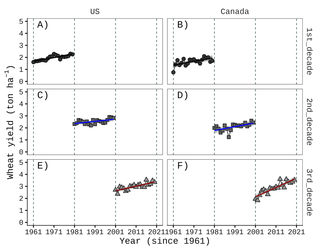
Now I want to add labels A) and B) to each panel, and I’ll run the following code.
text1= data.frame(location="US", LabelText= "A)", year=1965, mean=5)
text2= data.frame(location="Canada", LabelText= "B)", year=1965, mean=5)
ggplot() +
geom_text(data=text1, aes(family="serif", x=year, y=mean,
label=LabelText), size=7, color="black") +
geom_text(data=text2, aes(family="serif", x=year, y=mean,
label=LabelText), size=7, color="black") +
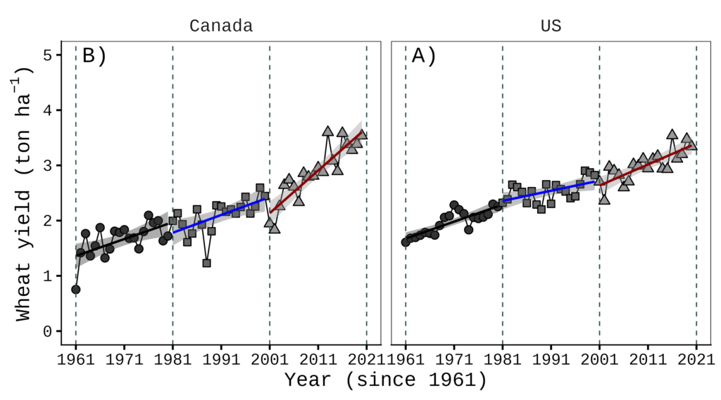
Even though I set the variable order for the location using FAOSTAT$location= factor(FAOSTAT$location, levels = c("World", "EU", "US", "Canada")) when loading the data, this labeling method overrides that order. To fix this, I created a separate data table and defined the variable order there as well.”
text1_2= data.frame(location= factor(c("US", "Canada"),
levels= c("US","Canada")),  LabelText = c("A)", "B)"),
year= 1965, mean= 5)
ggplot() +
geom_text(data= text1_2, aes(label= LabelText),
family= "serif", size= 7) +

Regardless, this is tricky and counterintuitive, and it becomes much more complicated as the number of panels increases. It would be much simpler if we could add text using relative coordinates directly on the figures to avoid this inconvenience. To address this, I recently developed new R functions named facetext() and facetext2().

facetext(): Easy Text Annotation for ggplot2 Faceted Plots
Before installing, please download Rtools (https://cran.r-project.org/bin/windows/Rtools)
if(!require(remotes)) install.packages("remotes")
if (!requireNamespace("facetext", quietly = TRUE)) {
  remotes::install_github("agronomy4future/facetext", force= TRUE)
}
library(remotes)
library(facetext)
The following example illustrates the basic usage of the facetext() function.
facetext(
  data      = same data frame as in ggplot(i.e., data = df)
  facet_var = same variable as in facet_wrap(~ ***)
  x_var     = same variable as in aes(x= ***)
  x         = relative x position (0= left, 0.5= center, 1= right)
  yrange    = same y-axis range as in scale_y_continuous(limits= c(*, *))
  y         = relative y position (0= bottom, 1= top)
  label     = text labels displayed in each panel
  color     = text color per label
  size      = font size passed to geom_text()
  family    = font family passed to geom_text()
)
To apply facetext() to an existing ggplot object, simply add it as a new layer:
facetext(data= NAmerica, facet_var="location",
x_var="year", x=c(0.08, 0.08), yrange=c(0, 5),
y=c(0.95, 0.95), label=c("A)", "B)"),
color=c("black", "black"), size=7, family="serif") +
This code positions the labels A) and B) at the (0.08, 0.08) x-axis coordinates and (0.95, 0.95) y-axis coordinates within each panel, respectively. All other settings follow standard ggplot2 syntax, allowing you to add aesthetics such as size and color.
if(!require(ggplot2)) install.packages("ggplot2")
library(ggplot2)

NAmerica= subset(df, location=="Canada" | location=="US")

Fig4= ggplot(data=NAmerica, aes(x=year, y=mean))+
  geom_line(size=0.5,linetype="solid")+
  geom_point(aes(fill=trend, shape=trend),size=3, stroke=0.7)+
  geom_smooth(aes(fill=trend, color=trend), method=lm, level=0.95,
              se=TRUE, linetype=1, size=1, formula=y~x)+
  scale_shape_manual(values=rep(c(21,22,24),4))+
  scale_fill_manual(values=rep(c("grey20","grey40","grey60"),4))+
  scale_color_manual(values=rep(c("Black","Blue","Dark red"),4))+
  scale_x_continuous(breaks=seq(1961,2021,10),limits=c(1961,2021))+
  scale_y_continuous(breaks=seq(0,5,1),limits=c(0,5))+
  geom_vline(xintercept=1961,linetype="dashed",
  color="Darkslategray", linewidth=0.5)+
  geom_vline(xintercept=1981,linetype="dashed",
  color="Darkslategray", linewidth=0.5)+
  geom_vline(xintercept=2001,linetype="dashed",
  color="Darkslategray", linewidth=0.5)+
  geom_vline(xintercept=2021,linetype="dashed",
  color="Darkslategray", linewidth=0.5)+

  facet_wrap(~location) +

  facetext(data= NAmerica, facet_var="location",
  x_var="year", x=c(0.08, 0.08), yrange=c(0, 5),
  y=c(0.95, 0.95), label=c("A)", "B)"),
  color=c("black", "black"), size=7, family="serif") +

  ylab(bquote("Wheat yield (ton" ~ ha^-1*')'))+
  labs(x="Year (since 1961)") +
  theme_classic(base_size= 18, base_family = "serif") +
  theme(legend.position="none",
        panel.border= element_rect(color="black", fill=NA,
        linewidth=0.5),
        strip.background=element_rect(color="white",
        linewidth=0.5, linetype="solid"),
        strip.text = element_text(size = 16),
        axis.line=element_line(linewidth=0.5, colour="black"))

options(repr.plot.width=9, repr.plot.height=5)
print(Fig4)

ggsave("Fig4.png", plot= Fig4, width=9, height=5, dpi= 300)

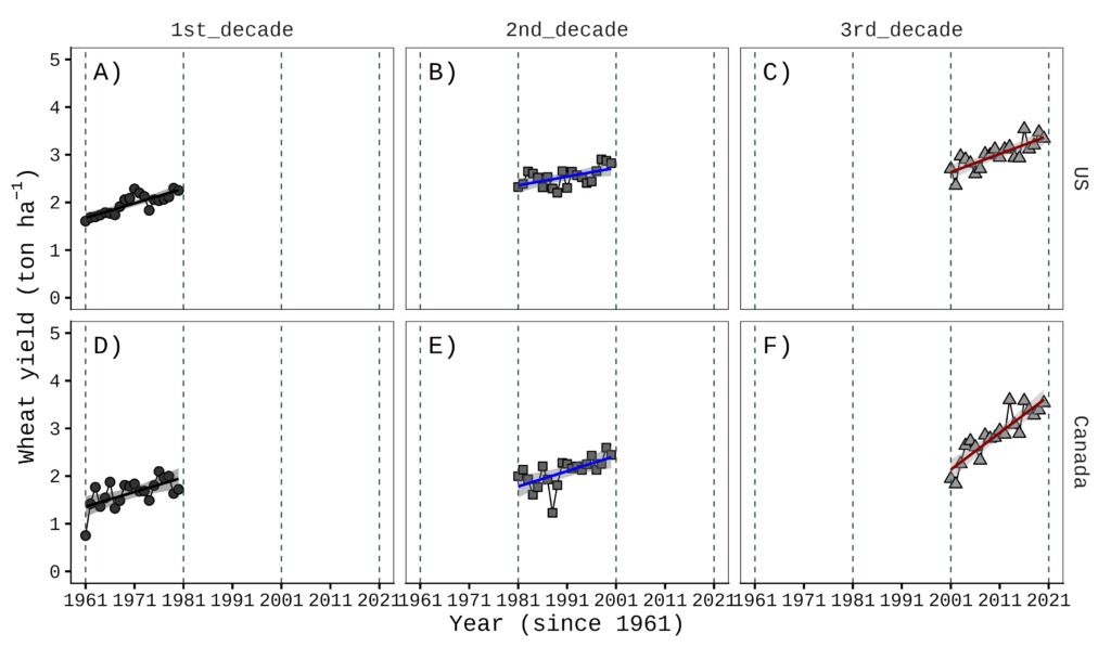
How should we handle a plot with three panels?
if(!require(ggplot2)) install.packages("ggplot2")
library(ggplot2)

NAmericaE= subset(df, location=="Canada" | location=="US" | location=="EU")

Fig5= ggplot(data=NAmericaE, aes(x=year, y=mean))+
  geom_line(size=0.5,linetype="solid")+
  geom_point(aes(fill=trend, shape=trend),size=3, stroke=0.7)+
  geom_smooth(aes(fill=trend, color=trend), method=lm, level=0.95,
              se=TRUE, linetype=1, size=1, formula=y~x)+
  scale_shape_manual(values=rep(c(21,22,24),4))+
  scale_fill_manual(values=rep(c("grey20","grey40","grey60"),4))+
  scale_color_manual(values=rep(c("Black","Blue","Dark red"),4))+
  scale_x_continuous(breaks=seq(1961,2021,10),limits=c(1961,2021))+
  scale_y_continuous(breaks=seq(0,7,1),limits=c(0,7))+
  geom_vline(xintercept=1961,linetype="dashed",
  color="Darkslategray", linewidth=0.5)+
  geom_vline(xintercept=1981,linetype="dashed",
  color="Darkslategray", linewidth=0.5)+
  geom_vline(xintercept=2001,linetype="dashed",
  color="Darkslategray", linewidth=0.5)+
  geom_vline(xintercept=2021,linetype="dashed",
  color="Darkslategray", linewidth=0.5)+
  facet_wrap(~location) +
  ylab(bquote("Wheat yield (ton" ~ ha^-1*')'))+
  labs(x="Year (since 1961)") +
  theme_classic(base_size= 18, base_family = "serif") +
  theme(legend.position="none",
        panel.border= element_rect(color="black", fill=NA,
        linewidth=0.5),
        strip.background=element_rect(color="white",
        linewidth=0.5, linetype="solid"),
        strip.text = element_text(size = 16),
        axis.line=element_line(linewidth=0.5, colour="black"))

options(repr.plot.width=12, repr.plot.height=5)
print(Fig5)

ggsave("Fig5.png", plot= Fig5, width=12, height=5, dpi= 300)
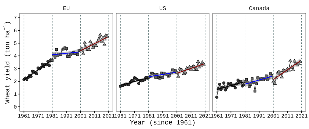
If there are three panels, you can simply add one more value to the facetext() function.
facetext(data= NAmericaE, facet_var="location",
x_var="year", x=c(0.08, 0.08, 0.08), yrange=c(0, 5),
y=c(0.95, 0.95, 0.95), label=c("A)", "B)", "C)"),
color=c("black", "black", "black"), size=7, family="serif")
Let’s apply facetext() to the ggplot call.
if(!require(ggplot2)) install.packages("ggplot2")
library(ggplot2)

NAmericaE= subset(df, location=="Canada" | location=="US" | location=="EU")

Fig6= ggplot(data=NAmericaE, aes(x=year, y=mean))+
  geom_line(size=0.5,linetype="solid")+
  geom_point(aes(fill=trend, shape=trend),size=3, stroke=0.7)+
  geom_smooth(aes(fill=trend, color=trend), method=lm, level=0.95,
              se=TRUE, linetype=1, size=1, formula=y~x)+
  scale_shape_manual(values=rep(c(21,22,24),4))+
  scale_fill_manual(values=rep(c("grey20","grey40","grey60"),4))+
  scale_color_manual(values=rep(c("Black","Blue","Dark red"),4))+
  scale_x_continuous(breaks=seq(1961,2021,10),limits=c(1961,2021))+
  scale_y_continuous(breaks=seq(0,7,1),limits=c(0,7))+
  geom_vline(xintercept=1961,linetype="dashed",
  color="Darkslategray", linewidth=0.5)+
  geom_vline(xintercept=1981,linetype="dashed",
  color="Darkslategray", linewidth=0.5)+
  geom_vline(xintercept=2001,linetype="dashed",
  color="Darkslategray", linewidth=0.5)+
  geom_vline(xintercept=2021,linetype="dashed",
  color="Darkslategray", linewidth=0.5)+
  facet_wrap(~location) +

  facetext(data= NAmericaE,
  facet_var="location", x_var="year", x=c(0.08, 0.08, 0.08),
  yrange=c(0, 7), y=c(0.95, 0.95, 0.95), label=c("A)", "B)", "C)"),
  color=c("black", "black", "black"), size=7, family="serif") +

  ylab(bquote("Wheat yield (ton" ~ ha^-1*')'))+
  labs(x="Year (since 1961)") +
  theme_classic(base_size= 18, base_family = "serif") +
  theme(legend.position="none",
        panel.border= element_rect(color="black", fill=NA,
        linewidth=0.5),
        strip.background=element_rect(color="white",
        linewidth=0.5, linetype="solid"),
        strip.text = element_text(size = 16),
        axis.line=element_line(linewidth=0.5, colour="black"))

options(repr.plot.width=12, repr.plot.height=5)
print(Fig6)

ggsave("Fig6.png", plot= Fig6, width=12, height=5, dpi= 300)

How do we handle a layout with two rows of panels?
if(!require(ggplot2)) install.packages("ggplot2")
library(ggplot2)

Fig7= ggplot(data=df, aes(x=year, y=mean))+
  geom_line(size=0.5,linetype="solid")+
  geom_point(aes(fill=trend, shape=trend),size=3, stroke=0.7)+
  geom_smooth(aes(fill=trend, color=trend), method=lm, level=0.95,
              se=TRUE, linetype=1, size=1, formula=y~x)+
  scale_shape_manual(values=rep(c(21,22,24),4))+
  scale_fill_manual(values=rep(c("grey20","grey40","grey60"),4))+
  scale_color_manual(values=rep(c("Black","Blue","Dark red"),4))+
  scale_x_continuous(breaks=seq(1961,2021,10),limits=c(1961,2021))+
  scale_y_continuous(breaks=seq(0,7,1),limits=c(0,7))+
  geom_vline(xintercept=1961,linetype="dashed",
  color="Darkslategray", linewidth=0.5)+
  geom_vline(xintercept=1981,linetype="dashed",
  color="Darkslategray", linewidth=0.5)+
  geom_vline(xintercept=2001,linetype="dashed",
  color="Darkslategray", linewidth=0.5)+
  geom_vline(xintercept=2021,linetype="dashed",
  color="Darkslategray", linewidth=0.5)+
  facet_wrap(~location, nrow=2) +

  facetext(data= df, facet_var="location", x_var="year",
  x=c(0.08, 0.08, 0.08, 0.08), yrange=c(0, 7),
  y=c(0.95, 0.95, 0.95, 0.95), label=c("A)", "B)", "C)", "D)"),
  color=c("black", "black", "black", "black"), size=7,
  family="serif") +

  ylab(bquote("Wheat yield (ton" ~ ha^-1*')'))+
  labs(x="Year (since 1961)") +
  theme_classic(base_size= 18, base_family = "serif") +
  theme(legend.position="none",
        panel.border= element_rect(color="black", fill=NA,
        linewidth=0.5),
        strip.background=element_rect(color="white",
        linewidth=0.5, linetype="solid"),
        strip.text = element_text(size = 16),
        axis.line=element_line(linewidth=0.5, colour="black"))

options(repr.plot.width=9, repr.plot.height=7)
print(Fig7)

ggsave("Fig7.png", plot= Fig7, width=9, height=7, dpi= 300)
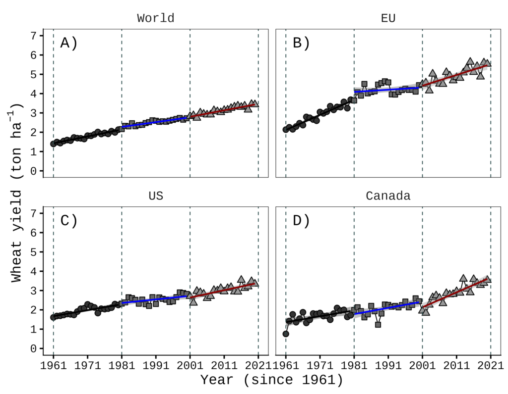
If facet_wrap() has only one facet variable, having two rows doesn’t matter; the labels are displayed in the same order as the panels.
facetext2(): Easy Text Annotation for ggplot2 Two-variable Faceted Plots
if(!require(ggplot2)) install.packages("ggplot2")
library(ggplot2)

NAmerica= subset(df, location=="Canada" | location=="US")

Fig8= ggplot(data=NAmerica, aes(x=year, y=mean))+
  geom_line(size=0.5,linetype="solid")+
  geom_point(aes(fill=trend, shape=trend),size=3, stroke=0.7)+
  geom_smooth(aes(fill=trend, color=trend), method=lm, level=0.95,
              se=TRUE, linetype=1, size=1, formula=y~x)+
  scale_shape_manual(values=rep(c(21,22,24),4))+
  scale_fill_manual(values=rep(c("grey20","grey40","grey60"),4))+
  scale_color_manual(values=rep(c("black","blue","darkred"),4))+
  scale_x_continuous(breaks=seq(1961,2021,10),limits=c(1961,2021))+
  scale_y_continuous(breaks=seq(0,5,1),limits=c(0,5))+
  geom_vline(xintercept=1961,linetype="dashed",
  color="Darkslategray", linewidth=0.5)+
  geom_vline(xintercept=1981,linetype="dashed",
  color="Darkslategray", linewidth=0.5)+
  geom_vline(xintercept=2001,linetype="dashed",
  color="Darkslategray", linewidth=0.5)+
  geom_vline(xintercept=2021,linetype="dashed",
  color="Darkslategray", linewidth=0.5)+
  facet_grid(decade ~location) +
  ylab(bquote("Wheat yield (ton" ~ ha^-1*')'))+
  labs(x="Year (since 1961)") +
  theme_classic(base_size= 18, base_family = "serif") +
  theme(legend.position="none",
        panel.border= element_rect(color="black", fill=NA,
        linewidth=0.5),
        strip.background=element_rect(color="white",
        linewidth=0.5, linetype="solid"),
        strip.text = element_text(size = 16),
        axis.line=element_line(linewidth=0.5, colour="black"))

options(repr.plot.width=9, repr.plot.height=7)
print(Fig8)

ggsave("Fig8.png", plot= Fig8, width=9, height=7, dpi= 300)
Now, it’s a different story. What if there are two facet variables? In this case, I created facetext2() as a counterpart to facetext() to handle this more complex scenario.
To begin, let’s load the facetext2() function.
if(!require(remotes)) install.packages("remotes")
if (!requireNamespace("facetext2", quietly = TRUE)) {
  remotes::install_github("agronomy4future/facetext2", force= TRUE)
}
library(remotes)
library(facetext2)
You can now add this code to your ggplot() object. It is important to note that facet_var should be the variable for the columns, while facet_var2 should be the variable for the rows on the figure.
facetext2(data= NAmerica, facet_var="location", facet_var2="decade",
                x_var= "year", x = rep(0.08, 6), y= rep(0.95, 6),
                yrange= c(0, 5), label= c("A)","C)","E)","B)","D)","F)"),
                color= rep("black", 6), size= 7, family= "serif")

#Note
facet_var=column direction, facet_var2= row direction
For example, in the figure above, ‘location’ is in the column direction and ‘decade’ is in the row direction. Therefore, you would set facet_var= "location" and facet_var2= "decade".
if(!require(ggplot2)) install.packages("ggplot2")
library(ggplot2)

NAmerica= subset(df, location=="Canada" | location=="US")

Fig9= ggplot(data=NAmerica, aes(x=year, y=mean))+
  geom_line(size=0.5,linetype="solid")+
  geom_point(aes(fill=trend, shape=trend),size=3, stroke=0.7)+
  geom_smooth(aes(fill=trend, color=trend), method=lm, level=0.95,
              se=TRUE, linetype=1, size=1, formula=y~x)+
  scale_shape_manual(values=rep(c(21,22,24),4))+
  scale_fill_manual(values=rep(c("grey20","grey40","grey60"),4))+
  scale_color_manual(values=rep(c("Black","Blue","Dark red"),4))+
  scale_x_continuous(breaks=seq(1961,2021,10),limits=c(1961,2021))+
  scale_y_continuous(breaks=seq(0,5,1),limits=c(0,5))+
  geom_vline(xintercept=1961,linetype="dashed",
  color="Darkslategray", linewidth=0.5)+
  geom_vline(xintercept=1981,linetype="dashed",
  color="Darkslategray", linewidth=0.5)+
  geom_vline(xintercept=2001,linetype="dashed",
  color="Darkslategray", linewidth=0.5)+
  geom_vline(xintercept=2021,linetype="dashed",
  color="Darkslategray", linewidth=0.5)+
  facet_grid(decade ~location) +

  facetext2(data= NAmerica, facet_var= "location", facet_var2= "decade",
  x_var= "year", x = rep(0.08, 6), y= rep(0.95, 6),
  yrange= c(0, 5), label= c("A)","C)","E)","B)","D)","F)"),
  color= rep("black", 6), size= 7, family= "serif") +

  ylab(bquote("Wheat yield (ton" ~ ha^-1*')'))+
  labs(x="Year (since 1961)") +
  theme_classic(base_size= 18, base_family = "serif") +
  theme(legend.position="none",
        panel.border= element_rect(color="black", fill=NA,
        linewidth=0.5),
        strip.background=element_rect(color="white",
        linewidth=0.5, linetype="solid"),
        strip.text = element_text(size = 16),
        axis.line=element_line(linewidth=0.5, colour="black"))

options(repr.plot.width=9, repr.plot.height=9)
print(Fig9)

ggsave("Fig9.png", plot= Fig9, width=9, height=9, dpi= 300)
This works in the opposite direction for facet_wrap() or facet_grid().
if(!require(ggplot2)) install.packages("ggplot2")
library(ggplot2)

NAmerica= subset(df, location=="Canada" | location=="US")

Fig10= ggplot(data=NAmerica, aes(x=year, y=mean))+
  geom_line(size=0.5,linetype="solid")+
  geom_point(aes(fill=trend, shape=trend),size=3, stroke=0.7)+
  geom_smooth(aes(fill=trend, color=trend), method=lm, level=0.95,
              se=TRUE, linetype=1, size=1, formula=y~x)+
  scale_shape_manual(values=rep(c(21,22,24),4))+
  scale_fill_manual(values=rep(c("grey20","grey40","grey60"),4))+
  scale_color_manual(values=rep(c("Black","Blue","Dark red"),4))+
  scale_x_continuous(breaks=seq(1961,2021,10),limits=c(1961,2021))+
  scale_y_continuous(breaks=seq(0,5,1),limits=c(0,5))+
  geom_vline(xintercept=1961,linetype="dashed",
  color="Darkslategray", linewidth=0.5)+
  geom_vline(xintercept=1981,linetype="dashed",
  color="Darkslategray", linewidth=0.5)+
  geom_vline(xintercept=2001,linetype="dashed",
  color="Darkslategray", linewidth=0.5)+
  geom_vline(xintercept=2021,linetype="dashed",
  color="Darkslategray", linewidth=0.5)+
  facet_grid(location ~ decade) +

  facetext2(data= NAmerica, facet_var= "decade", facet_var2= "location",
  x_var= "year", x = rep(0.08, 6), y= rep(0.95, 6),
  yrange= c(0, 5), label= c("A)","D)","B)","E)","C)","F)"),
  color= rep("black", 6), size= 7, family= "serif") +

  ylab(bquote("Wheat yield (ton" ~ ha^-1*')'))+
  labs(x="Year (since 1961)") +
  theme_classic(base_size= 18, base_family = "serif") +
  theme(legend.position="none",
        panel.border= element_rect(color="black", fill=NA, linewidth=0.5),
        strip.background=element_rect(color="white",
                         linewidth=0.5, linetype="solid"),
        strip.text = element_text(size = 16),
        axis.line=element_line(linewidth=0.5, colour="black"))

options(repr.plot.width=12, repr.plot.height=7)
print(Fig10)

ggsave("Fig10.png", plot= Fig10, width=12, height=7, dpi= 300)
Code practice / homework
if(!require(readr)) install.packages("readr")
if(!require(readr)) install.packages("dplyr")
library(readr)
library(dplyr)

github= paste0("https://raw.githubusercontent.com/agronomy4future/",
                "raw_data_practice/refs/heads/main/",
                "wheat_yield_trend_over_60_years_by_faostat.csv")
FAOSTAT=data.frame(read_csv(url(github),show_col_types = FALSE))
FAOSTAT=subset(data.frame(read_csv(url(github),show_col_types=FALSE)), location!="S.Korea")
FAOSTAT=subset(FAOSTAT, year!="2021")
FAOSTAT$location=factor(FAOSTAT$location, levels=c("World","EU","US","Canada"))
FAOSTAT$trend=factor(FAOSTAT$trend,levels=c("1STWorld","2NDWorld","3RDWorld",
"1STEU","2NDEU","3RDEU","1STUS","2NDUS","3RDUS","1STCanada","2NDCanada",
"3RDCanada"))
FAOSTAT= FAOSTAT %>%
                 mutate(decade = case_when(
                 grepl("1ST", trend) ~ "1st_decade",
                 grepl("2ND", trend) ~ "2nd_decade",
                 grepl("3RD", trend) ~ "3rd_decade",
                 TRUE ~ NA_character_
  ))

df= FAOSTAT %>%
            group_by(location, year, trend, decade) %>%
            summarise(mean= mean(yield, na.rm= TRUE), .groups= "drop")
###
if(!require(remotes)) install.packages("remotes")
if (!requireNamespace("facetext2", quietly = TRUE)) {
  remotes::install_github("agronomy4future/facetext2", force= TRUE)
}
library(remotes)
library(facetext2)
###

if(!require(ggplot2)) install.packages("ggplot2")
library(ggplot2)

NAmerica= subset(df, location=="Canada" | location=="US")

Fig9= ggplot(data=NAmerica, aes(x=year, y=mean))+
  geom_line(size=0.5,linetype="solid")+
  geom_point(aes(fill=trend, shape=trend),size=3, stroke=0.7)+
  geom_smooth(aes(fill=trend, color=trend), method=lm, level=0.95,
              se=TRUE, linetype=1, size=1, formula=y~x)+
  scale_shape_manual(values=rep(c(21,22,24),4))+
  scale_fill_manual(values=rep(c("grey20","grey40","grey60"),4))+
  scale_color_manual(values=rep(c("Black","Blue","Dark red"),4))+
  scale_x_continuous(breaks=seq(1961,2021,10),limits=c(1961,2021))+
  scale_y_continuous(breaks=seq(0,5,1),limits=c(0,5))+
  geom_vline(xintercept=1961,linetype="dashed",
  color="Darkslategray", linewidth=0.5)+
  geom_vline(xintercept=1981,linetype="dashed",
  color="Darkslategray", linewidth=0.5)+
  geom_vline(xintercept=2001,linetype="dashed",
  color="Darkslategray", linewidth=0.5)+
  geom_vline(xintercept=2021,linetype="dashed",
  color="Darkslategray", linewidth=0.5)+
  facet_grid(decade ~location) +

  facetext2(data= NAmerica, facet_var= "location", facet_var2= "decade",
  x_var= "year", x = rep(0.08, 6), y= rep(0.95, 6),
  yrange= c(0, 5), label= c("A)","C)","E)","B)","D)","F)"),
  color= rep("black", 6), size= 7, family= "serif") +

  ylab(bquote("Wheat yield (ton" ~ ha^-1*')'))+
  labs(x="Year (since 1961)") +
  theme_classic(base_size= 18, base_family = "serif") +
  theme(legend.position="none",
        panel.border= element_rect(color="black", fill=NA,
        linewidth=0.5),
        strip.background=element_rect(color="white",
        linewidth=0.5, linetype="solid"),
        strip.text = element_text(size = 16),
        axis.line=element_line(linewidth=0.5, colour="black"))

options(repr.plot.width=9, repr.plot.height=9)
print(Fig9)

ggsave("Fig9.png", plot= Fig9, width=9, height=9, dpi= 300)
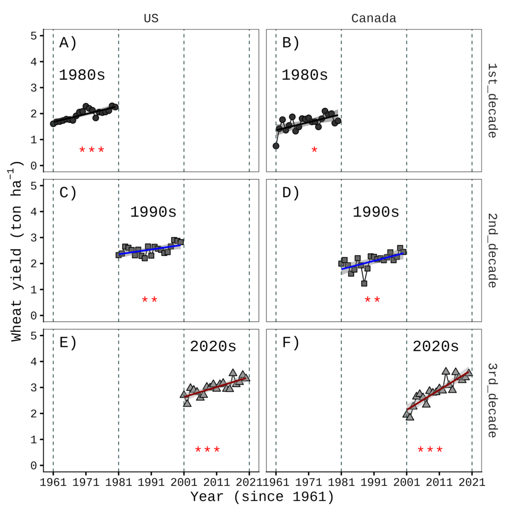
The preceding code was used to produce the figure shown above. Please generate the following figure using the facetext2() function.
Code summary: https://github.com/agronomy4future/r_code/blob/main/facetext()_R_Package_Easy_Text_Annotation_for_ggplot2_Faceted__Plots.ipynb
We aim to develop open-source code for agronomy ([email protected])
© 2022 – 2025 https://agronomy4future.com – All Rights Reserved.
Last Updated: 03/25/2026
# Homework answer
facetext2(data= NAmerica,
  facet_var= "location",
  facet_var2= "decade",
  x_var= "year",
  x = rep(0.08, 6),
  y= rep(0.95, 6),
  yrange= c(0, 5),
  label= c("A)","C)","E)","B)","D)","F)"),
  color= rep("black", 6),
  size= 7,
  family= "serif") +

facetext2(data= NAmerica,
  facet_var= "location",
  facet_var2= "decade",
  x_var= "year",
  x=c(0.15,0.52,0.83,  0.15,0.52,0.83),
  y=c(0.7,0.8,0.92,  0.7,0.8,0.92),
  yrange= c(0, 5),
  label= c("1980s","1990s","2020s","1980s","1990s","2020s"),
  color= rep("black", 6),
  size= 7,
  family= "serif") +

facetext2(data= NAmerica,
  facet_var= "location",
  facet_var2= "decade",
  x_var= "year",
  x=c(0.2,0.5,0.8,  0.2,0.5,0.8),
  y=c(0.1,0.1,0.1, 0.1,0.1,0.1),
  yrange= c(0, 5),
  label= c("***","**","***","*","**","***"),
  color= rep("red", 6),
  size= 7,
  family= "serif") +