In my previous posts, I introduced how to divide panels in one figure using facet_wrap(). Today, I’ll introduce how to add separate text to panels.
First, let’s make sure we have the required packages installed.
if(!require(ggplot2)) install.packages("ggplot2")
if(!require(dplyr)) install.packages("dplyr")
if(!require(tidyr)) install.packages("tidyr")
library (ggplot2)
library (dplyr)
library (tidyr)
I’ll create a dataset as shown below:
Nitrogen= c(rep("N0", 5), rep("N1", 5))
Cultivar_1= c(50,49,48,47,46,60,62,63,64,62)
Cultivar_2= c(55,57,56,55,54,65,66,67,64,63)
Cultivar_3= c(60,62,63,65,59,60,59,57,56,58)
dataA= data.frame(Nitrogen, Cultivar_1, Cultivar_2, Cultivar_3)

dataA
   Nitrogen Cultivar_1 Cultivar_2 Cultivar_3
1        N0         50         55         60
2        N0         49         57         62
3        N0         48         56         63
4        N0         47         55         65
5        N0         46         54         59
6        N1         60         65         60
7        N1         62         66         59
8        N1         63         67         57
9        N1         64         64         56
10       N1         62         63         58
Next, I’ll reshape the dataset into columns to facilitate data analysis.
df= data.frame(
               dataA %>%
               pivot_longer(
               cols=c(Cultivar_1, Cultivar_2, Cultivar_3),
               names_to="Genotype", values_to="Yield")
               )

df
Nitrogen	Genotype	Yield
N0	        Cultivar_1	50
N0	        Cultivar_2	55
N0	        Cultivar_3	60
N0	        Cultivar_1	49
N0	        Cultivar_2	57
N0	        Cultivar_3	62
.
.
.
And then, I’ll summarize this data using descriptive statistics.
dataB= data.frame(df %>%
  group_by(Genotype, Nitrogen) %>%
  dplyr::summarize(across(c(Yield),
                          .fns = list(Mean = mean,
                                      SD = sd,
                                      n = length,
                                      se = ~ sd(.)/sqrt(length(.))))))
dataB
Genotype	Nitrogen	Yield_Mean	Yield_SD	Yield_n	Yield_se
Cultivar_1	N0	48.0	1.581139	5	0.7071068
Cultivar_1	N1	62.2	1.483240	5	0.6633250
Cultivar_2	N0	55.4	1.140175	5	0.5099020
Cultivar_2	N1	65.0	1.581139	5	0.7071068
Cultivar_3	N0	61.8	2.387467	5	1.0677078
Cultivar_3	N1	58.0	1.581139	5	0.7071068
Finally, I’ll create a graph to visualize the summarized data.
ggplot (data=dataB, aes(x=Genotype, y=Yield_Mean, fill=Nitrogen)) +
  geom_bar(stat="identity",position="dodge") +
  geom_errorbar(aes(ymin= Yield_Mean-Yield_se, ymax= Yield_Mean+Yield_se),
                position=position_dodge(0.9), width=0.2) +
  scale_fill_manual(values= c("Gray","Dark green")) +
  scale_y_continuous(breaks= seq(0, 100, 20), limits= c(0, 100))+
  facet_wrap(~Nitrogen) +
  labs(x="Cultivar", y="Yield") +
  theme_classic(base_size=18, base_family="serif")+
  theme(legend.position='none',
        legend.title=element_blank(),
        legend.key=element_rect(color="white", fill="white"),
        legend.text=element_text(family="serif", face="plain",
                                 size=15, color= "Black"),
        legend.background=element_rect(fill="white"),
        axis.line=element_line(linewidth=0.5, colour="black"),
        strip.background=element_rect(color="white",
                                      linewidth=0.5,linetype="solid"))

In this graph, I want to indicate statistical significance with asterisks (***) in each panel. First, I’ll add asterisks in the N0 panel.
ggplot (data=dataB, aes(x=Genotype, y=Yield_Mean, fill=Nitrogen)) +
  geom_bar(stat="identity",position="dodge") +
  geom_errorbar(aes(ymin= Yield_Mean-Yield_se, ymax= Yield_Mean+Yield_se),
                position=position_dodge(0.9), width=0.2) +
  scale_fill_manual(values= c("Gray","Dark green")) +
  ###
  geom_text(aes(family="serif",fontface=6), x=1.5, y=80, label="***", size=7, col="red") +
  ###
  scale_y_continuous(breaks= seq(0, 100, 20), limits= c(0, 100))+
  facet_wrap(~Nitrogen) +
  annotate("segment", x=1.5, xend=2.5, y=Inf,yend=Inf, color="black", lwd=1)+
  labs(x="Cultivar", y="Yield") +
  theme_classic(base_size=18, base_family="serif")+
  theme(legend.position='none',
        legend.title=element_blank(),
        legend.key=element_rect(color="white", fill="white"),
        legend.text=element_text(family="serif", face="plain",
                                 size=15, color= "Black"),
        legend.background=element_rect(fill="white"),
        axis.line=element_line(linewidth=0.5, colour="black"),
        strip.background=element_rect(color="white",
                                      linewidth=0.5,linetype="solid"))

The problem is that *** is added to both panels. I want a different symbol for each panel.

to create data table to insert text to specific panel
I’ll create a data table.
text1= data.frame(Nitrogen="N0", STAT= "***", Genotype="Cultivar_2", Yield=70)

text1
Nitrogen	STAT	Genotype	Yield
N0	        ***	Cultivar_2	70
I’ll add this data table to the geom_text().
geom_text(data=text1, aes(family="serif", x=Genotype, y=Yield, label=STAT), size=5, color="red")
Let’s create a graph again, this time to visualize the data.
ggplot (data=dataB, aes(x=Genotype, y=Yield_Mean, fill=Nitrogen)) +
  geom_bar(stat="identity",position="dodge") +
  geom_errorbar(aes(ymin= Yield_Mean-Yield_se, ymax= Yield_Mean+Yield_se),
                position=position_dodge(0.9), width=0.2) +
  scale_fill_manual(values= c("Gray","Dark green")) +
  ###
  geom_text(data=text1, aes(family="serif", x=Genotype, y=Yield, label=STAT), size=5, color="red") +
  ###
  scale_y_continuous(breaks= seq(0, 100, 20), limits= c(0, 100))+
  facet_wrap(~Nitrogen) +
  annotate("segment", x=1.5, xend=2.5, y=Inf,yend=Inf, color="black", lwd=1)+
  labs(x="Cultivar", y="Yield") +
  theme_classic(base_size=18, base_family="serif")+
  theme(legend.position='none',
        legend.title=element_blank(),
        legend.key=element_rect(color="white", fill="white"),
        legend.text=element_text(family="serif", face="plain",
                                 size=15, color= "Black"),
        legend.background=element_rect(fill="white"),
        axis.line=element_line(linewidth=0.5, colour="black"),
        strip.background=element_rect(color="white",
                                      linewidth=0.5,linetype="solid"))
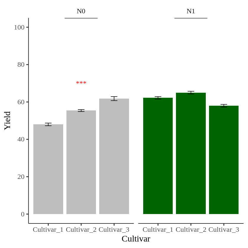
I’ll create another data table to add text in the second panel.
text2= data.frame(Nitrogen="N1", STAT= "**", Genotype="Cultivar_1", Yield=80)
geom_text(data=text2, aes(family="serif", x=Genotype, y=Yield, label=STAT), size=5, color="red")

##
ggplot (data=dataB, aes(x=Genotype, y=Yield_Mean, fill=Nitrogen)) +
  geom_bar(stat="identity",position="dodge") +
  geom_errorbar(aes(ymin= Yield_Mean-Yield_se, ymax= Yield_Mean+Yield_se),
                position=position_dodge(0.9), width=0.2) +
  scale_fill_manual(values= c("Gray","Dark green")) +
  ###
  geom_text(data=text1, aes(family="serif", x=Genotype, y=Yield, label=STAT), size=5, color="red") +
  geom_text(data=text2, aes(family="serif", x=Genotype, y=Yield, label=STAT), size=5, color="red") +
  ###
  scale_y_continuous(breaks= seq(0, 100, 20), limits= c(0, 100))+
  facet_wrap(~Nitrogen) +
  annotate("segment", x=1.5, xend=2.5, y=Inf,yend=Inf, color="black", lwd=1)+
  labs(x="Cultivar", y="Yield") +
  theme_classic(base_size=18, base_family="serif")+
  theme(legend.position='none',
        legend.title=element_blank(),
        legend.key=element_rect(color="white", fill="white"),
        legend.text=element_text(family="serif", face="plain",
                                 size=15, color= "Black"),
        legend.background=element_rect(fill="white"),
        axis.line=element_line(linewidth=0.5, colour="black"),
        strip.background=element_rect(color="white",
                                      linewidth=0.5,linetype="solid"))

Now, different asterisks (***) are indicated in each panel.
full code: https://github.com/agronomy4future/r_code/blob/main/How_to_add_separate_text_to_panels_divided_by_facet_wrap()_in_R.ipynb
We aim to develop open-source code for agronomy ([email protected])
© 2022 – 2025 https://agronomy4future.com – All Rights Reserved.
Last Updated: 02/27/2024