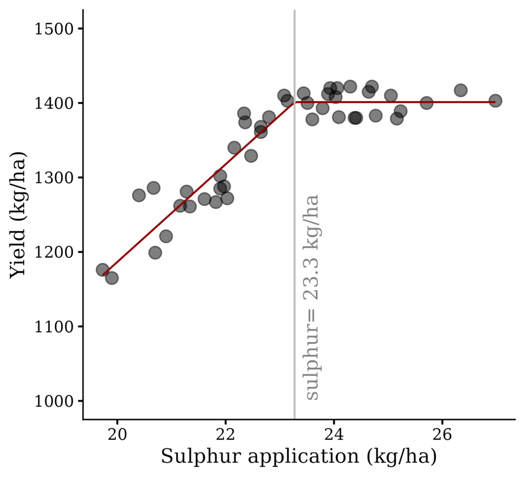
# This is the full code to generate the above graph. You can simply copy and paste this code in your R console to obtain the graph.

# upload required libraries
if(!require(readr)) install.packages("readr")
library (readr)
if(!require(ggplot2)) install.packages("ggplot2")
library(ggplot2)
if(!require(dplyr)) install.packages("dplyr")
library(dplyr)
if(!require(minpack.lm)) install.packages("minpack.lm")
library(minpack.lm)
if(!require(nlraa)) install.packages("nlraa")
library(nlraa)

# upload data
github= paste0("https://raw.githubusercontent.com/agronomy4future/",
                "raw_data_practice/main/sulphur%20application.csv")
dataA=data.frame(read_csv(url(github), show_col_types= FALSE))

# Find reasonable initial values for parameters
fit.lm= lm(yield~sulphur,data=dataA)
a_parameter= fit.lm$coefficients[1]
b_parameter= fit.lm$coefficients[2]
x_mean= mean(dataA$sulphur)

# Define linear plateau function
#a = intercept
#b = slope
#jp = join point or break point

linplat= function(x, a, b, jp){
         ifelse(x<jp,
                a+b*x,
                a+b*jp)
}

# Find best fit parameters
model= nls(yield~linplat(sulphur, a, b, jp),
            data=dataA,
            start=list(a=a_parameter,
                       b=b_parameter,
                       jp=x_mean),
            trace=FALSE,
            nls.control(maxiter=1000))
summary(model)

# Create a graph
dataA %>%
  ggplot(aes(sulphur, yield)) +
  geom_point(size=4, alpha = 0.5) +
  geom_line(stat="smooth",
            method="nlsLM",
            formula=y~SSlinp(x,a,b,jp),
            se=FALSE,
            color="darkred") +
  geom_vline(xintercept=23.2722, linetype="solid", color="grey") +
  annotate("text", label=paste("sulphur=","23.3","kg/ha"), x=23.3, y=1000,
         angle=90, hjust=0, vjust=1.5, alpha=0.5)+
  scale_y_continuous(breaks=seq(1000, 1500, 100), limits= c(1000, 1500)) +
  labs(x="Sulphur application (kg/ha)", y="Yield (kg/ha)") +
  theme_classic(base_size=15, base_family="serif") +
  theme(legend.position="none",
        axis.line=element_line(size=0.5, colour="black"))
When we talk about regression, it’s usually about simple linear regression model. This is about the relationship between two variables.
FYI
□ Simple linear regression (1/5)- correlation and covariance
□ Simple linear regression (2/5)- slope and intercept of linear regression model
Linear plateau model is similar with simple linear model, but linear plateau model is a segmented model, and this statistical model is interested in the critical value (the x-value above which there is no further increase in y), indicating the plateau value (the statistically highest value that y reaches).
I always talk with data. I’ll run the below R code.
if(!require(readr)) install.packages("readr")
library (readr)

github= paste0("https://raw.githubusercontent.com/agronomy4future/",
                "raw_data_practice/main/sulphur%20application.csv")
dataA=data.frame(read_csv(url(github), show_col_types= FALSE))

print(head(dataA, 3))
  variety sulphur yield
1     CV1   20.67  1286
2     CV1   19.90  1165
3     CV1   19.73  1176
.
.
.
Or you can directly generate the data like below.
variety= rep(c("CV1","CV2","CV3","CV4","CV5"), each=9)
sulphur= c(20.67, 19.9, 19.73,21.16, 21.61, 20.9, 22.36, 21.97, 21.9, 21.34, 21.28, 21.9, 20.7, 22.65, 22.16, 22.03, 20.4, 22.47, 22.65, 21.82, 24.41,  22.34, 24.03, 24.38, 23.6, 23.44, 23.51, 23.89, 24.7, 22.8, 23.08, 25.05, 24.09, 24.3, 25.23, 23.14, 24.06, 26.98, 25.71, 23.93, 25.16, 23.79, 26.34, 24.64, 24.77)
yield= c(1286, 1165, 1176, 1262, 1271, 1221, 1374, 1288, 1285, 1261, 1281, 1302, 1199, 1368, 1340, 1272, 1276, 1329, 1361, 1267, 1380, 1386, 1408, 1380, 1378, 1413, 1400, 1412, 1422, 1381, 1410, 1410, 1381, 1422, 1389, 1403, 1420, 1403, 1400, 1420, 1379, 1393, 1417, 1415, 1383)
dataA= data.frame(variety,sulphur,yield)

print(head(dataA, 3))
  variety sulphur yield
1     CV1   20.67  1286
2     CV1   19.90  1165
3     CV1   19.73  1176
.
.
.
Also, you can download this data in my Github https://github.com/agronomy4future/raw_data_practice/blob/main/sulphur%20application.csv
Let’s assume that this data is about yield data in five different crop variety according to different sulphur application. First, this is about analysis for simple linear regression.
if(!require(ggplot2)) install.packages("ggplot2")
library(ggplot2)

Fig1= ggplot (data=dataA, aes (x= sulphur, y= yield)) +
  geom_smooth (method= lm, level= 0.95, se= FALSE, linetype= 1, linewidth= 0.5, formula= y ~ x) +
  geom_point (aes(shape= variety, fill=variety),col="black", size= 5, stroke = 0.5) +
  scale_shape_manual (values= rep(c(21),5)) +
  scale_fill_manual (values= rep(c("dark grey"),5))+
  scale_x_continuous (breaks= seq(15,30,5), limits=c(15,30)) +
  scale_y_continuous (breaks= seq(500,1800,300), limits=c(500,1800)) +
  labs(x="sulphur application (kg/ha)", y="Yield (kg/ha)") +
  theme_grey (base_size= 15, base_family= "serif")+
  theme (legend.position="none",
                 axis.line= element_line (size= 0.5, colour= "black"))

options(repr.plot.width=5.5, repr.plot.height=5)
print(Fig1)

ggsave("Fig1.png", plot= Fig1, width=5.5, height=5, dpi= 300)
regression= lm (yield~sulphur, data= dataA)
summary (regression)
Call:
lm(formula = yield ~ sulphur, data = dataA)

Residuals:
    Min      1Q  Median      3Q     Max
-85.236 -25.614  -1.877  30.319  64.933

Coefficients:
            Estimate Std. Error t value Pr(>|t|)
(Intercept)  516.204     78.601   6.567 5.46e-08 ***
sulphur       36.028      3.402  10.591 1.47e-13 ***
---
Signif. codes:  0 ‘***’ 0.001 ‘**’ 0.01 ‘*’ 0.05 ‘.’ 0.1 ‘ ’ 1

Residual standard error: 38.79 on 43 degrees of freedom
Multiple R-squared:  0.7229,	Adjusted R-squared:  0.7164
F-statistic: 112.2 on 1 and 43 DF,  p-value: 1.467e-13
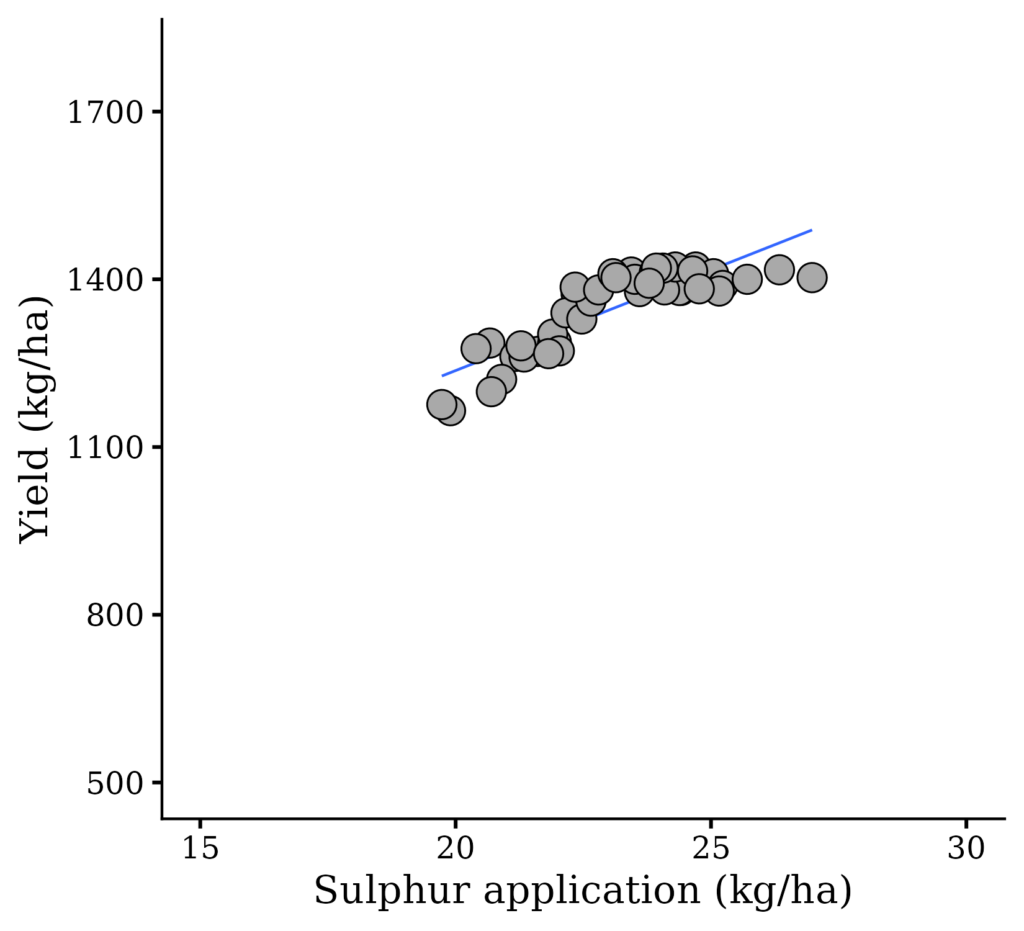
We obtained the model equation, y= 516.204 + 36.025x
However, this model equation would be different from actual data because the model equation predicts yield increase when sulphur increases, but in the actual data, yield does not increase at certain point.
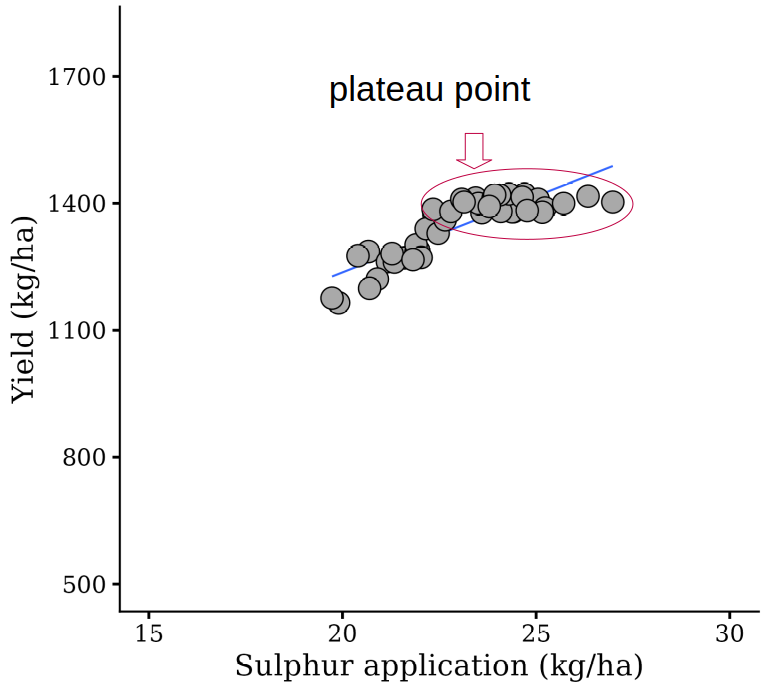
I’m interestedin this certain point. Therefore, I’d like to know the optimun sulphur application to bring about the grestest yield, using a linear plateau model.

1) Find reasonable initial values for parameters
fit.lm= lm(yield~sulphur,data=dataA)
a_parameter= fit.lm$coefficients[1]
b_parameter= fit.lm$coefficients[2]
x_mean= mean(dataA$sulphur)

> a_parameter
(Intercept)
516.2043

> b_parameter
sulphur
36.02786

> x_mean
23.04378
Now, the gereral values for simple linear regresion were calculated again. a_parameter is for intercept, b_parameter is for slope, and x_mean is for average of sulphur.
2) Define linear plateau function
Linear plateau model was defined as below.
#a = intercept
#b = slope
#jp = join point or break point

linplat= function(x, a, b, jp){
         ifelse(x<jp,
                a+b*x,
                a+b*jp)
}
3) Find best fit parameters
model= nls(yield~linplat(sulphur, a, b, jp),
            data=dataA,
            start=list(a=a_parameter,
                       b=b_parameter,
                       jp=x_mean),
            trace=FALSE,
            nls.control(maxiter=1000))

summary(model)

----------- or -----------

if(!require(minpack.lm)) install.packages("minpack.lm")
library(minpack.lm)

model= nlsLM(formula= yield ~ linplat(sulphur, a, b, jp),
             data= dataA,
             start=list(a=a_parameter,
                        b=b_parameter,
                        jp=x_mean))

summary(model)
Formula: yield ~ linplat(sulphur, a, b, jp)

Parameters:
    Estimate Std. Error t value Pr(>|t|)
a  -125.3667   115.2847  -1.087    0.283
b    65.5958     5.3061  12.362 1.39e-15 ***
jp   23.2722     0.1683 138.276  < 2e-16 ***
---
Signif. codes:  0 ‘***’ 0.001 ‘**’ 0.01 ‘*’ 0.05 ‘.’ 0.1 ‘ ’ 1

Residual standard error: 24.34 on 42 degrees of freedom

Number of iterations to convergence: 4
Achieved convergence tolerance: 2.832e-09
We obtained the linear plateau model equation. The below code is the whole code to obtain this model equation.
Tip!! nlraa() package
if(!require(nlraa)) install.packages("nlraa")
library(nlraa)

model= nlsLM (formula=yield~SSlinp (sulphur,a,b,jp),data= dataA)
summary (model)
Formula: yield ~ SSlinp(sulphur, a, b, jp)

Parameters:
    Estimate Std. Error t value Pr(>|t|)
a  -125.3667   115.2847  -1.087    0.283
b    65.5958     5.3061  12.362 1.39e-15 ***
jp   23.2722     0.1683 138.276  < 2e-16 ***
---
Signif. codes:  0 ‘***’ 0.001 ‘**’ 0.01 ‘*’ 0.05 ‘.’ 0.1 ‘ ’ 1

Residual standard error: 24.34 on 42 degrees of freedom

Number of iterations to convergence: 2
Achieved convergence tolerance: 1.49e-08
If we use nlraa(), we can obtain the model eqution at once without extra coding. However, it would be better to follow what I suggested step by step to understand the concept of linear plateau model.
How to interpret linear plateau model?
Formula: yield ~ linplat(sulphur, a, b, jp)

Parameters:
    Estimate Std. Error t value Pr(>|t|)
a  -125.3667   115.2847  -1.087    0.283
b    65.5958     5.3061  12.362 1.39e-15 ***
jp   23.2722     0.1683 138.276  < 2e-16 ***
---
Signif. codes:  0 ‘***’ 0.001 ‘**’ 0.01 ‘*’ 0.05 ‘.’ 0.1 ‘ ’ 1

Residual standard error: 24.34 on 42 degrees of freedom

Number of iterations to convergence: 4
Achieved convergence tolerance: 2.832e-09
In the model equation; y= – 125.4 + 65.6, the important thing is critical value, 23.3. Statistically, at this point, yield does not increase although sulphur application increases. Therefore, critical value is regarded as the highest value that yield reaches.
Therefore, the model equation is expressed as below.
y= -125.4 + 65.6x if x < 23.3
and when sulphur application is 23.3, yield would be
y= -125.3667 + 65.5958*23.2722 ≈ 1401.2
That is, when 23.3 S kg/ha was applied, yield would be 1,401.2 kg/ha and no more yield increases, indicating the optimum sulphur application would be 23.3 kg/ha.
How to create a graph?
Using the below code, we can easily draw a graph for linear plateau.
if(!require(ggplot2)) install.packages("ggplot2")
library(ggplot2)
if(!require(dplyr)) install.packages("dplyr")
library(dplyr)
if(!require(minpack.lm)) install.packages("minpack.lm")
library(minpack.lm)
if(!require(nlraa)) install.packages("nlraa")
library(nlraa)

Fig1= dataA %>%
  ggplot(aes(sulphur, yield)) +
  geom_point(size=4, alpha = 0.5) +
  geom_line(stat="smooth",
            method="nlsLM",
            formula=y~SSlinp(x,a,b,jp),
            se=FALSE,
            color="darkred") +
  scale_y_continuous(breaks=seq(1000, 1500, 100), limits= c(1000, 1500)) +
  labs(x="Sulphur application (kg/ha)", y="Yield (kg/ha)") +
  theme_classic(base_size=15, base_family="serif") +
  theme(legend.position="none",
        axis.line=element_line(size=0.5, colour="black"))

options(repr.plot.width=5.5, repr.plot.height=5)
print(Fig1)

ggsave("Fig1.png", plot= Fig1, width=5.5, height=5, dpi= 300)
The breaking point is 23.3 and at this point, yield would be 1,401.2
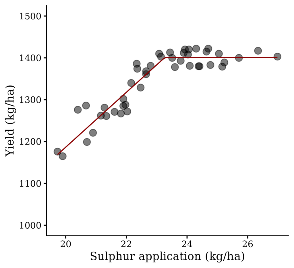
To visualize more clearly, more code will be added.
if(!require(ggplot2)) install.packages("ggplot2")
library(ggplot2)
if(!require(dplyr)) install.packages("dplyr")
library(dplyr)
if(!require(minpack.lm)) install.packages("minpack.lm")
library(minpack.lm)
if(!require(nlraa)) install.packages("nlraa")
library(nlraa)

Fig2= dataA %>%
  ggplot(aes(sulphur, yield)) +
  geom_point(size=4, alpha = 0.5) +
  geom_line(stat="smooth",
            method="nlsLM",
            formula=y~SSlinp(x,a,b,jp),
            se=FALSE,
            color="darkred") +
  geom_vline(xintercept=23.2722, linetype="solid", color="grey") +
  annotate("text", label=paste("sulphur=","23.3","kg/ha"), x=23.3, y=1000,
         angle=90, hjust=0, vjust=1.5, alpha=0.5)+
  scale_y_continuous(breaks=seq(1000, 1500, 100), limits= c(1000, 1500)) +
  labs(x="Sulphur application (kg/ha)", y="Yield (kg/ha)") +
  theme_classic(base_size=15, base_family="serif") +
  theme(legend.position="none",
        axis.line=element_line(size=0.5, colour="black"))

options(repr.plot.width=5.5, repr.plot.height=5)
print(Fig2)

ggsave("Fig2.png", plot= Fig2, width=5.5, height=5, dpi= 300)
p-value and pseudo R-squared
# Define null model
nullfunct= function(x, m){m}
m.ini= mean(dataA$sulphur)
null= nls(yield~nullfunct(sulphur, m),
          data=dataA,
          start=list(m=m.ini),
          trace=FALSE,
          nls.control(maxiter=1000))

# Find p-value and pseudo R-squared
if(!require(rcompanion)) install.packages("rcompanion")
library(rcompanion)

print(nagelkerke(model,null))
$Models

Model: "nlsLM, yield ~ linplat(sulphur, a, b, jp), dataA, list(a = a_parameter, b = b_parameter, jp = x_mean), LM, list(50, 1e-05, 0.0009765625, FALSE, FALSE, 0, FALSE), FALSE"
Null:  "nls, yield ~ nullfunct(sulphur, m), dataA, list(m = m.ini), list(1000, 1e-05, 0.0009765625, FALSE, FALSE, 0, FALSE), FALSE, default"

$Pseudo.R.squared.for.model.vs.null
                             Pseudo.R.squared
McFadden                             0.196568
Cox and Snell (ML)                   0.893469
Nagelkerke (Cragg and Uhler)         0.893479

$Likelihood.ratio.test
 Df.diff LogLik.diff  Chisq    p.value
      -2     -50.385 100.77 1.3127e-22

$Number.of.observations

Model: 45
Null:  45

$Messages
[1] "Note: For models fit with REML, these statistics are based on refitting with ML"

$Warnings
[1] "None"
■ Reference
https://gradcylinder.org/post/linear-plateau/
https://rcompanion.org/handbook/I_11.html
■ Alternative method
We used the code below to create the linear plateau line.
geom_line(stat="smooth",
            method="nlsLM",
            formula=y~SSlinp(x,a,b,jp),
            se=FALSE,
            color="darkred")
However, we can simply use geom_line() to plot the predicted yield.
model= nls(yield~linplat(sulphur, a, b, jp),
            data=dataA,
            start=list(a=a_parameter,
                       b=b_parameter,
                       jp=x_mean),
            trace=FALSE,
            nls.control(maxiter=1000))
In this analysis, let’s predict the yield based on the linear plateau model.
pred_lp = data.frame(sulphur = seq(19, 27, 0.1))
# This seq value is based on the range of the independent variable (x).

pred_lp$yield = predict(model, newdata = pred_lp)

print(head(pred_lp, 5))
  sulphur    yield
1    19.0 1120.954
2    19.1 1127.514
3    19.2 1134.073
4    19.3 1140.633
5    19.4 1147.192
.
.
.
and let’s calculate the plateau point, which turns out to be 23.3.
jp_val = round(coef(m_lp)["jp"], 1)
print(jp_val)

  jp
23.3
Let’s plot the graph using a simple geom_line().
if(!require(ggplot2)) install.packages("ggplot2")
library(ggplot2)
if(!require(dplyr)) install.packages("dplyr")
library(dplyr)
if(!require(minpack.lm)) install.packages("minpack.lm")
library(minpack.lm)
if(!require(nlraa)) install.packages("nlraa")
library(nlraa)

Fig3=ggplot(data=dataA, aes(x=sulphur, y=yield)) +
  geom_point(size=4, alpha = 0.5, na.rm = TRUE) +
  geom_line(data = pred_lp, color= "red", linewidth= 0.8, na.rm = TRUE) +
  geom_vline(xintercept=jp_val, linetype="solid", color="grey") +
  annotate("text", label=paste("sulphur=","23.3","kg/ha"), x=23.3, y=1100,
           angle=90, hjust=0, vjust=1.5, alpha=0.5, na.rm = TRUE)+
  scale_x_continuous(breaks=seq(20, 28, 2), limits= c(20, 28)) +
  scale_y_continuous(breaks=seq(1100, 1500, 50), limits= c(1100, 1500)) +
  labs(x="Sulphur application (kg/ha)", y="Yield (kg/ha)") +
  theme_classic(base_size=15, base_family="serif") +
  theme(legend.position="none",
        panel.border= element_rect(color="black", fill=NA, linewidth=0.5),
        axis.line= element_line(linewidth=0.5, colour="black"))

options(repr.plot.width=5.5, repr.plot.height=5)
print(Fig3)

ggsave("Fig3.png", plot= Fig3, width=5.5, height=5, dpi= 300)
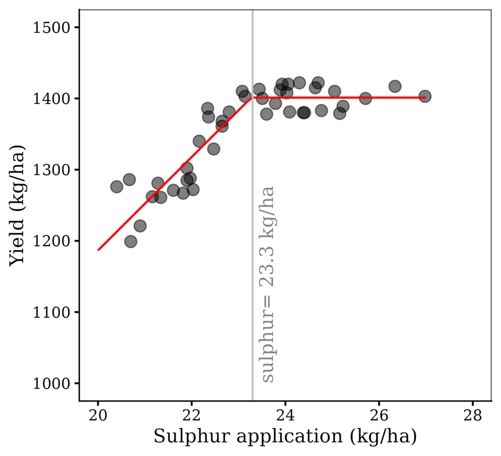
To create the figure, I used raw data rather than averaged values. Now, let’s group it by variety.
if(!require(ggplot2)) install.packages("ggplot2")
library(ggplot2)
if(!require(dplyr)) install.packages("dplyr")
library(dplyr)
if(!require(minpack.lm)) install.packages("minpack.lm")
library(minpack.lm)
if(!require(nlraa)) install.packages("nlraa")
library(nlraa)

Fig2A= dataA %>%
  ggplot(aes(sulphur, yield)) +
  geom_point(aes(fill=variety, shape=variety), size=4, alpha = 0.5) +
  scale_fill_manual(values=c("grey25","red","blue","cadetblue","orange"))+
  scale_shape_manual(values=c(21,21,21,21,21))+
  geom_line(stat="smooth",
            method="nlsLM",
            formula=y~SSlinp(x,a,b,jp),
            se=FALSE,
            color="darkred") +
  geom_vline(xintercept=23.2722, linetype="solid", color="grey") +
  annotate("text", label=paste("sulphur=","23.3","kg/ha"), x=23.3, y=1000,
         angle=90, hjust=0, vjust=1.5, alpha=0.5)+
  scale_y_continuous(breaks=seq(1000, 1500, 100), limits= c(1000, 1500)) +
  labs(x="Sulphur application (kg/ha)", y="Yield (kg/ha)") +
  theme_classic(base_size=15, base_family="serif") +
  theme(legend.position=c(0.88,0.15),
        legend.title=element_blank(),
        legend.key=element_rect(color="white", fill=alpha(0.5)),
        legend.text=element_text(family="serif", face="plain",
        size=13, color="black"),
        legend.background= element_rect(fill=alpha(0.5)),
        panel.border= element_rect(color="black", fill=NA, linewidth=0.5),
        axis.line= element_line(linewidth=0.5, colour="black"),
        strip.background=element_rect(color="white",
        linewidth=0.5, linetype="solid"))

options(repr.plot.width=5.5, repr.plot.height=5)
print(Fig2A)

ggsave("Fig2A.png", plot= Fig2, width=5.5, height=5, dpi= 300)
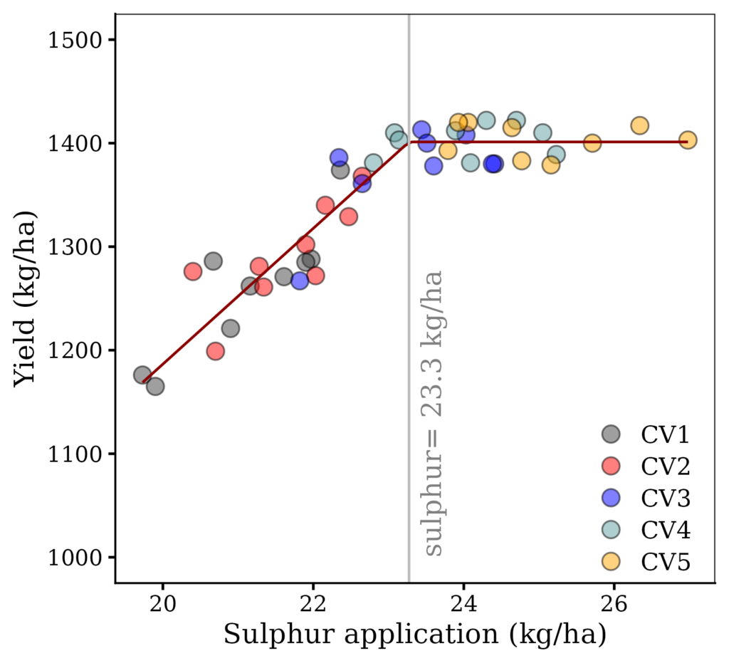
I’ll summarize the data by grouping it by variety.
dataAMean= dataA %>%
       group_by(variety) %>%
       dplyr::summarize(
       across(
        .cols= c(yield, sulphur),
        .fns= list(
         Mean= ~mean(., na.rm= TRUE),
         n= ~length(.),
         se= ~sd(., na.rm= TRUE) / sqrt(length(.)))),
        .groups= "drop") %>%
        as.data.frame()

print(dataAMean)
  variety yield_Mean yield_n yield_se sulphur_Mean sulphur_n sulphur_se
1     CV1   1258.667       9 21.34114     21.13333         9  0.3068659
2     CV2   1292.000       9 16.63998     21.65889         9  0.2591838
3     CV3   1374.778       9 14.52849     23.35333         9  0.3026274
.
.
.
Then, I’ll repeat the same process as above.
# Find reasonable initial values for parameters
fit.lm= lm(yield_Mean~sulphur_Mean, data= dataAMean)
a_parameter= fit.lm$coefficients[1]
b_parameter= fit.lm$coefficients[2]
x_mean= mean(dataAMean$sulphur_Mean)
# Fit the model
linplat= function(x, a, b, jp){ifelse(x<jp, a+b*x, a+b*jp)}
model= nls(data=dataAMean, yield_Mean~linplat(sulphur_Mean, a, b, jp),
       start=list(a=a_parameter, b=b_parameter, jp=x_mean),
       trace=FALSE, nls.control(maxiter=1000))

summary(model)
Formula: yield_Mean ~ linplat(sulphur_Mean, a, b, jp)

Parameters:
    Estimate Std. Error t value Pr(>|t|)
a  173.94831   43.43324   4.005  0.05706 .
b   51.45621    1.96808  26.145  0.00146 **
jp  23.89187    0.09084 263.002 1.45e-05 ***
---
Signif. codes:  0 ‘***’ 0.001 ‘**’ 0.01 ‘*’ 0.05 ‘.’ 0.1 ‘ ’ 1

Residual standard error: 3.229 on 2 degrees of freedom

Number of iterations to convergence: 3
Achieved convergence tolerance: 1.064e-06
I’ll calculate the predicted yield.
# Predict and evalulate
pred_lp = data.frame(sulphur_Mean = seq(19, 27, 0.1))
pred_lp$yield_Mean = predict(model, newdata= pred_lp)

print(head(pred_lp, 5))
  sulphur_Mean yield_Mean
1         19.0   1151.616
2         19.1   1156.762
3         19.2   1161.908
4         19.3   1167.053
5         19.4   1172.199
.
.
.
if(!require(ggplot2)) install.packages("ggplot2")
library(ggplot2)
if(!require(dplyr)) install.packages("dplyr")
library(dplyr)
if(!require(minpack.lm)) install.packages("minpack.lm")
library(minpack.lm)
if(!require(nlraa)) install.packages("nlraa")
library(nlraa)

Fig4=ggplot(data=dataAMean, aes(x= sulphur_Mean, y= yield_Mean)) +
  geom_point(size=4, alpha = 0.5, na.rm = TRUE) +

  geom_errorbar(aes(xmin=sulphur_Mean-sulphur_se,
                    xmax=sulphur_Mean+sulphur_se),
                    position = position_dodge(0.9),
                    linewidth=0.5, width=0.5, color="grey25") +

  geom_errorbar(aes(ymin=yield_Mean-yield_se,
                    ymax=yield_Mean+yield_se),
                    position = position_dodge(0.9),
                    linewidth=0.5, width=0.5, color="grey25") +

  geom_line(data= pred_lp, color = "red", linewidth = 0.8, na.rm = TRUE) +
  geom_vline(xintercept=jp_val, linetype="solid", color="grey", na.rm = TRUE) +
  annotate("text", label=paste("sulphur=","23.3","kg/ha"), x=23.3, y=1100,
           angle=90, hjust=0, vjust=1.5, alpha=0.5, na.rm = TRUE)+
  scale_x_continuous(breaks=seq(20, 28, 2), limits= c(20, 28)) +
  scale_y_continuous(breaks=seq(1100, 1500, 50), limits= c(1100, 1500)) +
  labs(x="Sulphur application (kg/ha)", y="Yield (kg/ha)") +
  theme_classic(base_size=15, base_family="serif") +
  theme(legend.position="none",
        legend.title=element_blank(),
        legend.key=element_rect(color="white", fill=alpha(0.5)),
        legend.text=element_text(family="serif", face="plain",
        size=13, color="black"),
        legend.background= element_rect(fill=alpha(0.5)),
        panel.border= element_rect(color="black", fill=NA, linewidth=0.5),
        axis.line= element_line(linewidth=0.5, colour="black"),
        strip.background=element_rect(color="white",
        linewidth=0.5, linetype="solid"))

options(repr.plot.width=5.5, repr.plot.height=5)
print(Fig4)

ggsave("Fig4.png", plot= Fig4, width=5.5, height=5, dpi= 300)
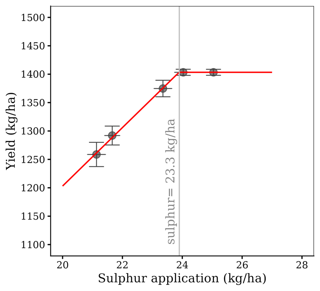
How to analyze the same data as quadratic plateau model? The answer is below.
How to analyze quadratic plateau model in R Studio?

We aim to develop open-source code for agronomy ([email protected])
© 2022 – 2025 https://agronomy4future.com – All Rights Reserved.
Last Updated: 07/24/2026