When analyzing yield, we usually use bar or box plots based on the mean. However, sometimes we need to visualize the spatial variation of yield. In those cases, GIS maps are commonly used, often created with powerful software such as ArcGIS, which I have used and found to be excellent. The drawback is that ArcGIS is not free. If you want to create a simple yield map using R, it is possible, although the map quality may be slightly lower. To make this easier, I developed an R package called agronomymap() for creating yield maps directly in R.
agronomymap() provides functions for generating heatmaps and spatial field visualizations from agronomic trial data, including raster interpolation, point overlays, and customizable axis labeling, and is designed for grid-based field layouts (row/column).

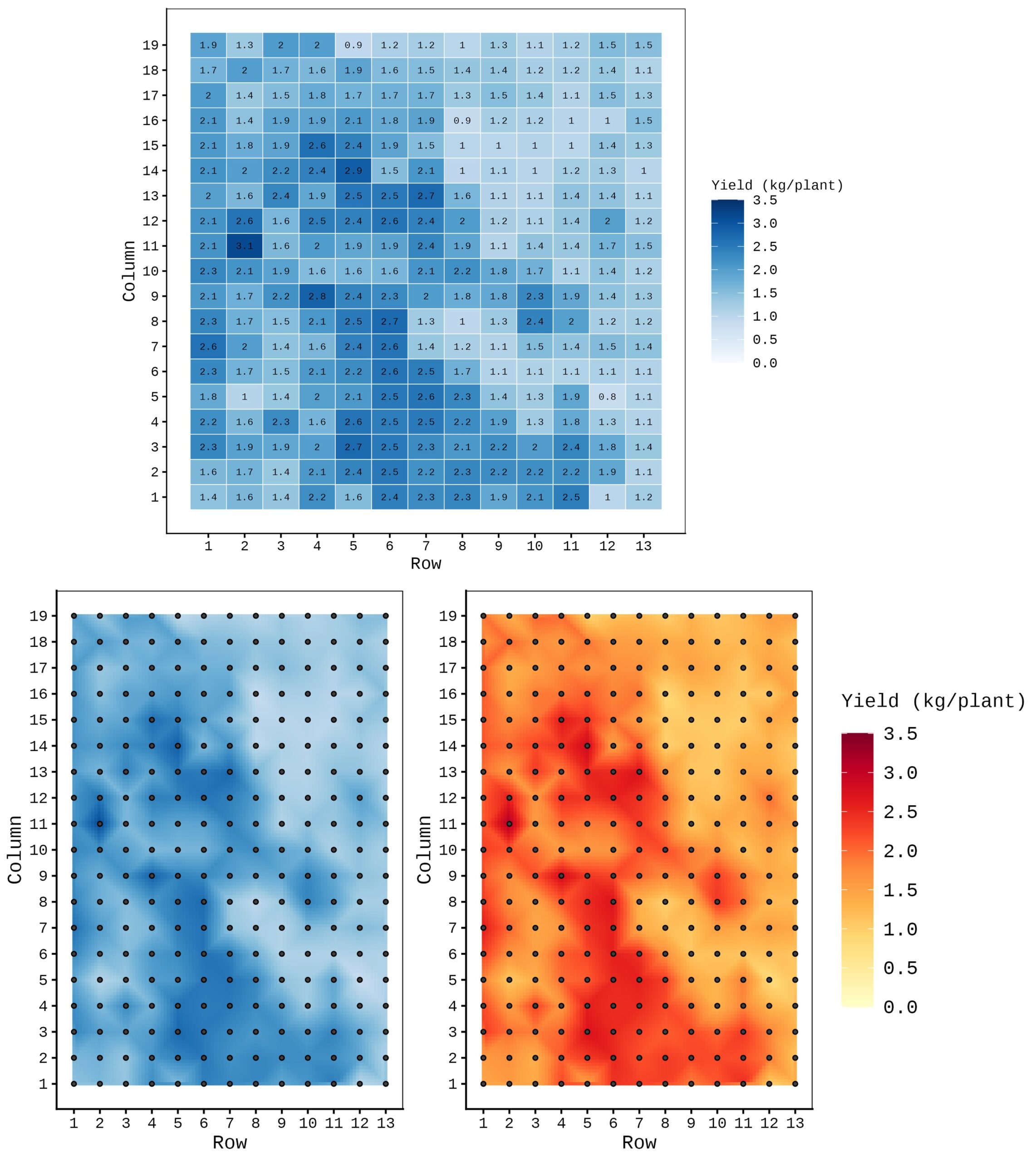
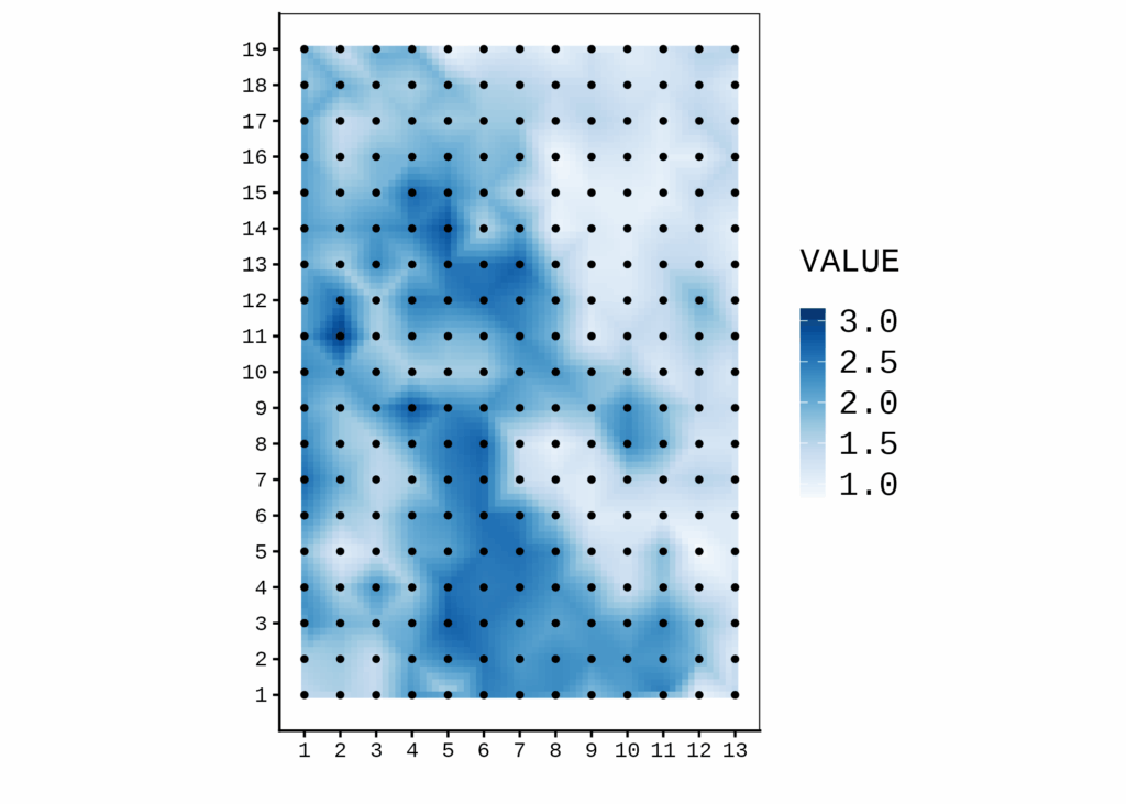
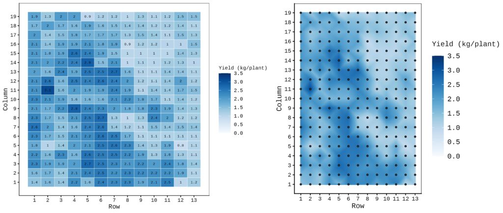
First, let’s create a yield map using geom_tile(). To begin, we’ll upload a dataset.
if(!require(readr)) install.packages("readr")
library(readr)

github= paste0("https://raw.githubusercontent.com/agronomy4future/",
                "raw_data_practice/refs/heads/main/",
                "SOC.csv")
dataA= data.frame(read_csv(url(github),show_col_types = FALSE))
print(head(dataA, 5))
  Column Row  SOC
1      1   1 1.45
2      2   1 1.60
3      3   1 2.34
4      4   1 2.20
5      5   1 1.80
.
.
.
and then generate the yield map.
ggplot(df, aes(x=Row, y=Column, fill=Yield)) +
  geom_tile(color="white") +
  geom_text(aes(label=round(Yield, 1)), color="black", size=3) +
  scale_x_continuous(breaks=1:13) +
  scale_y_continuous(breaks=1:19) +
  scale_fill_gradientn(
  colours=colorRampPalette(brewer.pal(9, "Blues"))(100),
  limits=c(0, 3.5),  breaks=seq(0, 3.5, 1), name="SOC",
  na.value="white") +
  labs(x="Row", y="Column") +
  theme_classic(base_size=15) +
  theme(legend.position="right",
        legend.title= element_text(size=12),
        legend.key.size=unit(0.5,'cm'),
        legend.key=element_rect(color=alpha("white",.05),
        fill=alpha("white",.05)),
        legend.text=element_text(size=12),
        legend.background=element_rect(fill=alpha("white",.05)),
        panel.grid=element_blank(),
        panel.border=element_rect(color="black",
        fill=NA, linewidth=0.5),
        axis.line=element_line(linewidth=0.5, colour="black"))
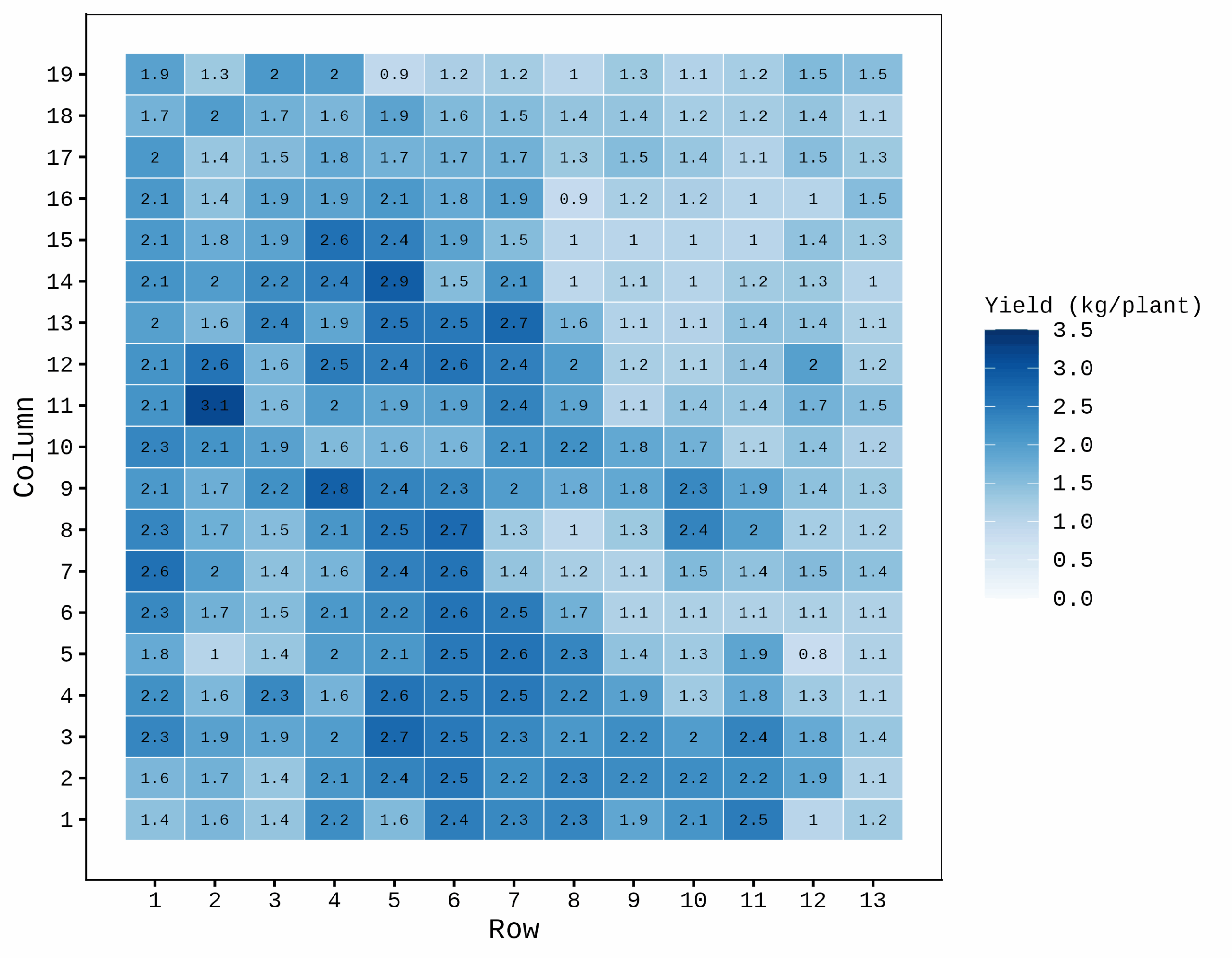
This produces a tiled map, but I want to create a yield map that looks more like a GIS map using R.
■ agronomymap()
1) Install the package
Before installing agronomymap(), please download Rtools (https://cran.r-project.org/bin/windows/Rtools)
if(!require(remotes)) install.packages("remotes")
if (!requireNamespace("agronomymap", quietly = TRUE)) {
 remotes::install_github("agronomy4future/agronomymap", force= TRUE)
}
library(remotes)
library(agronomymap)
2) Basic code
agronomymap(data,
            map= c("x","y"),
            variable= "yield")

# x represents the horizontal axis and y represents the vertical axis in the grid-based field
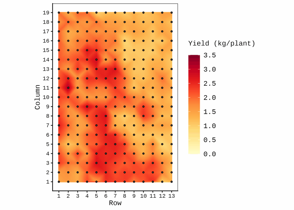
Let’s create a yield map using agronomymap().
agronomymap(
 data= df,
 map= c("Row", "Column"), # x and y
 variable= "Yield")
When using the basic code, the function generates a yield map with default settings.
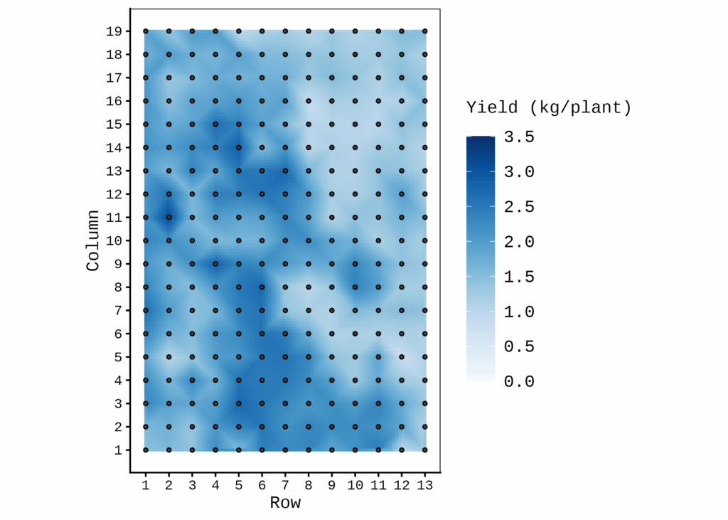
Let’s add more details
agronomymap(
 data= df,
 map= c("Row", "Column"),
 variable= "Yield",

# fill scale
 grid_res = 100,
 palette= "Blues",
 fill_limits= c(0, 3.5),
 fill_breaks= seq(0, 3.5, 0.5),

# label
 label_title= "Yield (kg/plant)",
 label_size= 12,
 label_key= 12,
 label_position= "right",
 label_key_height= 1.2,
 label_key_width= 0.7,
 xlab= "Row",
 ylab= "Column",

# point aesthetics
 point_size= 1,
 point_shape= 21,
 point_color= "black",
 point_fill= "grey25",
 #border and axis unit
 add_border= TRUE,
 axis_units= TRUE
)
Let us compare the map generated using geom_tile() with the one generated using agronomymap().
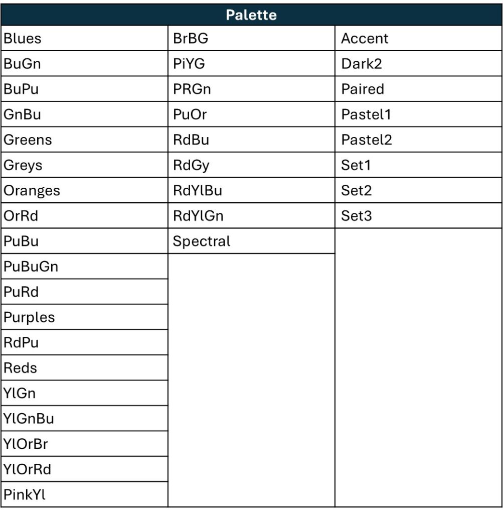
If you want to change the map color, you can simply set palette = "Blues". If you prefer a red color scheme, change it to palette= "YlOrRd".
Below is a summary of available palette colors.
code summary: https://github.com/agronomy4future/r_code/blob/main/agronomymap.ipynb
We aim to develop open-source code for agronomy ([email protected])
© 2022 – 2025 https://agronomy4future.com – All Rights Reserved.
Last Updated: 17/Nov/2025