When analyzing data, we sometimes need to analyze cumulative data. When calculating cumulative data, grouping is important, and it takes time to perform the grouping and calculations. To simplify this process, I developed an R package called datacume().
Let’s upload the dataset.
if(!require(readr)) install.packages("readr")
library(readr)

github="https://raw.githubusercontent.com/agronomy4future/raw_data_practice/refs/heads/main/biomass_cumulative.csv"
df=data.frame(read_csv(url(github),show_col_types = FALSE))
set.seed(100)
print(df[sample(nrow(df),5),])

    Treatment Block Plant Branch Days Biomass
503   Control   III     5      1   66  360.73
358   Control     I     5      4   59  345.46
470   Control     I     8      3   66  403.13
516   Control     I     1      4   73  565.40
98    Drought   III     3      2   59  162.15
.
.
.
This dataset contains biomass measurements across different treatments over time, recorded for various plants and their branches. I want to calculate the cumulative biomass over time. To do this accurately, I’ll first calculate the average biomass of the branches within each plant, since the number of branches varies between plants. This step ensures consistency before calculating the cumulative biomass.
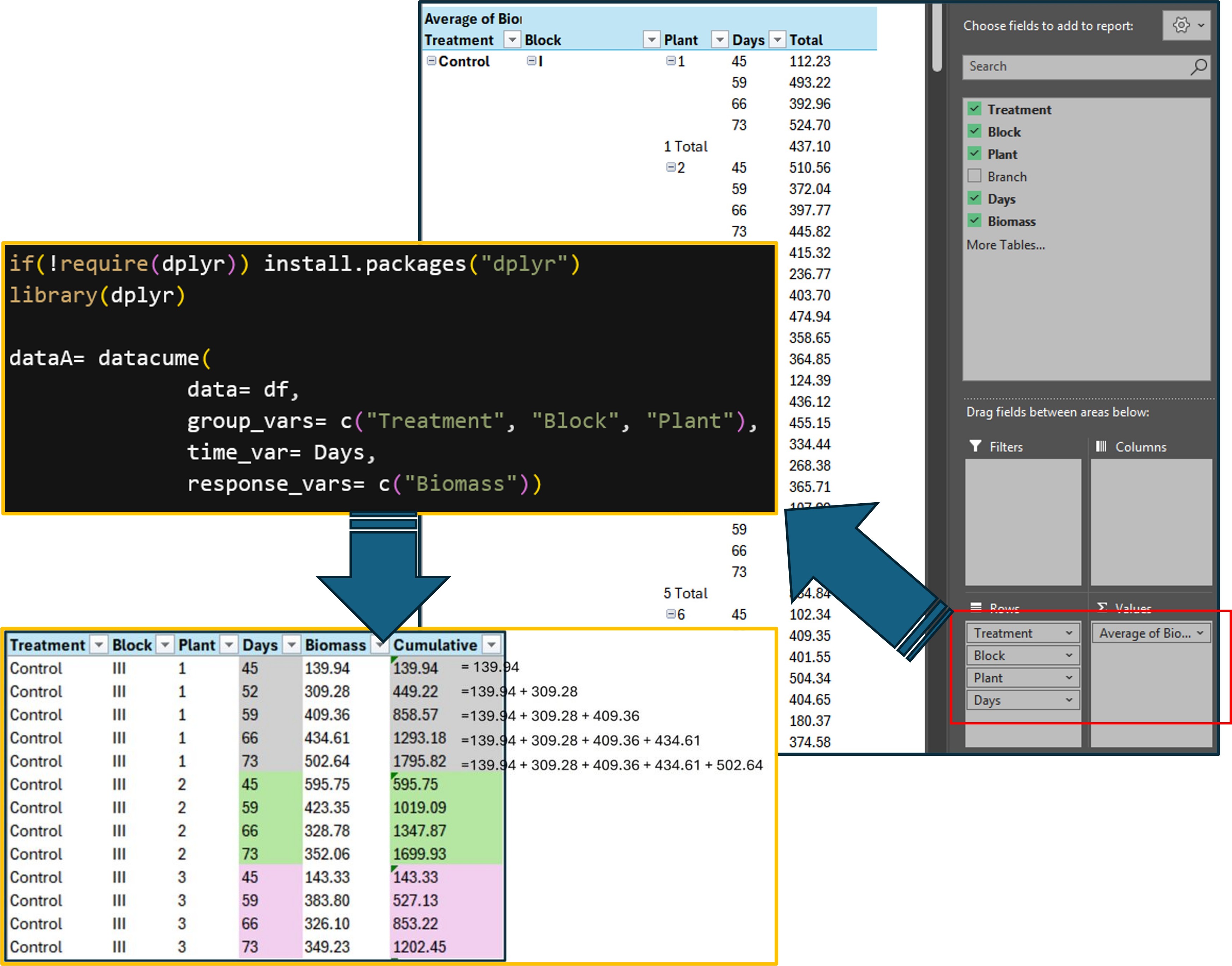
First, let’s start by using Excel. We’ll use a PivotTable to calculate the average biomass of the branches for each plant.

After that, we’ll calculate the cumulative biomass over time (by day).

Next, I’ll calculate another average — this time by Treatment and Day — using the cumulative biomass data. This will show how biomass accumulates over time across different treatments. This step provides a clear overview of the biomass accumulation patterns for each treatment group over time.
This process can be time-consuming, which is why the datacume() package helps streamline the workflow and save time.

1. Install package
if(!require(remotes)) install.packages("remotes")
if (!requireNamespace("datacume", quietly = TRUE)) {
  remotes::install_github("agronomy4future/datacume", force= TRUE)
}
library(remotes)
library(datacume)
After installing the package, you can type ?datacume in the R console to view detailed information and documentation about the package.

2. Run the package
Let’s run the package.
if(!require(dplyr)) install.packages("dplyr")
library(dplyr)

dataA= datacume(
              data= df,
              group_vars= c("Treatment", "Block", "Plant"),
              time_var= Days,
              response_vars= c("Biomass"))
print(dataA[sample(nrow(dataA),5),])
  Treatment Block Plant  Days Biomass Cumulative_Biomass
1 Control   III       1    52    309.               449.
2 Drought   III       2    66    168.               292.
3 Control   II        4    59    207.               567.
4 Control   I         8    59    361.               996.
5 Control   III       5    59    423.               575.
.
.
.
This code performs the same steps as the PivotTable process. Additionally, the function calculates cumulative biomass based on the Days variable.
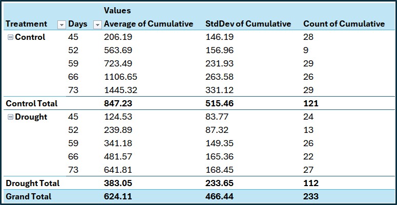
Next, I’ll calculate the average of the cumulative biomass grouped by Treatment and Days.
summary= dataA %>%
       group_by(Treatment, Days) %>%
       dplyr::summarize(
       across(
        .cols= Cumulative_Biomass,
        .fns= list(
         Mean= ~mean(., na.rm= TRUE),
         n= ~length(.),
         se= ~sd(., na.rm= TRUE) / sqrt(length(.)))),
        .groups= "drop") %>%
         as.data.frame()
print(summary[sample(nrow(summary),5),])
   Treatment Days Cumulative_Biomass_Mean Cumulative_Biomass_SD
5    Control   73               1445.3170              331.1185
3    Control   59                723.4944              231.9299
10   Drought   73                641.8063              168.4534
4    Control   66               1106.6503              263.5810
8    Drought   59                341.1837              149.3478
   Cumulative_Biomass_n Cumulative_Biomass_se
5                    29              61.48716
3                    29              43.06831
10                   27              32.41887
4                    26              51.69249
8                    26              29.28952
Let’s compare this result with the one calculated in Excel. The results are the same, which confirms that the code accurately calculates the cumulative values.

3. Create figure
if(!require(ggplot2)) install.packages("ggplot2")
library(ggplot2)

ggplot() +
  geom_jitter(data= dataA,
  aes(x= as.factor(Days), y= Cumulative_Biomass,
  fill= Treatment, shape=Treatment),
  width=0.2, alpha=0.5, size=2, color="grey75") +
  geom_errorbar(data= summary, aes(x=as.factor(Days),
  y= Cumulative_Biomass_Mean,
  ymin= Cumulative_Biomass_Mean - Cumulative_Biomass_se,
  ymax= Cumulative_Biomass_Mean + Cumulative_Biomass_se),
  width=0.2, linewidth=0.5, color="black") +
  geom_line(data= summary, aes(x=as.factor(Days),
  y=Cumulative_Biomass_Mean,
  color=Treatment, group=Treatment)) +
  geom_point(data= summary, aes(x=as.factor(Days),
  y=Cumulative_Biomass_Mean,
  fill=Treatment, shape=Treatment), size=2) +
  scale_color_manual(values= c("darkred","cadetblue"))+
  scale_fill_manual(values= c("darkred","cadetblue"))+
  scale_shape_manual(values= c(24,21))+
  scale_y_continuous(breaks = seq(0,3000,500), limits= c(0,3000)) +
  labs(x="Days from planting", y="Cumulative biomass (g/plant)") +
  theme_classic(base_size=18, base_family="serif")+
  theme(legend.position=c(0.85,0.88),
        legend.title=element_blank(),
        legend.key.size=unit(0.5,'cm'),
        legend.key=element_rect(color=alpha("white",.05),
        fill=alpha("white",.05)),
        legend.text=element_text(size=15),
        legend.background= element_rect(fill=alpha("white",.05)),
        panel.border= element_rect(color="black", fill=NA, linewidth=0.5),
        panel.grid.major= element_line(color="grey90", linetype="dashed"),
        axis.line=element_line(linewidth=0.5, colour="black"))

How about different grouping?
In the previous case, I calculated the average biomass of branches within each plant. Now, I’ll calculate the average biomass across plants to reduce data variability. This means the data will be grouped by Treatment and Block.
if(!require(dplyr)) install.packages("dplyr")
library(dplyr)

dataB= datacume(
              data= df,
              group_vars= c("Treatment", "Block"),
              time_var= Days,
              response_vars= c("Biomass"))
print(dataB[sample(nrow(dataB),5),])
  Treatment Block  Days Biomass Cumulative_Biomass
1 Control   IV       52    398.               553.
2 Drought   I        73    196.               930.
3 Drought   IV       52    138.               269.
4 Control   II       73    402.              1775.
5 Control   IV       66    469.              1533.
If I create a figure based on this grouped dataset, it will look like the example below.

Averaging more variables reduces data variability, and this is a key concept in statistics and data analysis. Averaging helps eliminate random fluctuations or “noise” in the data, making the underlying trend more visible. Especially in small samples, individual measurements may be erratic. Averaging smooths them out, giving a more reliable estimate. On the other hand, averaging hides the differences between data points. Important variations or outliers may be lost. Also, when different groups or conditions are averaged together, you can mask important subgroup trends.

The left figure shows the average number of branches and cumulative biomass over time (by days), while the right figure shows the average number of plants and cumulative biomass. When averaging by branches, the cumulative biomass was calculated for each plant within blocks for each treatment. When averaging by plants, the cumulative biomass was calculated for each block within each treatment. By grouping the data pattern is slighly different.
full code: https://github.com/agronomy4future/r_code/blob/main/Compute_Cumulative_Summaries_of_Grouped_Data.ipynb
We aim to develop open-source code for agronomy ([email protected])
© 2022 – 2025 https://agronomy4future.com – All Rights Reserved.
Last Updated: 07/Sep/2025