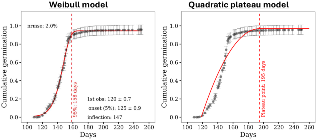
Codes to create two figures above; https://github.com/agronomy4future/r_code/blob/main/weibullfit.ipynb
In my previous posts, I introduced the linear and quadratic plateau models to identify the plateau point where the data stabilizes.
■ How to analyze linear plateau model in R Studio?
■ How to analyze quadratic plateau model in R Studio?
In this post, I’ll introduce the Weibull model and explain why it is often a better choice for cumulative data such as seed germination or biomass accumulation.
1) Why plateau models struggle with cumulative data?
Cumulative data has a characteristic shape: a slow start (lag phase), a rapid rise, and a leveling off (plateau). The quadratic plateau models is designed to find where the data stabilizes, but it was not built to capture the S-shaped (sigmoidal) rise that germination data usually shows.
The figure below makes the difference clear. The same dataset is fitted with a Weibull model (left) and a quadratic plateau model (right).
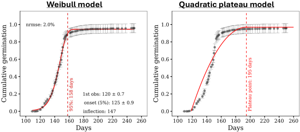
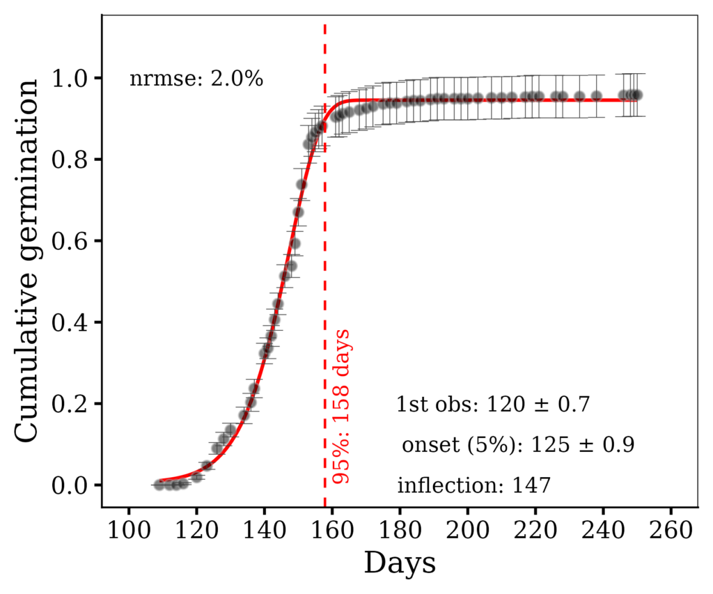
The Weibull model tracks the data points almost exactly through the steep rise and settles onto the plateau right where the observations do. Its normalized error (NRMSE) is only 2.0%.
The quadratic plateau model cannot follow the steep S-shaped rise. It runs below the data during the fast phase and only reaches its plateau at day 195 — long after the data actually stabilized (around day 158). The plateau point is badly overestimated.
This is not a quirk of one dataset. It happens because germination follows a lag → rapid rise → saturation pattern, and only a sigmoidal model can represent all three phases. The quadratic plateau, being a parabola joined to a flat line, has no lag phase and cannot bend sharply enough during the rise.
2) Why is the Weibull model more accurate?
Beyond a better visual fit, the Weibull model lets you extract biologically meaningful timing metrics directly from the fitted curve:
- onset (5%) — the day when 5% of total germination is reached
- inflection point — the day of maximum germination rate (the steepest point)
- 95% completion — the day when germination is effectively finished
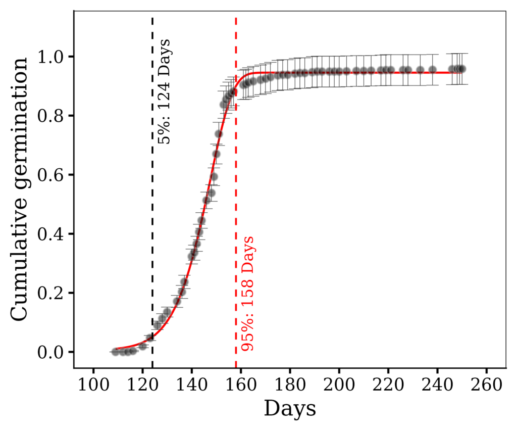
In the figure, these come out as onset = 125 days, inflection = 147 days, and 95% = 158 days. The quadratic plateau model, by contrast, gives you only a single plateau point — and as we saw, that point can be misleading.
The Weibull curve is also robust to isolated late observations. If a single seed germinates weeks after the main flush, a percentile calculated directly from the raw data can be dragged far to the right. The fitted curve, which follows the overall pattern, is far less affected — it reports the day germination effectively ended, not the day the last stray seed appeared.
3) How to fit the Weibull model in R
R’s SSweibull() uses the parameterization: y = Asym - Drop * exp(-exp(lrc) * x^pwr)
Asym — the upper asymptote (plateau); the final cumulative value
Drop — the change from the value at x = 0 up to Asym
lrc — the natural log of the rate constant
pwr — the power (shape) parameter that creates the lag phase
We can easily calculate those parameters using the below R code.
model_wb= nls (y ~ SSweibull(x, Asym, Drop, lrc, pwr), data= df)
summary (model_wb)
Let’s practice using an actual dataset.
if(!require(readr)) install.packages("readr")
library (readr)

github= paste0("https://raw.githubusercontent.com/agronomy4future/",
               "raw_data_practice/refs/heads/main/cumulative_germination.csv")
df=data.frame(read_csv(url(github), show_col_types= FALSE))

print(head(df, 5))
Treatment   Days   Rep   Cumulative_germination
Control        116     1         0.00
Control        120     1         0.03
Control        123     1         0.07
Control        126     1         0.15
Control        128     1         0.19
.
.
.
After uploading the data, I’ll average it out.
if(!require(dplyr)) install.packages("dplyr")
library(dplyr)

summary= df %>%
       group_by(Days) %>%
       dplyr::summarize(
       across(
        .cols= c(Cumulative_germination),
        .fns= list(
         Mean= ~mean(., na.rm= TRUE),
         n= ~length(.),
         se= ~sd(., na.rm= TRUE) / sqrt(length(.)))),
        .groups= "drop") %>%
        as.data.frame()
Let’s fit the Weibull model.
model_wb = nls(Cumulative_germination_Mean ~SSweibull(Days, Asym, Drop, lrc, pwr), data= summary)

print(model_wb)

Nonlinear regression model
  model: Cumulative_germination_Mean ~ SSweibull(Days, Asym, Drop, lrc,     pwr)
   data: summary
    Asym     Drop      lrc      pwr
  0.9454   0.9399 -84.8043  16.9708
 residual sum-of-squares: 0.02182

Number of iterations to convergence: 0
Achieved convergence tolerance: 1.855e-06
R calculates Asym, Drop, lrc and pwr.
Let’s go back to the basics! I’ll calculate the prediction values (which form the curve of the Weibull model) in Excel. Recall that the Weibull model is defined as y = Asym - Drop * exp(-exp(lrc) * x^pwr). Here are the prediction values and the figure, calculated using Excel.
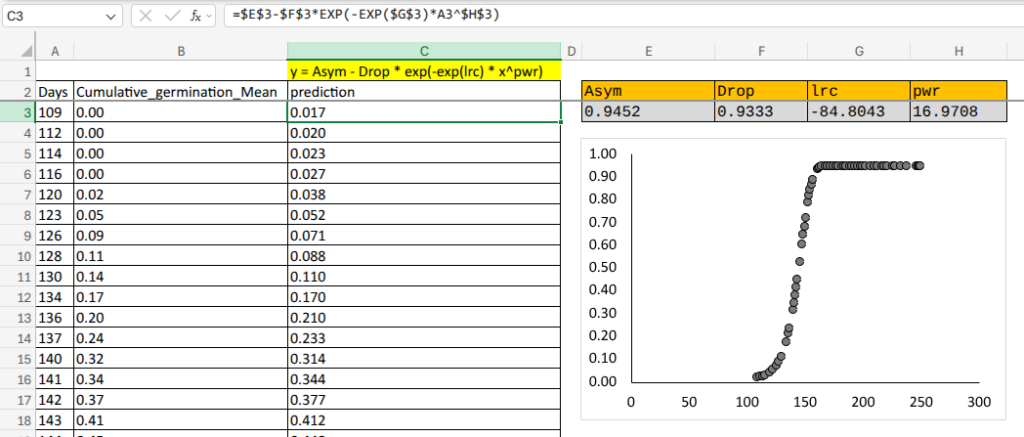
and I’ll calculate these prediction values using R.
# to create x-axis
x_range = range(summary$Days)
pred = data.frame (Days = seq(x_range[1], x_range[2], length.out = 200))

# to predict cumulative germination
pred$Cumulative_germination = predict(model_wb, newdata = pred)

print(head(pred, 5))
Days              Cumulative_germination
109.0000             0.01071099
109.7085             0.01131725
110.4171             0.01198892
111.1256             0.01273252
111.8342             0.01355512
.
.
.
Let’s create a figure.
if(!require(ggplot2)) install.packages("ggplot2")
library(ggplot2)

Fig1= ggplot(data= summary,
            aes(x= Days, y= Cumulative_germination_Mean)) +

  geom_line(data=pred, aes(x= Days, y= Cumulative_germination),
            color = "red", linewidth = 0.8) +  # This is Weibull model

  geom_point(size= 2.5, fill="black", color="grey65", alpha=0.5,
            shape=21, na.rm = TRUE) +

  geom_errorbar(aes(ymin=Cumulative_germination_Mean - Cumulative_germination_se,
                    ymax=Cumulative_germination_Mean + Cumulative_germination_se),
                    linewidth=0.2, width=5, color="grey25") +

  scale_x_continuous(breaks= seq(100,260,20), limits = c(100,260)) +
  scale_y_continuous(breaks= seq(0, 1, 0.2), limits = c(0, 1.1)) +

  labs(x= "Days", y= "Cumulative germination") +
  theme_classic(base_size= 18, base_family = "serif") +
  theme(legend.position= "none",
        legend.title= element_blank(),
        legend.key.size= unit(0.6, 'cm'),
        legend.key= element_rect(color= alpha("white", .05),
                                  fill= alpha("white", .05)),
        legend.text= element_text(size= 10),
        legend.background= element_rect(fill= alpha("white", .05)),
        panel.border= element_rect(color= "black", fill= NA,
             linewidth= 0.5),
        strip.background= element_rect(color= "white", linewidth= 0.5,
             linetype = "solid"),
        axis.line= element_line(linewidth = 0.5, colour = "black"))

options(repr.plot.width=6, repr.plot.height=5)
print(Fig1)

ggsave("Fig1.png", plot= Fig1, width=6, height= 5, dpi= 300)
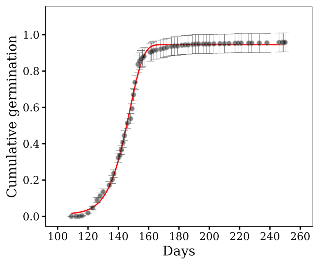
I’ll extract the timing metrics, and add those values to the graph.
# Extracting the timing metrics

cf  = coef(model_wb)
kk  = exp(cf["lrc"])
pwr = cf["pwr"]

# day at which a given fraction p of germination is reached
t_frac = function(p) as.numeric(((-log(1 - p)) / kk)^(1 / pwr))

# inflection point (day of maximum germination rate)
t_inflection = if (pwr > 1) {
  round(as.numeric(((pwr - 1) / (pwr * kk))^(1 / pwr)))
} else {
  NA_real_
}

# onset (5%) and 95% completion from the fitted curve
t_onset = round(t_frac(0.05))
t_end   = round(t_frac(0.95))

cat("t_onset:", t_onset, fill = TRUE)
cat("t_inflection:", t_inflection, fill = TRUE)
cat("t_end:", t_end, fill = TRUE)

t_onset: 124
t_inflection: 147
t_end: 158
if(!require(ggplot2)) install.packages("ggplot2")
library(ggplot2)

Fig2= ggplot(data= summary, aes(x= Days, y= Cumulative_germination_Mean)) +
  geom_line(data=pred, aes(x= Days, y= Cumulative_germination), color = "red", linewidth = 0.8) +
  geom_point(size= 2.5, fill="black", color="grey65", alpha=0.5, shape=21, na.rm = TRUE) +
  geom_errorbar(aes(ymin=Cumulative_germination_Mean - Cumulative_germination_se,
                    ymax=Cumulative_germination_Mean + Cumulative_germination_se),
                    linewidth=0.2, width=5, color="grey25") +

  geom_vline(xintercept= t_onset, linetype = "dashed",
             linewidth= 0.7, color= "black") +
  annotate("text", x= t_onset, y= 0.7, angle= 90, hjust= 0, vjust= 1.5,
           color= "black", size= 4.5, label= paste0("5%: ", t_onset, " Days")) +

  geom_vline(xintercept= t_end, linetype = "dashed",
             linewidth= 0.7, color= "red") +
  annotate("text", x= t_end, y= 0, angle= 90, hjust= 0, vjust= 1.5,
           color= "red", size= 4.5, label= paste0("95%: ", t_end, " Days")) +

  scale_x_continuous(breaks= seq(100,260,20), limits = c(100,260)) +
  scale_y_continuous(breaks= seq(0, 1, 0.2), limits = c(0, 1.1)) +
  labs(x= "Days", y= "Cumulative germination") +
  theme_classic(base_size= 18, base_family = "serif") +
  theme(legend.position= "none",
        legend.title= element_blank(),
        legend.key.size= unit(0.6, 'cm'),
        legend.key= element_rect(color= alpha("white", .05),
                                  fill= alpha("white", .05)),
        legend.text= element_text(size= 10),
        legend.background= element_rect(fill= alpha("white", .05)),
        panel.border= element_rect(color= "black", fill= NA, linewidth= 0.5),
        strip.background= element_rect(color= "white", linewidth= 0.5, linetype = "solid"),
        axis.line= element_line(linewidth = 0.5, colour = "black"))

options(repr.plot.width=6, repr.plot.height=5)
print(Fig2)

ggsave("Fig2.png", plot= Fig2, width=6, height= 5, dpi= 300)
Assessing the fit: use NRMSE, not R²
For cumulative data, R² is almost useless as a measure of fit. Because cumulative values rise from zero to a large maximum, the total sum of squares is enormous, and R² comes out near 0.99 even for a poor fit. It cannot distinguish a good model from a bad one. Instead, I suggest using the normalized root mean square error (NRMSE):
rmse  = sqrt(mean(residuals(model_wb)^2))
nrmse = round(rmse / (max(summary$Cumulative_germination_Mean) - min(summary$Cumulative_germination_Mean)),2)

cat("rmse:", rmse, fill = TRUE)
cat("nrmse:", nrmse, fill = TRUE)

rmse: 0.01891245
nrmse: 0.02
NRMSE is the average prediction error expressed as a percentage of the data range. A value of 2.0% means the fitted curve is, on average, within 2% of the observed cumulative germination — a genuinely good fit. Values below about 5% indicate the model tracks the data well.

R package – weibullfit
I introduced how to fit the Weibull model, and recently I developed a new R package to easily fit the model. I will introduce how the weibullfit() R package works.
First, let’s import the library.
if(!require(remotes)) install.packages("remotes")
if (!requireNamespace("weibullfit", quietly = TRUE)) {
    remotes::install_github("agronomy4future/weibullfit", force= TRUE)
}
library(remotes)
library(weibullfit)
Second, let’s go back to the previous Weibull model.
model_wb = nls(Cumulative_germination_Mean ~SSweibull(Days, Asym, Drop, lrc, pwr), data= summary)

print(model_wb)

Nonlinear regression model
  model: Cumulative_germination_Mean ~ SSweibull(Days, Asym, Drop, lrc,     pwr)
   data: summary
    Asym     Drop      lrc      pwr
  0.9454   0.9399 -84.8043  16.9708
 residual sum-of-squares: 0.02182

Number of iterations to convergence: 0
Achieved convergence tolerance: 1.855e-06
and this is how weibullfit() works.
model= weibullfit(Cumulative_germination ~ Days,
       data= df,  rep= "Rep")
This is much simpler, and the output is also very informative. Plus, you don’t need to manually average the data before fitting the model. By adding rep = "Rep", weibullfit() recognizes that the data includes replicates and automatically averages them.
print(model)

Weibull fit (SSweibull)
-----------------------
Model : Cumulative_germination ~ Days
N     : 61 points used for the curve  (replicate means)

Parameters:
    Asym     Drop      lrc      pwr
  0.9454   0.9399 -84.8043  16.9708

Event timing (from replicates):
  t_first      : 120 ± 0.7
  t_onset      : 125 ± 0.9
  n_rep        : 10

Event timing (from fitted curve):
  t_inflection : 147.4
  t_end        : 157.9

Curve-based quantiles:
   t5   t10   t25   t50   t75   t90   t95
124.2 129.6 137.5 144.8 150.9 155.4 157.9

Goodness of fit:
  RMSE  = 0.02
  NRMSE = 2.0%
  R2    = 0.9970
  AIC   = -301.0
  (fitted range: 0.0 to 1.0)
Additionally, weibullfit() provides timing metrics—such as the time to 1%, 5%, 95% germination, and the inflection point—along with the NRMSE. Another powerful feature is that weibullfit() makes it easy to plot the fitted curve by adding geom_weibull(model, color = "red", linewidth = 1). Furthermore, timing metrics with standard errors (when replicates are specified, e.g., rep = "Rep") can be easily added to the plot.
if(!require(ggplot2)) install.packages("ggplot2")
library(ggplot2)

Fig3= ggplot(data= summary,
       aes(x= Days, y= Cumulative_germination_Mean)) +
  geom_weibull(model, color="red", linewidth=1) +
  geom_point(size= 2.5, fill="black", color="grey65", alpha=0.5, shape=21, na.rm = TRUE) +

  geom_errorbar(aes(ymin=Cumulative_germination_Mean - Cumulative_germination_se,
                    ymax=Cumulative_germination_Mean + Cumulative_germination_se),
                    linewidth=0.2, width=5, color="grey25") +

# t_first
  annotate("text", x = 207.5, y = 0.2, size = 4.5,
           label = sprintf("1st obs: %.0f ± %.1f", model$t_first, model$t_first_se)) +

  # onset
  annotate("text", x = 215, y = 0.1, color = "black", size = 4.5,
           label = sprintf("onset (5%%): %.0f ± %.1f", model$t_onset, model$t_onset_se)) +

  # inflection
  annotate("text", x = 202, y = 0, size = 4.5, color = "black",
           label = sprintf("inflection: %.0f", model$t_inflection)) +

  # end
  geom_vline(xintercept = model$t_end, linetype = "dashed",
             linewidth = 0.7, color = "red") +
  annotate("text", x = model$t_end, y = 0, angle = 90, hjust = 0, vjust = 1.5,
           color = "red", size = 4.5,
           label = sprintf("95%%: %.0f days", model$t_end)) +

# nrmse
  annotate("text", x= 120, y= 1, size = 4.5,
           label= sprintf("nrmse: %.1f%%", model$nrmse * 100)) +

  scale_x_continuous(breaks= seq(100,260,20), limits = c(100,260)) +
  scale_y_continuous(breaks= seq(0, 1, 0.2), limits = c(0, 1.1)) +


  labs(x= "Days", y= "Cumulative germination") +
  theme_classic(base_size= 18, base_family = "serif") +
  theme(legend.position= "none",
        legend.title= element_blank(),
        legend.key.size= unit(0.6, 'cm'),
        legend.key= element_rect(color= alpha("white", .05),
                                  fill= alpha("white", .05)),
        legend.text= element_text(size= 10),
        legend.background= element_rect(fill= alpha("white", .05)),
        panel.border= element_rect(color= "black", fill= NA, linewidth= 0.5),
        strip.background= element_rect(color= "white", linewidth= 0.5, linetype = "solid"),
        axis.line= element_line(linewidth = 0.5, colour = "black"))

options(repr.plot.width=6, repr.plot.height=5)
print(Fig3)

ggsave("Fig3.png", plot= Fig3, width=6, height= 5, dpi= 300)
Is Weibull always better?
No, it would not be. If your data is S-shaped cumulative data (germination, emergence, growth), the Weibull model captures the lag, rise, and plateau together, and gives you onset, inflection, and completion times in one fit. Here it clearly outperforms the plateau models. On the other hand, if you only need the single point where a response stabilizes, and the rise is roughly linear rather than sigmoidal, a linear or quadratic plateau model may still be the simpler, more appropriate choice.
In summary, for cumulative germination data like the example here, the Weibull model is the better tool: it fits the steep rise the plateau models miss, it locates the plateau accurately, and it delivers a full set of timing metrics from a single equation.

We aim to develop open-source code for agronomy ([email protected])
© 2022 – 2025 https://agronomy4future.com – All Rights Reserved.
Last Updated: 07/27/2026