I have one dataset as below.
if(!require(readr)) install.packages("readr")
library(readr)

github= paste0("https://raw.githubusercontent.com/agronomy4future/",
                "raw_data_practice/refs/heads/main/",
                "genotype_transgenic_line_with_fertilizer.csv")
dataA= data.frame(read_csv(url(github),show_col_types = FALSE))
print(head(dataA,5))
  genotype plot resistance fertilizer   GN   AGW
1      cv1    1         no        150 1310 33.15
2      cv1    1         no          0 1168 25.07
3      cv1    1         no        200  570 36.04
4      cv2    1         no        150 1120 53.05
5      cv2    1         no          0 1230 26.71
.
.
.
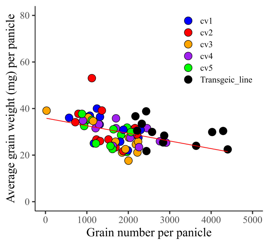
Now, I’ll create a regression graph between grain number (GN) and average grain weight (AGW).
if(!require(ggplot2)) install.packages("ggplot2")
library(ggplot2)

ggplot(data=dataA, aes(x=GN, y=AGW))+
  geom_point(aes(fill=genotype, shape=genotype),
  color= "black", size= 5) +
  geom_smooth(method='lm', linetype=1, se=FALSE, color="red",
  formula=y~x, linewidth=0.5) +
  scale_fill_manual(values=c("blue","red","orange","purple",
  "green","black"))+
  scale_shape_manual(values=rep(c(21),6))+
  scale_x_continuous(breaks=seq(0,5000,1000), limits = c(0,5000)) +
  scale_y_continuous(breaks=seq(0,80,20), limits = c(0,80)) +
  labs(x="Grain number per panicle",
  y="Average grain weight (mg) per panicle") +
  theme_classic(base_size=18, base_family="serif")+
  theme(legend.position=c(0.8,0.8),
        legend.title=element_blank(),
        legend.key=element_rect(color="white", fill="white"),
        legend.text=element_text(family="serif", face="plain",
        size=13, color= "Black"),
        legend.background=element_rect(fill="white"),
        axis.line=element_line(linewidth=0.5, colour="black"),
        strip.background=element_rect(color="white",
        linewidth=0.5,linetype="solid"))
I distinguished genotypes with different colors, and now I want to differentiate resistance (yes and no) using distinct shapes. Therefore, I’ll be changing the shape representation from genotype to resistance.
if(!require(ggplot2)) install.packages("ggplot2")
library(ggplot2)

ggplot(data=dataA, aes(x=GN, y=AGW))+
 geom_point(aes(fill=genotype, shape=resistance),
 color= "black", size= 5) +
 geom_smooth(method='lm', linetype=1, se=FALSE, color="red",
 formula=y~x, size=0.5) +
 scale_fill_manual(values=c("blue","red","orange","purple",
 "green","black"))+
  scale_shape_manual(values=c(21,22)) +
  scale_x_continuous(breaks=seq(0,5000,1000), limits = c(0,5000)) +
  scale_y_continuous(breaks=seq(0,80,20), limits = c(0,80)) +
  labs(x="Grain number per panicle",
  y="Average grain weight (mg) per panicle") +
  theme_classic(base_size=18, base_family="serif")+
  theme(legend.position=c(0.8,0.8),
        legend.title=element_blank(),
        legend.key=element_rect(color="white", fill="white"),
        legend.text=element_text(family="serif", face="plain",
        size=13, color= "Black"),
        legend.background=element_rect(fill="white"),
        axis.line=element_line(linewidth=0.5, colour="black"),
        strip.background=element_rect(color="white",
        linewidth=0.5,linetype="solid"))
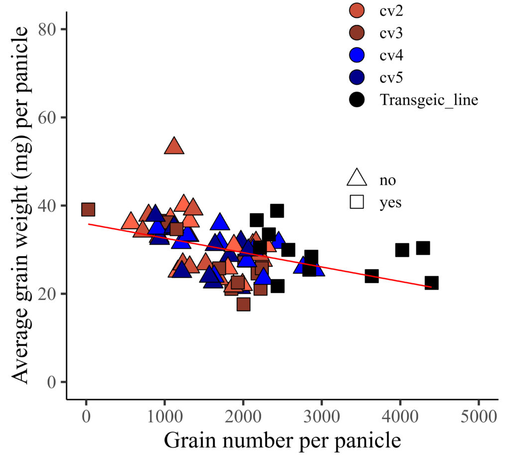
However, the color is not currently applied to the legend. I aim to apply the provided color to the legend, and additionally, assign colors to represent different levels of resistance.

Here is the solution!!
if(!require(ggplot2)) install.packages("ggplot2")
library(ggplot2)

ggplot(data=dataA, aes(x=GN, y=AGW))+
  geom_point(aes(fill=genotype, shape=resistance),
  color= "black", size= 5) +
  geom_smooth(method='lm', linetype=1, se=FALSE, color="red",
  formula=y~x, size=0.5) +
  scale_fill_manual(values=c("tomato1","tomato3","tomato4","blue",
  "darkblue","black"),  guide=guide_legend(override.aes=list(shape=21))) +
  scale_shape_manual(values=c(24,22),
  guide=guide_legend(override.aes=list(colour="black"))) +
  scale_x_continuous(breaks=seq(0,5000,1000), limits = c(0,5000)) +
  scale_y_continuous(breaks=seq(0,80,20), limits = c(0,80)) +
  labs(x="Grain number per panicle",
  y="Average grain weight (mg) per panicle") +
  theme_classic(base_size=18, base_family="serif")+
  theme(legend.position=c(0.8,0.8),
        legend.title=element_blank(),
        legend.key=element_rect(color="white", fill="white"),
        legend.text=element_text(family="serif", face="plain",
        size=13, color= "Black"),
        legend.background=element_rect(fill="white"),
        axis.line=element_line(linewidth=0.5, colour="black"),
        strip.background=element_rect(color="white",
        linewidth=0.5,linetype="solid"))
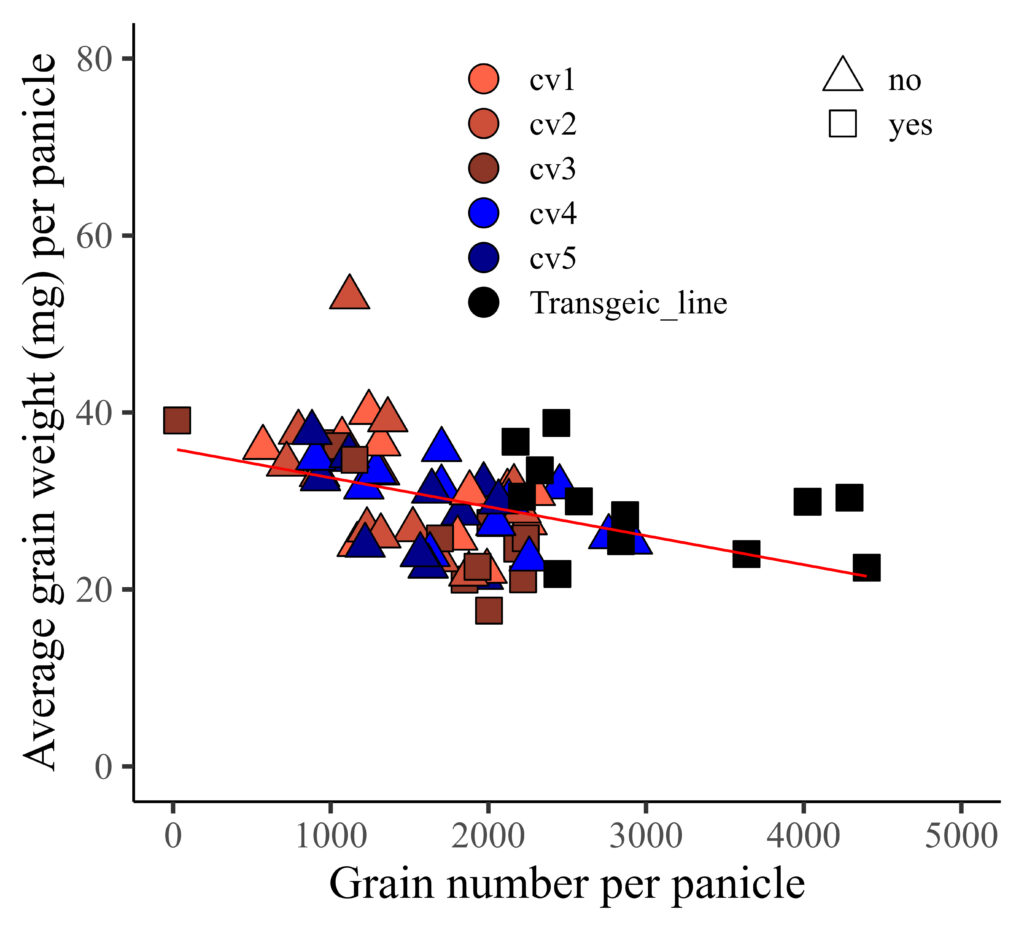
If you want to display two legend horizontally, you can add legend.box="horizontal"
if(!require(ggplot2)) install.packages("ggplot2")
library(ggplot2)

ggplot(data=dataA, aes(x=GN, y=AGW))+
  geom_point(aes(fill=genotype, shape=resistance),
  color= "black", size= 5) +
  geom_smooth(method='lm', linetype=1, se=FALSE, color="red",
  formula=y~x, size=0.5) +
  scale_fill_manual(values=c("tomato1","tomato3","tomato4", "blue",
  "darkblue","black"), guide=guide_legend(override.aes=list(shape=21))) +
  scale_shape_manual(values=c(24,22),
  guide=guide_legend(override.aes=list(colour="black"))) +
  scale_x_continuous(breaks=seq(0,5000,1000), limits = c(0,5000)) +
  scale_y_continuous(breaks=seq(0,80,20), limits = c(0,80)) +
  labs(x="Grain number per panicle",
  y="Average grain weight (mg) per panicle") +
  theme_classic(base_size=18, base_family="serif")+
  theme(legend.position=c(0.65,0.8),
        legend.box= "horizontal",
        legend.title=element_blank(),
        legend.key=element_rect(color="white", fill="white"),
        legend.text=element_text(family="serif", face="plain",
        size=13, color= "Black"),
        legend.background=element_rect(fill="white"),
        axis.line=element_line(linewidth=0.5, colour="black"),
        strip.background=element_rect(color="white",
        linewidth=0.5, linetype="solid"))
■ Full code; https://github.com/agronomy4future/raw_data_practice/blob/main/different_color_shape_legend
© 2022 – 2023 https://agronomy4future.com