
■ Quantifying Phenotypic Plasticity of Crops
In my previous posts, I explained how to quantify phenotypic plasticity of crops in response to environmental factors, and introduced the concept of responsiveness, calculated using the formula: (Treatment - Control) / Control, as shown in the table below.
| Genotype | Control | Treatment | Responsiveness |
| A | 100 | 90 | -10.0% = (90-100)/100 |
| B | 120 | 70 | -41.7% |
| C | 115 | 90 | -21.7% |
| D | 95 | 85 | -10.5% |
| E | 110 | 105 | -4.5% |
While calculating responsiveness for a single variable is relatively straightforward, it becomes more complex when grouping is involved—for example, calculating nitrogen responsiveness across different genotypes under various fungicide treatments. Performing such analyses by manually sorting and calculating in Excel can be time-consuming and error-prone.
To address this, I recently developed an R package called deltactrl. This package enables users to calculate responsiveness efficiently and consistently across multiple variables and grouping structures.
Here is one dataset.
if(!require(readr)) install.packages("readr")
library(readr)

github="https://raw.githubusercontent.com/agronomy4future/raw_data_practice/main/fertilizer_treatment.csv"
df= data.frame(read_csv(url(github),show_col_types = FALSE))

head(df,5)
    Genotype Block variable value
1 Genotype_A     I  Control  42.9
2 Genotype_A    II  Control  41.6
3 Genotype_A   III  Control  28.9
4 Genotype_A    IV  Control  30.8
5 Genotype_B     I  Control  53.3
.
.
.

tail(df,5)
     Genotype Block    variable value
60 Genotype_C    IV Fertilizer3  51.8
61 Genotype_D     I Fertilizer3  71.6
62 Genotype_D    II Fertilizer3  69.4
63 Genotype_D   III Fertilizer3  56.6
64 Genotype_D    IV Fertilizer3  47.4
This data has two treatments (Genotype and Fertilizer) with 4 replicates.
xtabs(~variable + Genotype, data=df)

             Genotype
variable      Genotype_A Genotype_B Genotype_C Genotype_D
  Control              4          4          4          4
  Fertilizer1          4          4          4          4
  Fertilizer2          4          4          4          4
  Fertilizer3          4          4          4          4
This graph represents the dataset.
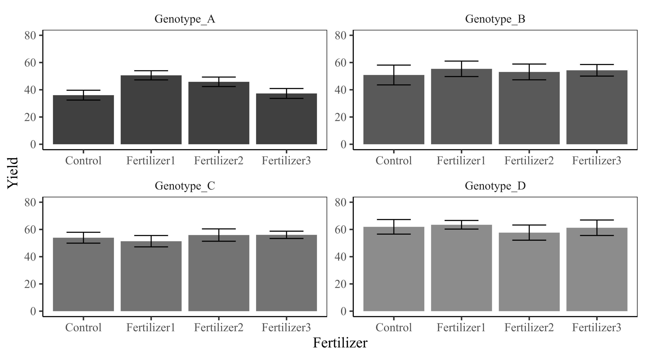
If we calculate responsiveness, we can omit the Control from the graph. The responsiveness metric will indicate how yields at different fertilizer levels deviate from the Control.

■ deltactrl package
First, let’s load the necessary library.
if(!require(remotes)) install.packages("remotes")
if (!requireNamespace("deltactrl", quietly = TRUE)) {
remotes::install_github("agronomy4future/deltactrl", force= TRUE)
}
library(remotes)
library(deltactrl)
After loading the library, you can type ?deltactrl to view the details about the function.
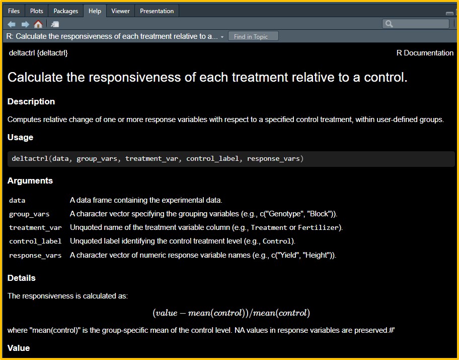
I will calculate responsiveness by grouping the data by genotype, using the ‘Control’ level in the ‘variable’ column as the baseline. The basic code structure will be as follows:
df2= deltactrl(
  data= df,
  group_vars= c("Genotype"),
  treatment_var= variable,
  control_label= Control,
  response_vars= c("value")
)

print(df2, n = Inf)
   Genotype   Block variable    value responsive_value
<mark style="background-color:rgba(0, 0, 0, 0)" class="has-inline-color has-vivid-red-color"> 1 Genotype_A I     Control      42.9          NA
 2 Genotype_A II    Control      41.6          NA
 3 Genotype_A III   Control      28.9          NA
 4 Genotype_A IV    Control      30.8          NA
 5 Genotype_B I     Control      53.3          NA
 6 Genotype_B II    Control      69.6          NA
 7 Genotype_B III   Control      45.4          NA
 8 Genotype_B IV    Control      35.1          NA
 9 Genotype_C I     Control      62.3          NA
10 Genotype_C II    Control      58.5          NA
11 Genotype_C III   Control      44.6          NA
12 Genotype_C IV    Control      50.3          NA
13 Genotype_D I     Control      75.4          NA
14 Genotype_D II    Control      65.6          NA
15 Genotype_D III   Control      54            NA
16 Genotype_D IV    Control      52.7          NA </mark>
17 Genotype_A I     Fertilizer1  53.8           0.492
18 Genotype_A II    Fertilizer1  58.5           0.623
19 Genotype_A III   Fertilizer1  43.9           0.218
20 Genotype_A IV    Fertilizer1  46.3           0.284
21 Genotype_B I     Fertilizer1  57.6           0.133
22 Genotype_B II    Fertilizer1  69.6           0.369
23 Genotype_B III   Fertilizer1  42.4          -0.166
24 Genotype_B IV    Fertilizer1  51.9           0.0206
25 Genotype_C I     Fertilizer1  63.4           0.176
26 Genotype_C II    Fertilizer1  50.4          -0.0654
27 Genotype_C III   Fertilizer1  45            -0.166
28 Genotype_C IV    Fertilizer1  46.7          -0.134
29 Genotype_D I     Fertilizer1  70.3           0.135
30 Genotype_D II    Fertilizer1  67.3           0.0868
31 Genotype_D III   Fertilizer1  57.6          -0.0698
32 Genotype_D IV    Fertilizer1  58.5          -0.0553
33 Genotype_A I     Fertilizer2  49.5           0.373
34 Genotype_A II    Fertilizer2  53.8           0.492
35 Genotype_A III   Fertilizer2  40.7           0.129
36 Genotype_A IV    Fertilizer2  39.4           0.0929
37 Genotype_B I     Fertilizer2  59.8           0.176
38 Genotype_B II    Fertilizer2  65.8           0.294
39 Genotype_B III   Fertilizer2  41.4          -0.186
40 Genotype_B IV    Fertilizer2  45.4          -0.107
41 Genotype_C I     Fertilizer2  64.5           0.196
42 Genotype_C II    Fertilizer2  46.1          -0.145
43 Genotype_C III   Fertilizer2  62.6           0.161
44 Genotype_C IV    Fertilizer2  50.3          -0.0672
45 Genotype_D I     Fertilizer2  68.8           0.111
46 Genotype_D II    Fertilizer2  65.3           0.0545
47 Genotype_D III   Fertilizer2  45.6          -0.264
48 Genotype_D IV    Fertilizer2  51            -0.176
49 Genotype_A I     Fertilizer3  44.4           0.232
50 Genotype_A II    Fertilizer3  41.8           0.160
51 Genotype_A III   Fertilizer3  28.3          -0.215
52 Genotype_A IV    Fertilizer3  34.7          -0.0374
53 Genotype_B I     Fertilizer3  64.1           0.261
54 Genotype_B II    Fertilizer3  57.4           0.129
55 Genotype_B III   Fertilizer3  44.1          -0.133
56 Genotype_B IV    Fertilizer3  51.6           0.0147
57 Genotype_C I     Fertilizer3  63.6           0.179
58 Genotype_C II    Fertilizer3  56.1           0.0403
59 Genotype_C III   Fertilizer3  52.7          -0.0227
60 Genotype_C IV    Fertilizer3  51.8          -0.0394
61 Genotype_D I     Fertilizer3  71.6           0.156
62 Genotype_D II    Fertilizer3  69.4           0.121
63 Genotype_D III   Fertilizer3  56.6          -0.0860
64 Genotype_D IV    Fertilizer3  47.4          -0.235
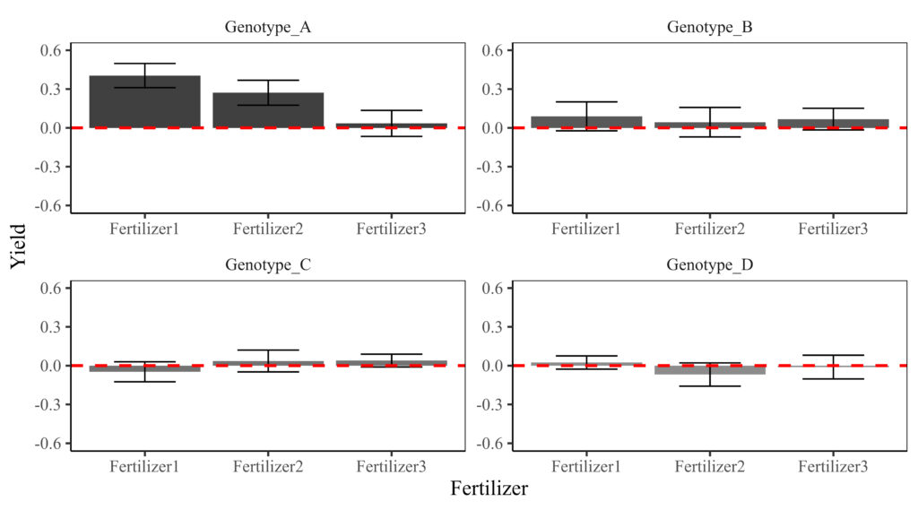
The responsiveness relative to the Control was calculated for each genotype. Now, let’s create a figure to visualize the results. First, the data needs to be summarized to generate a bar graph.
df3= data.frame(subset (df2, variable!="Control") %>%
                    group_by(Genotype, variable) %>%
                    dplyr::summarize(across(c(responsive_value),
                                            .fns= list(Mean=~mean(., na.rm= TRUE),
                                                       SD= ~sd(., na.rm= TRUE),
                                                       n=~length(.),
                                                       se=~sd(.,na.rm= TRUE) / sqrt(length(.))))))

print(df3)
     Genotype    variable responsive_value_Mean responsive_value_SD responsive_value_n responsive_value_se
1  Genotype_A Fertilizer1            0.40429958          0.18678735                  4          0.09339368
2  Genotype_A Fertilizer2            0.27184466          0.19261643                  4          0.09630821
3  Genotype_A Fertilizer3            0.03467406          0.20157613                  4          0.10078807
4  Genotype_B Fertilizer1            0.08898722          0.22356907                  4          0.11178453
5  Genotype_B Fertilizer2            0.04424779          0.22774865                  4          0.11387433
6  Genotype_B Fertilizer3            0.06784661          0.16724697                  4          0.08362349
7  Genotype_C Fertilizer1           -0.04728790          0.15442957                  4          0.07721479
8  Genotype_C Fertilizer2            0.03616134          0.16801000                  4          0.08400500
9  Genotype_C Fertilizer3            0.03940658          0.09945565                  4          0.04972782
10 Genotype_D Fertilizer1            0.02422285          0.10233126                  4          0.05116563
11 Genotype_D Fertilizer2           -0.06863141          0.17988747                  4          0.08994374
12 Genotype_D Fertilizer3           -0.01090028          0.18341009                  4          0.09170505
Second, I will generate the figure.
if(!require(ggplot2)) install.packages("ggplot2")
library(ggplot2)

Fig2=ggplot(data=df3, aes(x=variable, y=responsive_value_Mean, fill=Genotype)) +
  geom_bar(stat="identity",position="dodge", width=0.9, size=1) +
  geom_errorbar(aes(ymin=responsive_value_Mean-responsive_value_se, ymax=responsive_value_Mean+responsive_value_se),
                position=position_dodge(0.5), width=0.5) +
  scale_fill_manual(values=c("grey25","grey35","grey45","grey55"))+
  scale_y_continuous(breaks = seq(-0.6, 0.6, 0.3), limits = c(-0.6, 0.6)) +
  geom_hline(yintercept=0, linetype="dashed", color="red", size=1) +
  facet_wrap(~ Genotype, scales="free") +
  labs(x="Fertilizer", y="Yield") +
  theme_classic(base_size= 15, base_family = "serif") +
  theme(legend.position="none",
        legend.title=element_blank(),
        legend.key=element_rect(color="white", fill=alpha(0.5)),
        legend.text=element_text(family="serif", face="plain",
                                 size=13, color="black"),
        legend.background= element_rect(fill=alpha(0.5)),
        panel.border= element_rect(color="black", fill=NA, linewidth=0.5),
        axis.line= element_line(linewidth= 0.5, colour= "black"),
        strip.background=element_rect(color="white",
                                      linewidth=0.5, linetype="solid"))
Fig2+windows(width=9, height= 5)

ggsave("C:/Users/agron/Fig2.jpg",
       Fig2, width=9*2.54, height=5*2.54, units="cm", dpi=1000)
However, one of my alumni friends in the Netherlands pointed out that the bar plot is meant for nominal data or counts, and that in this case, a boxplot would be better. So, I’ll create a boxplot.
Fig3=ggplot(data=subset(df1, variable!="Control"), aes(x=variable, y=responsive_value, fill=Genotype)) +
  geom_boxplot() +
  scale_fill_manual(values=c("grey25","grey35","grey45","grey55"))+
  scale_y_continuous(breaks = seq(-1, 1, 0.5), limits = c(-1, 1)) +
  geom_hline(yintercept=0, linetype="dashed", color="red", size=1) +
  facet_wrap(~ Genotype, scales="free") +
  labs(x="Fertilizer", y="Yield") +
  theme_classic(base_size= 15, base_family = "serif") +
  theme(legend.position="none",
        legend.title=element_blank(),
        legend.key=element_rect(color="white", fill=alpha(0.5)),
        legend.text=element_text(family="serif", face="plain",
                                 size=13, color="black"),
        legend.background= element_rect(fill=alpha(0.5)),
        panel.border= element_rect(color="black", fill=NA, linewidth=0.5),
        axis.line= element_line(linewidth= 0.5, colour= "black"),
        strip.background=element_rect(color="white",
                                      linewidth=0.5, linetype="solid"))
Fig3+windows(width=9, height= 5)

ggsave("C:/Users/agron/Fig3.jpg",
       Fig3, width=9*2.54, height=5*2.54, units="cm", dpi=1000)

This graph illustrates how yield at different fertilizer levels responds relative to the control. Compared with the previous graph, it clearly highlights the yield differences from the control for each genotype. Genotype A appears to show greater responsiveness at Fertilizer 1 and 2, suggesting that Fertilizers 1 and 2 are beneficial for improving yield in Genotype A. In contrast, the fertilizer effect is minimal in Genotypes B, C, and D.
[Tip] descriptivestat() package
If it’s better to use just the mean and error bars to present responsiveness, I recommend using the descriptivestat() package.
<strong># upload required package</strong>
if(!require(remotes)) install.packages("remotes")
if (!requireNamespace("descriptivestat", quietly = TRUE)) {
  remotes::install_github("agronomy4future/descriptivestat", force= TRUE)
}
library(remotes)
library(descriptivestat)

<strong># to calculate descriptive statistics</strong>
df2= descriptivestat(data= df1, group_vars= c("Genotype"),
                     value_vars= c("responsive_value"),
                     output_stats= c("se"))
Fig4= ggplot() +
  geom_jitter(data= subset(df2, category=="observed"),
              aes(x= variable, y= responsive_value), width=0.2, alpha=0.7,
              size=2, color="gray75") +

  geom_errorbar(data= subset(df2, category=="mean"),
                aes(x= variable, ymin= responsive_value-sd.responsive_value,
                    ymax=responsive_value+sd.responsive_value),
                width= 0.1, color= "black") +

  geom_point(data= subset(df2, category=="mean"),
             aes(x= variable, y= responsive_value, fill= Genotype, shape=Genotype),
             size=4, color="black") +

  scale_fill_manual(name="Genotype",
                   values= c("orange", "red", "blue","purple")) +
  scale_shape_manual(name="Genotype",
                     values = c(21,21,21,21)) +
  scale_y_continuous(breaks=seq(-1,1,0.5), limits = c(-1,1)) +
  facet_wrap(~ Genotype, scales = "free") +
  labs(x= NULL, y="Responsiveness") +
  theme_classic(base_size=18, base_family="serif") +
  theme(
    legend.position="none",
    legend.key=element_rect(color="white", fill="white"),
    legend.text=element_text(family="serif", face="plain",
                             size=15, color= "black"),
    legend.background=element_rect(fill=alpha("white", 0.5)),
    strip.background= element_rect(color="white", linewidth=0.5, linetype="solid"),
    panel.border= element_rect(color="black", fill=NA, linewidth=0.5),
    panel.grid.major= element_line(color="grey90", linetype="dashed"),
    axis.line= element_blank()
  )

Fig4+windows(width=9, height= 5)

ggsave("C:/Users/agron/Fig4.jpg",
       Fig4, width=9*2.54, height=5*2.54, units="cm", dpi=1000)

We aim to develop open-source code for agronomy ([email protected])
© 2022 – 2025 https://agronomy4future.com – All Rights Reserved.
Last Updated: 09/06/2025