■ [R package] Embedding Key Descriptive Statistics within Original Data (Feat. descriptivestat)
■ [R package] Calculate the responsiveness of each treatment relative to a control (Feat. deltactrl)
In my previous posts, I introduced two R packages. The first package, descriptivestat(), displays raw data along with mean values and additional descriptive statistics. The second package, deltactrl(), calculates the responsiveness of dependent variables in response to the control. Today, in this article, I will demonstrate how combining these two R packages allows us to easily create different types of figures to better understand the dataset.
First, I will upload a dataset.”
if (!require("rio")) install.packages("rio")
library(rio)

df=import("https://github.com/agronomy4future/raw_data_practice/raw/main/wheat_grain_size_big_data.RData")

df1= subset(subset(df, fungicide!="N/A" & Genotype=="Peele"),
          select = c(-fertilizer, -Shoot, -Length.mm., -Width.mm.))
print(tail(df1,5))
      Field Genotype Block fungicide planting_date Area.mm2.
96315 South    Peele   III        No         early    13.687
96316 South    Peele   III        No         early    11.058
96317 South    Peele   III        No         early     9.154
96318 South    Peele    II        No          late    18.092
96319 South    Peele    II        No          late    18.092
This dataset contains 96,319 rows, making it difficult to perform certain calculations in Excel. In this case, R programming is an efficient tool for conducting data analysis. I will create a bar graph based on this dataset to analyze how the grain area differs at different planting dates, depending on whether fungicide is applied.
First, I will rename the variables and reorder them accordingly.
if (!require("dplyr")) install.packages("dplyr")
library(dplyr)

dataA= df1 %>%
              mutate (planting_date= case_when(
                      planting_date== "early"  ~ "Early",
                      planting_date== "normal"  ~ "Normal",
                      planting_date== "late"  ~ "Late",
                      TRUE ~ as.character(planting_date)
  ))

dataA$planting_date=factor(dataA$planting_date, levels=c("Early","Normal","Late"))
print(head(dataA,5))
      Field Genotype Block fungicide planting_date Area.mm2.
54438 South    Peele    II       Yes        Normal    20.531
54439 South    Peele    II       Yes        Normal    19.336
54440 South    Peele    II       Yes        Normal    19.770
54441 South    Peele    II       Yes        Normal    14.413
54442 South    Peele    II       Yes        Normal    14.590
and I will summarize the dataset to create a bar graph.
if (!require("dplyr")) install.packages("dplyr")
library(dplyr)

dataB= dataA %>%
       group_by(fungicide, planting_date) %>%
       dplyr::summarize(
       across(
        .cols= Area.mm2.,
        .fns= list(
         Mean= ~mean(., na.rm= TRUE),
         n= ~length(.),
         se= ~sd(., na.rm= TRUE) / sqrt(length(.)))),
        .groups= "drop") %>%
        as.data.frame()
print(dataB)
  fungicide planting_date Area.mm2._Mean Area.mm2._n Area.mm2._se
1        No         Early       13.97312        2054   0.05470698
2        No        Normal       15.78524        2217   0.06558086
3        No          Late       17.65699        1628   0.06909563
4       Yes         Early       14.23392        2243   0.05425093
5       Yes        Normal       16.87129        2434   0.05291166
6       Yes          Late       17.59145        1636   0.06789364
Okay! Let’s create a bar graph.
if(!require("ggplot2")) install.packages("ggplot2")
library(ggplot2)

Fig1=ggplot(data=dataB, aes(x=planting_date, y=Area.mm2._Mean,
  fill=fungicide)) +
  geom_bar(stat="identity", position="dodge", width=0.9) +
  geom_errorbar(aes(ymin=Area.mm2._Mean-Area.mm2._se,
  ymax=Area.mm2._Mean+Area.mm2._se),
  position=position_dodge(0.9), width=0.5) +
  scale_fill_manual(name="Fungicide", values= c("grey35", "grey75")) +
  geom_text(aes(family="serif", x=0.8, y=18, label="e"),
  size=5, color="black") +
  geom_text(aes(family="serif", x=1.2, y=19, label="d"),
  size=5, color="black") +
  geom_text(aes(family="serif", x=1.8, y=20, label="c"),
  size=5, color="black") +
  geom_text(aes(family="serif", x=2.2, y=21, label="b"),
  size=5, color="black") +
  geom_text(aes(family="serif", x=2.8, y=23, label="a"),
  size=5, color="black") +
  geom_text(aes(family="serif", x=3.2, y=23, label="a"),
  size=5, color="black") +
  geom_text(aes(family="serif", x=2, y=25, label="***"),
  size=6, color="red") +
  scale_y_continuous(breaks = seq(0, 30, 5), limits = c(0, 30)) +
  labs(x="", y="Yield") +
  theme_classic(base_size= 15, base_family = "serif") +
  theme(legend.position=c(0.15,0.87),
        legend.title= element_text(family="serif", size=14,
        color="black"),
        legend.key=element_rect(color="white", fill=alpha(0.5)),
        legend.text=element_text(family="serif", face="plain",
        size=13, color="black"),
        legend.background= element_rect(fill=alpha(0.5)),
        panel.border= element_rect(color="black",
        fill=NA, linewidth=0.5),
        axis.line= element_line(linewidth= 0.5, colour= "black"),
        strip.background=element_rect(color="white",
        linewidth=0.5, linetype="solid"))

options(repr.plot.width=5.5, repr.plot.height=5)
print(Fig1)

ggsave("Fig1.png", plot= Fig1, width=5.5, height= 5, dpi= 300)
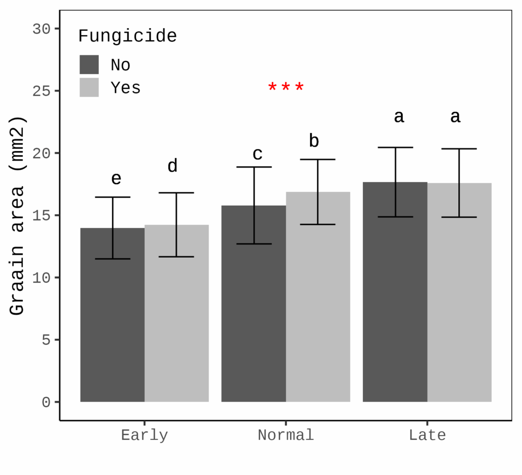
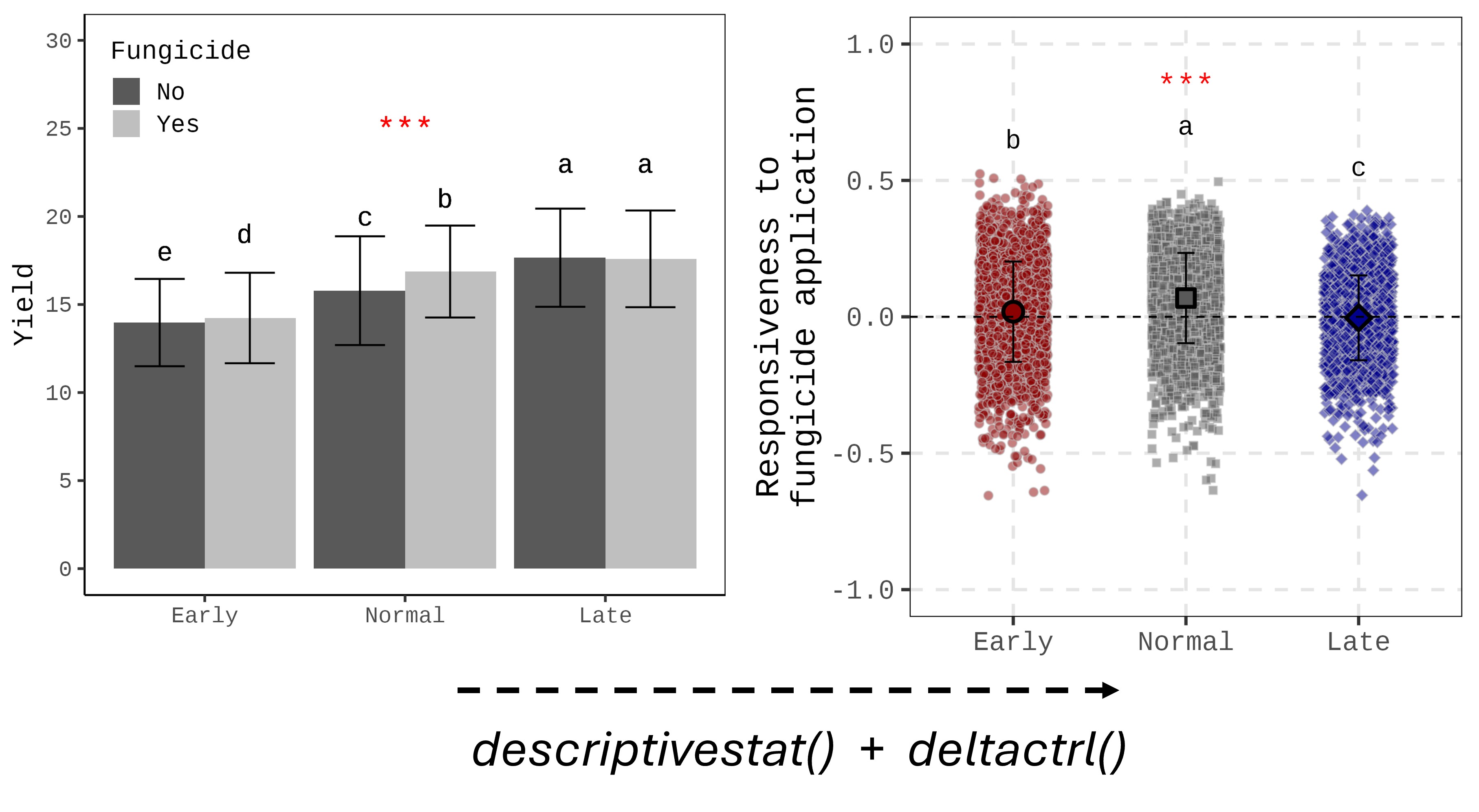
This figure shows how grain area differs at various planting dates, with or without fungicide application. At later planting dates, grain area tends to be greater (the error bar represents the standard deviation).
While this figure is useful, if our primary interest is not the grain area differences but rather the effect of fungicide, it would be better to focus on the responsiveness of grain area to fungicide, rather than displaying the grain area itself.
Additionally, to provide a more comprehensive view of the dataset, using raw data points instead of mean values would better capture the variation in the data.
The two R packages, descriptivestat() and deltactrl(), make it easy to conduct such data analysis.

First, let’s load the necessary libraries.
if(!require(remotes)) install.packages("remotes")
library(remotes)

# deltactrl
if (!requireNamespace("deltactrl", quietly = TRUE)) {
remotes::install_github("agronomy4future/deltactrl", force= TRUE)
}
library(deltactrl)

# descriptivestat
if (!requireNamespace("descriptivestat", quietly = TRUE)) {
  remotes::install_github("agronomy4future/descriptivestat", force= TRUE)
}
library(descriptivestat)
I will calculate the responsiveness of grain area in response to fungicide application. The ‘fungicide’ column contains two levels: ‘Yes’ (fungicide application) and ‘No’ (no fungicide). I will use ‘No’ as the control (baseline), and the responsiveness will be calculated as (Treatment - Control) / Control, which translates to (Yes - No) / No.
dataC= deltactrl(
  data= dataA,
  group_vars= c("planting_date"),
  treatment_var= fungicide,
  control_label= No,
  response_vars= c("Area.mm2.")
)
print(tail(dataC,5))
  Field Genotype Block fungicide planting_date Area.mm2. responsive_Area.mm2.
1 South Peele    III   No        Early             13.7                    NA
2 South Peele    III   No        Early             11.1                    NA
3 South Peele    III   No        Early              9.15                   NA
4 South Peele    II    No        Late              18.1                    NA
5 South Peele    II    No        Late              18.1                    NA
In this code, you can designate the control by setting control_label= No. You can also calculate responsiveness by grouping the data with group_vars = c('planting_date'). With these conditions, I’ll calculate the responsiveness of the grain area (Area.mm2).
Responsiveness will be calculated by adding a new column: responsive_Area.mm2. This column indicates how the grain area changes when fungicide is applied. Next, I’ll add descriptive statistics to dataC.
dataD= descriptivestat(data= dataC, group_vars= c("planting_date","fungicide"),
                     value_vars= c("responsive_Area.mm2."),
                     output_stats= c("sd"))
I added the standard deviation; output_stats = c('sd'), calculated by grouping the data by planting date and fungicide application. Since ‘no fungicide’ is regarded as the baseline, it is not necessary to include it in the final output. Therefore, I will delete it.
dataE= subset(dataD, fungicide!="No")
Let’s create the figure.
if(!require(ggplot2)) install.packages("ggplot2")
library(ggplot2)

Fig2= ggplot() +
  geom_jitter(data= subset(dataE, category=="observed"),
  aes(x= planting_date, y= responsive_Area.mm2.,
  fill= planting_date, shape=planting_date),
  width=0.2, alpha=0.5, size=2, color="grey75") +

  geom_errorbar(data= subset(dataE, category=="mean"),
  aes(x= planting_date,
  ymin= responsive_Area.mm2.-sd.responsive_Area.mm2.,
  ymax=responsive_Area.mm2.+sd.responsive_Area.mm2.),
  width= 0.1, color= "black") +

  geom_point(data= subset(dataE, category=="mean"),
  aes(x= planting_date, y= responsive_Area.mm2.,
  fill= planting_date, shape=planting_date),
  size=4, color="black", stroke=1.5) +

  geom_text(aes(family="serif", x=1, y=0.65, label="b"),
  size=5, color="black") +
  geom_text(aes(family="serif", x=2, y=0.7, label="a"),
  size=5, color="black") +
  geom_text(aes(family="serif", x=3, y=0.55, label="c"),
  size=5, color="black") +
  geom_text(aes(family="serif", x=2, y=0.85, label="***"),
  size=6, color="red") +
  scale_fill_manual(values=c("darkred", "grey35", "darkblue")) +
  scale_shape_manual(values=c(21,22,23)) +
  geom_hline(yintercept=0, linetype="dashed", color="black",
  linewidth=0.5) +
  scale_y_continuous(breaks=seq(-1,1,0.5), limits = c(-1,1)) +
  labs(x= NULL, y="Responsiveness to fungicide application") +
  theme_classic(base_size=18, base_family="serif") +
  theme(
    legend.position="none",
    legend.key=element_rect(color="white", fill="white"),
    legend.text=element_text(family="serif", face="plain",
    size=15, color= "black"),
    legend.background=element_rect(fill=alpha("white", 0.5)),
    strip.background= element_rect(color="white", linewidth=0.5,
    linetype="solid"),
    panel.border= element_rect(color="black", fill=NA,
    linewidth=0.5),
    panel.grid.major= element_line(color="grey90",
    linetype="dashed"),
    axis.line= element_blank()
  )

options(repr.plot.width=5.5, repr.plot.height=5)
print(Fig2)

ggsave("Fig2.png", plot= Fig2, width=5.5, height= 5, dpi= 300)
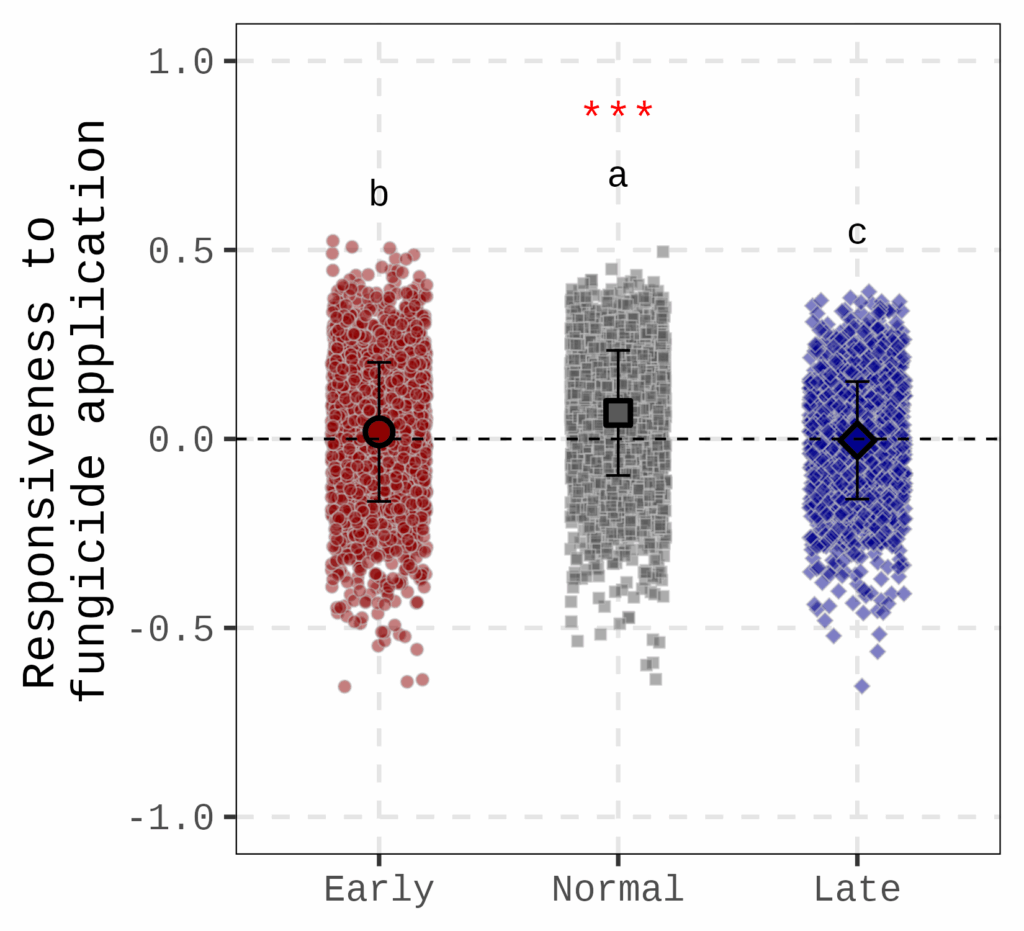
This figure shows how grain area responds to fungicide application at different planting dates. The dotted line represents no fungicide application, meaning that if the responsiveness is 0, there is no difference in grain area between fungicide and non-fungicide treatments. The figure indicates that at the normal planting date, grain area is most responsive to fungicide application.

I created two different formats of the figure using the same dataset. The bar graph (left figure) is the typical format we use, while the raw data with mean graph (right figure) provides a different insight for analyzing the data.
What is more, calculating responsiveness can reduce the number of variables (in this figure, ‘No fungicide’ has been omitted). This approach is also useful when there are many variables that take up too much space in the figure.
■ code summary: https://github.com/agronomy4future/r_code/blob/main/%5BData_article%5D_Visualizing_Responsiveness_Integrating_Raw_Data_for_a_Holistic_Dataset_View.ipynb
We aim to develop open-source code for agronomy ([email protected])
© 2022 – 2025 https://agronomy4future.com – All Rights Reserved.
Last Updated: 09/06/2025