In my previous post, I explained how to calculate interpolation to predict in-between data points.
■ [Data article] Predicting Intermediate Data Points with Linear Interpolation in Excel and R
To make interpolation calculations easier, particularly for groups, I recently developed a new R package, interpolate().
First, let’s upload a dataset.
if(!require(readr)) install.packages("readr")
library(readr)
github="https://raw.githubusercontent.com/agronomy4future/raw_data_practice/refs/heads/main/chlorophyll_content_2024.csv"
df= data.frame(read_csv(url(github), show_col_types=FALSE))

print(head(df,5))
print(tail(df,5))

  season    crop reps days   ch
1   2024 Sorghum    1   65 65.8
2   2024 Sorghum    2   65 63.0
3   2024 Sorghum    3   65 62.7
4   2024 Sorghum    4   65 61.4
5   2024 Sorghum    1   75 57.3
.
.
.
52   2024 Soybean    4  115 35.3
53   2024 Soybean    1  125  9.2
54   2024 Soybean    2  125  0.0
55   2024 Soybean    3  125  7.2
56   2024 Soybean    4  125  6.1
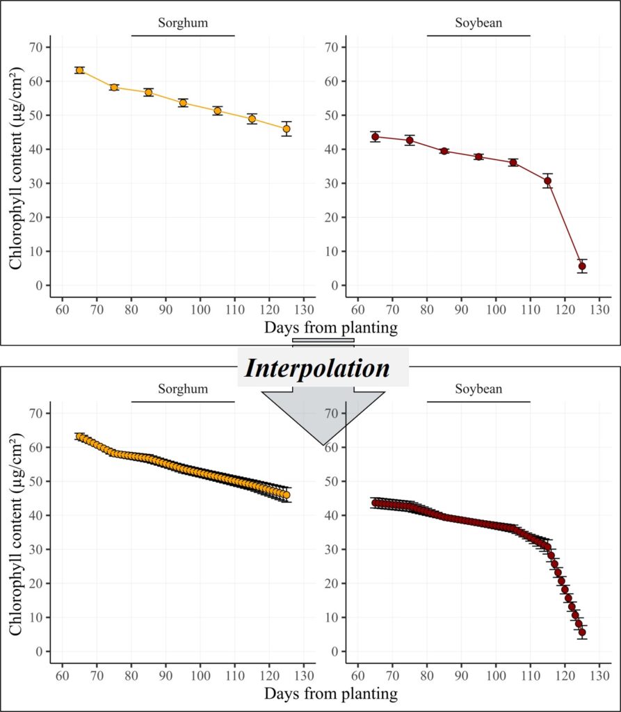
This dataset contains chlorophyll content measurements for sorghum and soybean. I measured chlorophyll content every 10 days between 65 and 125 days after sowing, with four replicates at each time point.

Let’s visualize this data. First, I’ll summarize it to account for the replicates.
if(!require(dplyr)) install.packages("dplyr")
library(dplyr)
dataA= data.frame(df %>%
                    group_by(crop, days) %>%
                    dplyr::summarize(across(c(ch),
                                            .fns= list(Mean= mean,
                                                       SD= sd,
                                                       n= length,
                                                       se= ~ sd(.)/sqrt(length(.))))))

print(dataA)
      crop days ch_Mean    ch_SD ch_n     ch_se
1  Sorghum   65  63.225 1.851801    4 0.9259005
2  Sorghum   75  58.175 1.534872    4 0.7674362
3  Sorghum   85  56.725 2.206619    4 1.1033094
4  Sorghum   95  53.625 2.312827    4 1.1564133
5  Sorghum  105  51.300 2.493993    4 1.2469964
6  Sorghum  115  48.925 2.950000    4 1.4750000
7  Sorghum  125  46.000 4.252842    4 2.1264211
8  Soybean   65  43.675 2.991516    4 1.4957579
9  Soybean   75  42.625 2.940947    4 1.4704733
10 Soybean   85  39.450 1.190238    4 0.5951190
11 Soybean   95  37.775 1.534872    4 0.7674362
12 Soybean  105  36.100 2.102380    4 1.0511898
13 Soybean  115  30.725 4.184396    4 2.0921978
14 Soybean  125   5.625 3.963479    4 1.9817396
Next, I’ll create a line graph.
if(!require(ggplot2)) install.packages("ggplot2")
library(ggplot2)

ch_contents=ggplot(data=dataA,  aes(x=days, y=ch_Mean)) +
  geom_errorbar(aes(ymin=ch_Mean-ch_se, ymax=ch_Mean+ch_se),
                position="identity", width=3) +
  geom_point(aes(fill=crop, shape=crop), size=3) +
  geom_line (aes(color=crop)) +
  scale_fill_manual(values=c("orange","darkred")) +
  scale_shape_manual(values=c(21,21)) +
  scale_color_manual(values=c("orange","darkred")) +
  scale_x_continuous(breaks = seq(60, 130, 10), limits = c(60, 130)) +
  scale_y_continuous(breaks = seq(0, 70, 10), limits = c(0, 70)) +
  facet_wrap( ~ crop, scales="free",) +
  annotate("segment", x=80, xend=110, y=Inf, yend=Inf, color="black", lwd=1) +
  labs(x="Days from planting", y="Chlorophyll content (µg/cm²) ") +
  theme_classic(base_size= 18, base_family = "serif") +
  theme(legend.position="none",
        legend.title=element_blank(),
        legend.key=element_rect(color="white", fill=alpha(0.5)),
        legend.text=element_text(family="serif", face="plain",
                                 size=15, color="black"),
        legend.background= element_rect(fill=alpha(0.5)),
        panel.grid.major = element_line(color= "grey85", size = 0.1),
        strip.background=element_rect(color="white",
                                      linewidth=0.5,linetype="solid"),
        axis.line= element_line(linewidth= 0.5, colour= "black"))
ch_contents + windows(width=9, height=5)

ggsave("C:/Users/agron/OneDrive/Desktop/Coding_Output/ch_contents.jpg",
       ch_contents, width=9*2.54, height=5*2.54, units="cm", dpi=1000)
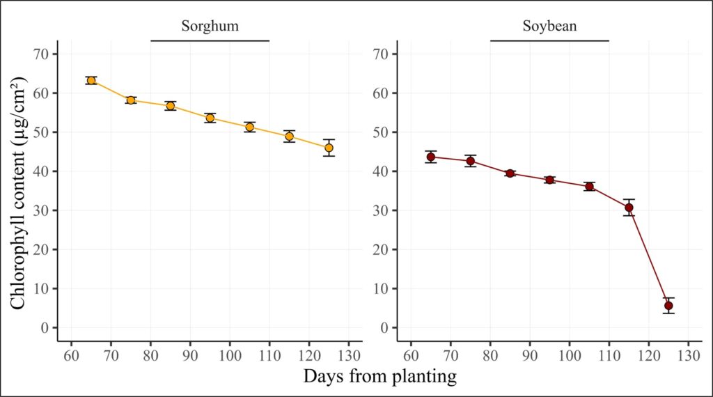
It looks good, but I want to include all data points between 65 and 125 days using interpolation. We can perform interpolation manually using Excel, R, or other programs.
■ [Data article] Predicting Intermediate Data Points with Linear Interpolation in Excel and R
However, I have developed a simple R package to make interpolation easier.
Before installing the package, please ensure that Rtools is downloaded. (https://cran.r-project.org/bin/windows/Rtools). Then, I’ll run the code below to load the package.
if(!require(remotes)) install.packages("remotes")
if (!requireNamespace("interpolate", quietly = TRUE)) {
    remotes::install_github("agronomy4future/interpolate", force= TRUE)
}
library(remotes)
library(interpolate)
Next, I’ll run the following code. Please specify the x and y variables for interpolation, as well as the grouping variable.
result= interpolate(df, x="days", y="ch", group_vars= c("crop","reps"))
print(head(result,5))
print(tail(result,5))
  crop     reps season  days    ch category
  <chr>   <dbl>  <dbl> <int> <dbl>    <dbl>
1 Sorghum     1   2024    65  65.8        0
2 Sorghum     1     NA    66  65.0        1
3 Sorghum     1     NA    67  64.1        1
4 Sorghum     1     NA    68  63.2        1
5 Sorghum     1     NA    69  62.4        1
# A tibble: 5 × 6
  crop     reps season  days    ch category
  <chr>   <dbl>  <dbl> <int> <dbl>    <dbl>
1 Soybean     4     NA   121 17.8         1
2 Soybean     4     NA   122 14.9         1
3 Soybean     4     NA   123 11.9         1
4 Soybean     4     NA   124  9.02        1
5 Soybean     4   2024   125  6.1         0
This code generates all data points between actual measurements using interpolation, grouping by crop and reps. It also creates a new column, ‘category,’ which identifies actual data points (0) and interpolated data points (1).
Next, let’s visualize this data again.
if(!require(dplyr)) install.packages("dplyr")
library(dplyr)
dataB= data.frame(result %>%
                    group_by(crop, days) %>%
                    dplyr::summarize(across(c(ch),
                                            .fns= list(Mean= mean,
                                                       SD= sd,
                                                       n= length,
                                                       se= ~ sd(.)/sqrt(length(.))))))

print(head(dataB,5))
print(tail(dataB,5))
     crop days ch_Mean     ch_SD ch_n     ch_se
1 Sorghum   65  63.225 1.8518009    4 0.9259005
2 Sorghum   66  62.720 1.5925242    4 0.7962621
3 Sorghum   67  62.215 1.3482211    4 0.6741105
4 Sorghum   68  61.710 1.1286570    4 0.5643285
5 Sorghum   69  61.205 0.9511221    4 0.4755611
       crop days ch_Mean    ch_SD ch_n    ch_se
118 Soybean  121  15.665 2.553501    4 1.276750
119 Soybean  122  13.155 2.752992    4 1.376496
120 Soybean  123  10.645 3.076248    4 1.538124
121 Soybean  124   8.135 3.489035    4 1.744518
122 Soybean  125   5.625 3.963479    4 1.981740
if(!require(ggplot2)) install.packages("ggplot2")
library(ggplot2)

ch_contents=ggplot(data=dataB,  aes(x=days, y=ch_Mean)) +
  geom_errorbar(aes(ymin=ch_Mean-ch_se, ymax=ch_Mean+ch_se),
                position="identity", width=3) +
  geom_point(aes(fill=crop, shape=crop), size=3) +
  geom_line (aes(color=crop)) +
  scale_fill_manual(values=c("orange","darkred")) +
  scale_shape_manual(values=c(21,21)) +
  scale_color_manual(values=c("orange","darkred")) +
  scale_x_continuous(breaks = seq(60, 130, 10), limits = c(60, 130)) +
  scale_y_continuous(breaks = seq(0, 70, 10), limits = c(0, 70)) +
  facet_wrap( ~ crop, scales="free",) +
  annotate("segment", x=80, xend=110, y=Inf, yend=Inf, color="black", lwd=1) +
  labs(x="Days from planting", y="Chlorophyll content (µg/cm²) ") +
  theme_classic(base_size= 18, base_family = "serif") +
  theme(legend.position="none",
        legend.title=element_blank(),
        legend.key=element_rect(color="white", fill=alpha(0.5)),
        legend.text=element_text(family="serif", face="plain",
                                 size=15, color="black"),
        legend.background= element_rect(fill=alpha(0.5)),
        panel.grid.major = element_line(color= "grey85", size = 0.1),
        strip.background=element_rect(color="white",
                                      linewidth=0.5,linetype="solid"),
        axis.line= element_line(linewidth= 0.5, colour= "black"))
ch_contents + windows(width=9, height=5)

ggsave("C:/Users/agron/OneDrive/Desktop/Coding_Output/ch_contents.jpg",
       ch_contents, width=9*2.54, height=5*2.54, units="cm", dpi=1000)
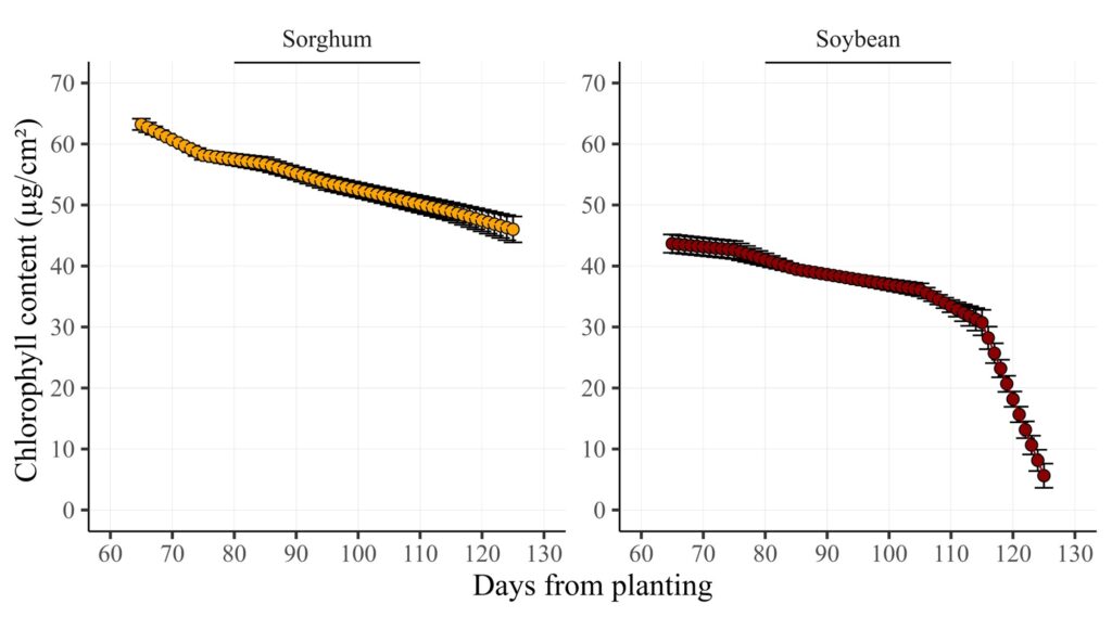
All data points have been generated between the actual measurements. This method is useful for presenting time series data, ensuring a continuous and intact representation over time.
Github: https://github.com/agronomy4future/interpolate
We aim to develop open-source code for agronomy ([email protected])
© 2022 – 2025 https://agronomy4future.com – All Rights Reserved.
Last Updated: 01/03/2025