This post is part of a series introducing R packages that present methods for calculating phenotypic plasticity.
□ [R package] Finlay-Wilkinson Regression model (feat. fwrmodel)
□ [R package] Calculate the responsiveness of each treatment relative to a control (Feat. deltactrl)
□ [R package] Quantifying Reaction Norm Plasticity from Slopes to Individual Responses (Feat. nrmodel)
In my previous post, I explained how to quantify phenotypic plasticity in crops and described three different approaches: Responsiveness, Reaction Norm, and the Finlay-Wilkinson Regression Model.
□ Quantifying Phenotypic Plasticity of Crops
Recently, I developed an R package, deltactrl(), to easily calculate responsiveness. Last year, I developed another R package, fwrmodel(), to facilitate the calculation of the environmental index for the Finlay-Wilkinson Regression Model. Now, I am introducing the final R package for calculating phenotypic plasticity: rnmodel(), which calculates Reaction Norm.
Let’s start by uploading a dataset.
if(!require(readr)) install.packages("readr")
library(readr)

github= paste0("https://raw.githubusercontent.com/agronomy4future/",
                "raw_data_practice/refs/heads/main/",
                "nitrogen_level_crop_yield.csv")
df= data.frame(read_csv(url(github),show_col_types = FALSE))
set.seed(100)
print(df[sample(nrow(df),5),])

     Genotype Nitrogen_Level Replicate   Yield
3786      CV2            100       286  4.4000
503       CV1             50         3  2.9900
3430      CV2             50       430  3.3600
3696      CV2            100       196  3.8100
4090      CV2            150        90  3.6036
.
.
.
This dataset contains crop yield data across various levels of nitrogen for five different genotypes. I am interested in evaluating how crop yield responds to these nitrogen levels. Specifically, I want to identify which genotypes exhibit greater or lesser plasticity in response to nitrogen.
First, I will summarize the data. Then, I will fit a linear regression model of nitrogen versus crop yield and create a linear regression graph.
if(!require(dplyr)) install.packages("dplyr")
library(dplyr)

df1= df %>%
       group_by(Genotype, Nitrogen_Level) %>%
       dplyr::summarize(
       across(
        .cols= Yield,
        .fns= list(
         Mean= ~mean(., na.rm= TRUE),
         n= ~length(.),
         se= ~sd(., na.rm= TRUE) / sqrt(length(.)))),
        .groups= "drop") %>%
        as.data.frame()
if(!require(ggplot2)) install.packages("ggplot2")
library(ggplot2)

Fig=ggplot(data=df1, aes(x=Nitrogen_Level, y=Yield_Mean)) +
  geom_smooth(aes(group=Genotype, color=Genotype),
  method=lm, level=0.95, se=FALSE, linetype=1, size=0.5, formula=y~x) +
  geom_errorbar(aes(ymin=Yield_Mean-Yield_SD, ymax=Yield_Mean+Yield_SD),
  position=position_dodge(0.5), width=10) +
  geom_point(aes(fill=Genotype, shape=Genotype), size=4) +
  scale_color_manual(values=c("cadetblue","darkorchid4","orange3",
  "skyblue4","wheat4"))+
  scale_fill_manual(values=c("cadetblue","darkorchid4","orange3",
  "skyblue4","wheat4"))+
  scale_shape_manual(values=c(21,21,21,21,21))+
  scale_y_continuous(breaks = seq(0, 10, 2), limits = c(0, 10)) +
  labs(x="Nitrogen level", y="Yield (Mg/ha)") +
  theme_classic(base_size= 15, base_family = "serif") +
  theme(legend.position="right",
        legend.title=element_blank(),
        legend.key=element_rect(color="white", fill=alpha(0.5)),
        legend.text=element_text(family="serif", face="plain",
        size=13, color="black"),
        legend.background= element_rect(fill=alpha(0.5)),
        panel.border= element_rect(color="black", fill=NA, linewidth=0.5),
        axis.line= element_line(linewidth= 0.5, colour= "black"),
        panel.grid.major= element_line(color="grey90", linetype="dashed"))

options(repr.plot.width=5.5, repr.plot.height=5)
print(Fig)

ggsave("Fig.png", plot= Fig, width=5.5, height= 5, dpi= 300)

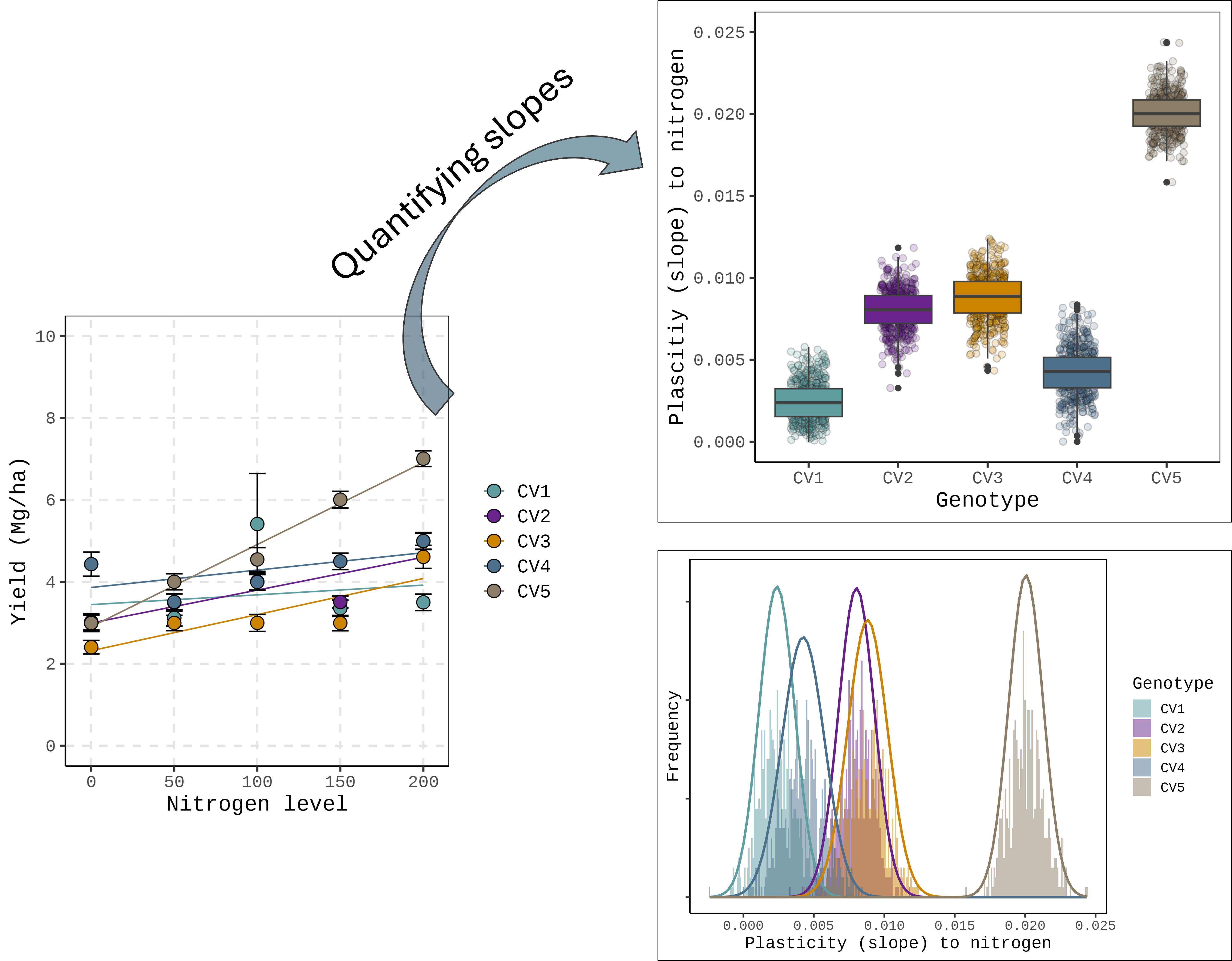
This figure shows how each genotype responds to nitrogen levels, but this graph alone is not sufficient to fully explain the plasticity of certain genotypes in specific environments. In other words, we need an additional approach to quantify plasticity.

My idea started from here.
Typically, in linear regression analyses for genotype responses (e.g., G×E studies), we often use the mean performance of each genotype across replicates to fit a single slope. Please refer to how the df1 dataset was created.
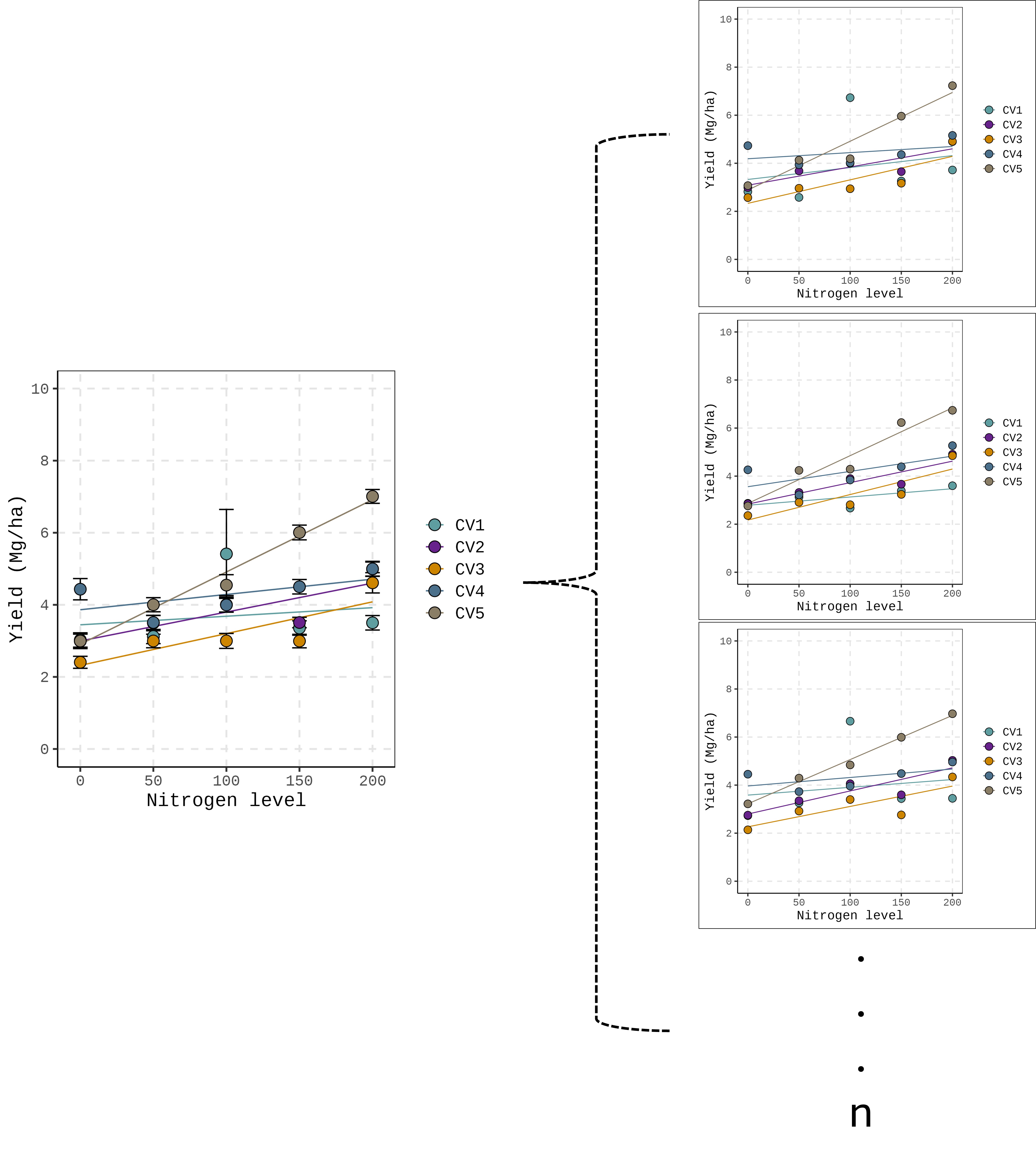
It means that each genotype has multiple slopes, one per replicate. If we can estimate these slopes individually, we can treat each slope as a measure of plasticity and analyze the variance of plasticity. In other words, plasticity can be quantified using these slopes. This approach also produces a distribution of slopes for each genotype, enabling the estimation of variability (variance) in plasticity within a genotype.

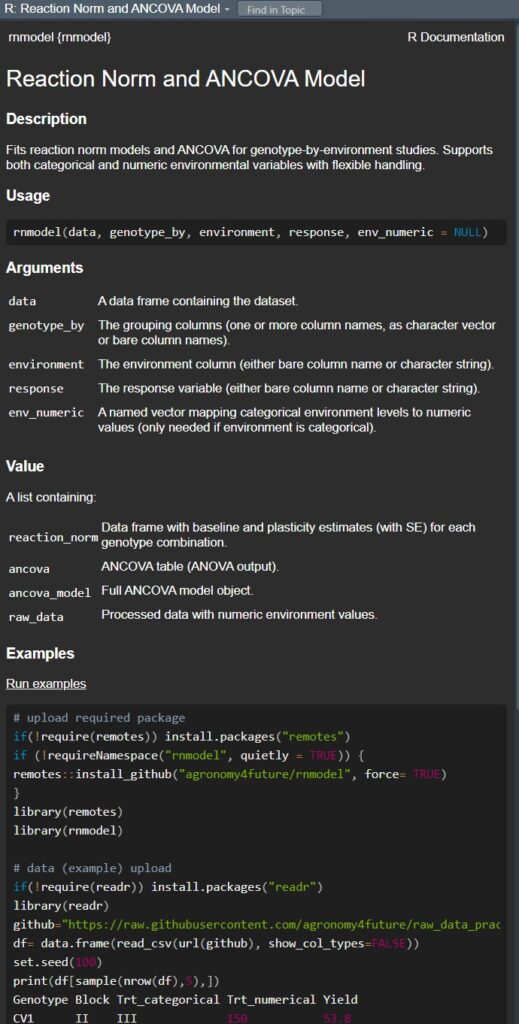
To facilitate this analysis, I have recently developed a new R package, rnmodel().
This package allows users to easily calculate slopes that represent responses to environmental factors by grouping data and estimating the slope of the reaction norm.
A reaction norm describes how the phenotype of a particular genotype changes across a range of environmental conditions. In simple terms, it represents the set of possible phenotypes that a single genotype can express under varying environmental conditions.
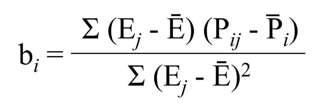
The formula for a reaction norm depends on how the relationship between phenotype and environment is modeled for a given genotype. The most basic and widely used formulation—particularly in crop physiology—is a linear reaction norm model, which can be expressed as:
Pij= μ + Gi + βiEj + ϵij
Where:
Pij: Phenotypic value of genotype i in environment j
μ: Overall mean
Gi: Genotypic main effect (baseline performance of genotype i)
Ej: Environmental index or environmental variable (could be continuous or categorical)
βi: Genotype-specific sensitivity (slope of reaction norm; plasticity)
ϵij: Residual error
and this model could be simplified
P(E)= a + bE
Where:
P(E) = Phenotype as a function of environment E
a = Intercept (baseline phenotype)
b = Slope (sensitivity or plasticity of the phenotype to the environment)
E = Environmental variable
and the rnmodel() package can easily calculate the slope (b) using the following formula:
Before starting, we need to load the required libraries.
if(!require(remotes)) install.packages("remotes")
library(remotes)
if (!requireNamespace("rnmodel", quietly = TRUE)) {
  remotes::install_github("agronomy4future/rnmodel", force= TRUE)
}
library(rnmodel)
Now, let’s return to the df dataset.
     Genotype Nitrogen_Level Replicate   Yield
3786      CV2            100       286  4.4000
503       CV1             50         3  2.9900
3430      CV2             50       430  3.3600
3696      CV2            100       196  3.8100
4090      CV2            150        90  3.6036
.
.
.
This is the basic code format for using rnmodel().
output= rnmodel(data= df, genotype_by= c("Genotype","Replicate"),
                environment="Nitrogen_Level",
                response="Yield",
                env_numeric = NULL)
I want to obtain the slope representing how Yield responds to Nitrogen_Level. To do this, I grouped the data by Genotype and Replicate, set the environment variable as Nitrogen_Level, and the response variable as Yield. Since Nitrogen_Level is numeric, I set env_numeric = NULL.
If the environment variable is categorical, it is necessary to assign numeric values to each category using env_numeric. For example: env_numeric = c("N0" = 0, "N1" = 50, ...)
After loading the library, you can run ?rnmodel in R to view detailed documentation and explanations for this function.
Next, I will add the column reaction_norm to the output dataset and assign it to a new dataset named result.
result=output$reaction_norm

set.seed(100)
print(result[sample(nrow(result),5),])

Reaction Norm Model Output (Biological Terms):

     Genotype Replicate baseline plasticity baseline_se plasticity_se
503       CV2         3  3.22400  0.0063072   0.3199945   0.002612744
2035      CV5        35  2.95600  0.0193400   0.3123171   0.002550059
470       CV1       470  3.31600 -0.0008200   0.1552482   0.001267596
1990      CV4       490  3.96964  0.0041024   0.3560298   0.002906971
1540      CV4        40  3.50714  0.0057524   0.4093860   0.003342623
.
.
.
Now, the baseline, plasticity, and their corresponding standard errors have been generated. In the model equation P(E) = a + bE, the baseline corresponds to a (intercept), and plasticity corresponds to b (slope).
For example, for genotype CV2 in replicate 3, the model equation is:
P(E) = 3.224 + 0.0063072 × N
Since we now have the original plasticity (slope) estimates for each individual replicate, rather than averaged values, we can analyze plasticity in various ways and quantify it more comprehensively.
– Quantifying slopes –
1) Boxplot
First, I will create a boxplot to visualize the distribution of these slopes.
Fig1=ggplot(data=result, aes(x=Genotype, y=plasticity, fill=Genotype)) +
  geom_boxplot() +
  scale_color_manual(values=c("cadetblue","darkorchid4","orange3",
  "skyblue4","wheat4"))+
  scale_fill_manual(values=c("cadetblue","darkorchid4","orange3",
  "skyblue4","wheat4"))+
  scale_y_continuous(breaks = seq(0, 0.025, 0.005), limits= c(0,0.025)) +
  labs(x="Genotype", y="Plascitiy (slope) in response to nitrogen") +
  theme_classic(base_size=15, base_family="serif") +
  theme(legend.position="none",
        legend.title=element_blank(),
        legend.key=element_rect(color="white", fill=alpha(0.5)),
        legend.text=element_text(family="serif", face="plain",
        size=13, color="black"),
        legend.background= element_rect(fill=alpha(0.5)),
        panel.border= element_rect(color="black", fill=NA, linewidth=0.5),
        axis.line= element_line(linewidth=0.5, colour="black"),
        strip.background=element_rect(color="white",
        linewidth=0.5, linetype="solid"))

options(repr.plot.width=5.5, repr.plot.height=5)
print(Fig1)

ggsave("Fig1.png", plot= Fig1, width=5.5, height= 5, dpi= 300)
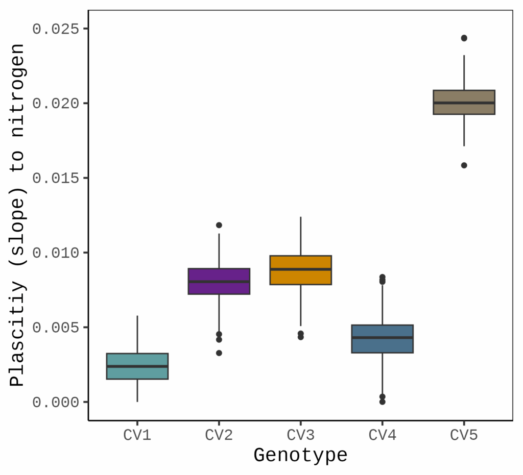
This plot shows the variability of slopes for each genotype in response to nitrogen. Let’s compare this with the linear regression graph. In linear regression, the slope is estimated based on the mean values of the data points for each genotype, providing a single averaged slope. In contrast, when using rnmodel(), we obtain multiple slope estimates across replicates, which allows us to capture the variation in slope and quantify it as plasticity.

Next, I will perform statistical analysis using ANOVA.
model=aov (plasticity~ Genotype, data=result)
summary(model)

              Df  Sum Sq  Mean Sq F value Pr(>F)
Genotype       4 0.09462 0.023655   13145 <2e-16 ***
Residuals   2495 0.00449 0.000002

if(!require(agricolae)) install.packages("agricolae")
library(agricolae)

Tukey= HSD.test(model, "Genotype")
print(Tukey)
$groups
     plasticity groups
CV5 0.020056360      a
CV3 0.008815360      b
CV2 0.008026436      c
CV4 0.004243682      d
CV1 0.002379400      e
The results indicate that CV5 has the greatest plasticity in response to nitrogen application, while CV1 displays minimal plasticity.
Previously, I developed an R package called descriptivestat(), and by incorporating this package, we can generate a more informative and visually appealing figure.
if(!require(remotes)) install.packages("remotes")
if (!requireNamespace("descriptivestat", quietly = TRUE)) {
  remotes::install_github("agronomy4future/descriptivestat", force= TRUE)
}
library(remotes)
library(descriptivestat)
df2= descriptivestat(data= result, group_vars= c("Genotype"),
                     value_vars= c("plasticity"),
                     output_stats= c("sd"))
and I’ll create a figure again.
 Fig2=ggplot(data=df2, aes(x=Genotype, y=plasticity, fill=Genotype)) +
  geom_jitter(data= subset(df2, category=="observed"),
  aes(x= Genotype, y= plasticity, fill=Genotype, shape=Genotype),
  width=0.2, alpha=0.2, size=2) +
  geom_boxplot(aes(fill=Genotype), color="grey25") +
  scale_fill_manual(values=c("cadetblue","darkorchid4","orange3",
  "skyblue4","wheat4"))+
  scale_shape_manual(values=c(21,21,21,21,21)) +
  scale_y_continuous(breaks = seq(0, 0.025, 0.005), limits= c(0,0.025)) +
  labs(x="Genotype", y="Plascitiy (slope) to nitrogen") +
  theme_classic(base_size= 15, base_family= "serif") +
  theme(legend.position="none",
        legend.title=element_blank(),
        legend.key=element_rect(color="white", fill=alpha(0.5)),
        legend.text=element_text(family="serif", face="plain",
        size=13, color="black"),
        legend.background= element_rect(fill=alpha(0.5)),
        panel.border= element_rect(color="black", fill=NA, linewidth=0.5),
        axis.line= element_line(linewidth=0.5, colour="black"),
        strip.background=element_rect(color="white",
        linewidth=0.5, linetype="solid"))

options(repr.plot.width=5.5, repr.plot.height=5)
print(Fig2)

ggsave("Fig2.png", plot= Fig2, width=5.5, height= 5, dpi= 300)

This graph provides a much clearer representation for quantifying plasticity, as it displays both the raw data and the averaged dataset.
[R package] Embedding Key Descriptive Statistics within Original Data (Feat. descriptivestat)
2) Normal distribution
Since we have raw data for plasticity, we can also generate a normal distribution plot to visualize its distribution.
Fig3= ggplot (data=result, aes(x=plasticity, fill=Genotype)) +

  geom_histogram(aes(y=0.5*..density..), alpha=0.5,
  position='identity',binwidth=0.0001) +
  scale_fill_manual(values=c("cadetblue","darkorchid4","orange3",
  "skyblue4","wheat4"))+

  stat_function(data=subset(result, Genotype=="CV1"), aes(x=plasticity),
  color="cadetblue", size=1, fun=dnorm,
  args=c(mean=mean(subset(result, Genotype=="CV1")$plasticity),
  sd=sd(subset(result,Genotype=="CV1")$plasticity))) +

  stat_function(data=subset(result, Genotype=="CV2"), aes(x=plasticity),
  color="darkorchid4", size=1, fun=dnorm,
  args=c(mean=mean(subset(result, Genotype=="CV2")$plasticity),
  sd=sd(subset(result,Genotype=="CV2")$plasticity))) +

  stat_function(data=subset(result, Genotype=="CV3"), aes(x=plasticity),
  color="orange3", size=1, fun=dnorm,
  args=c(mean=mean(subset(result, Genotype=="CV3")$plasticity),
  sd=sd(subset(result,Genotype=="CV3")$plasticity))) +

  stat_function(data=subset(result, Genotype=="CV4"), aes(x=plasticity),
  color="skyblue4", size=1, fun=dnorm,
  args=c(mean=mean(subset(result, Genotype=="CV4")$plasticity),
  sd=sd(subset(result,Genotype=="CV4")$plasticity))) +

  stat_function(data=subset(result, Genotype=="CV5"), aes(x=plasticity),
  color="wheat4", size=1, fun=dnorm,
  args=c(mean=mean(subset(result, Genotype=="CV5")$plasticity),
  sd=sd(subset(result,Genotype=="CV5")$plasticity))) +

  labs(x="Plasticity (slope) to nitrogen", y="Frequency") +
  theme_classic(base_size= 15, base_family = "serif") +
  theme(legend.position="right",
        axis.text.y = element_blank(),
        panel.border= element_rect(color="black", fill=NA, linewidth=0.5),
        axis.line= element_line(linewidth=0.5, colour="black"))

options(repr.plot.width=5.5, repr.plot.height=5)
print(Fig3)

ggsave("Fig3.png", plot=Fig3, width=5.5, height= 5, dpi= 300)

Tips for nrmodel()
1) Comparing slopes for genotype
If you run output$ancova, you can obtain the statistical output for genotype × environment (G×E) interaction. This allows you to test whether the slopes are parallel (no interaction) or not parallel (indicating a significant interaction). This is ANCOVA (Analysis of Covariance) which is often used to evaluate if different groups (e.g., genotypes) have the same relationship (slope) with a covariate (e.g., environment or environmental gradient).
output= rnmodel(data= df, genotype_by= c("Genotype"),
                environment="Nitrogen_Level",
                response="Yield",
                env_numeric = NULL)

print(output$ancova)

Analysis of Variance Table

Response: Yield
                              Df Sum Sq Mean Sq F value    Pr(>F)
Genotype                       4 4227.1  1056.8  3008.7 < 2.2e-16 ***
env_numeric_value              1 4735.2  4735.2 13481.6 < 2.2e-16 ***
Genotype:env_numeric_value     4 2365.5   591.4  1683.7 < 2.2e-16 ***
Residuals                  12490 4386.9     0.4
2) Visualization for GxE
By running plot_rnmodel(output), you can generate a genotype × environment plot that supports the results from output$ancova.
plot_rnmodel(output)
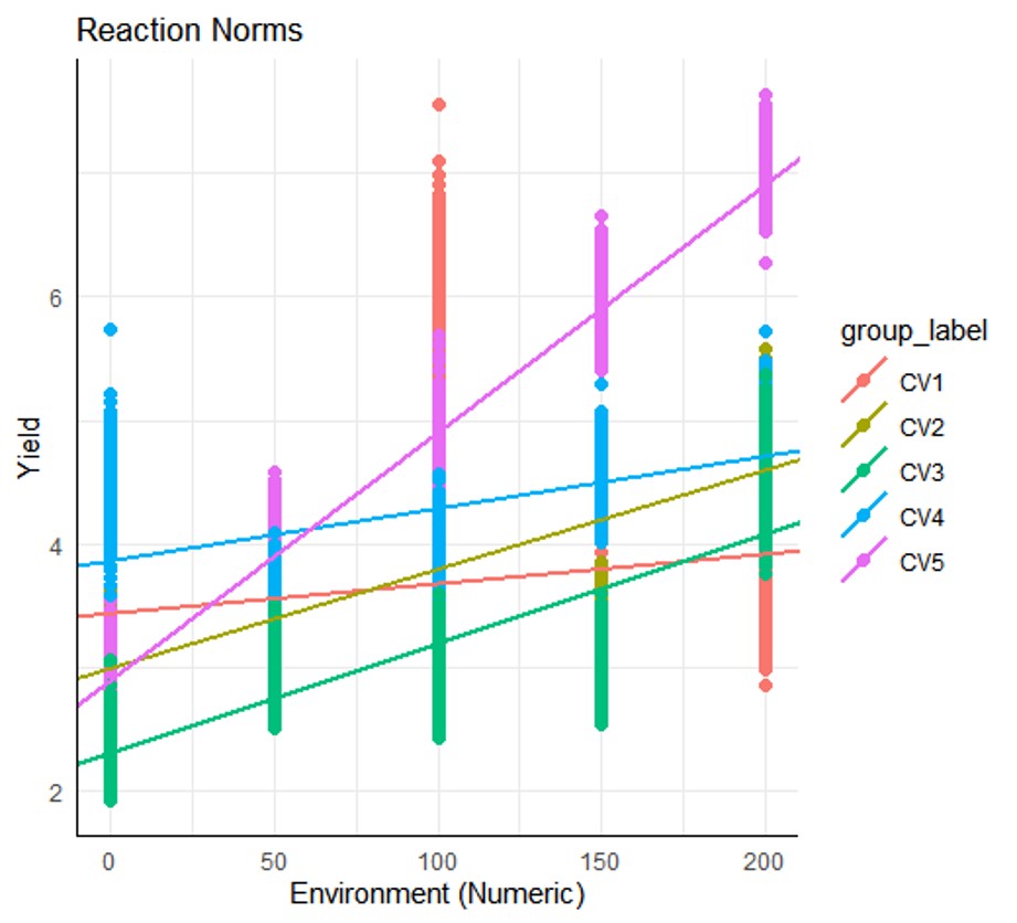
The rnmodel() function easily quantifies slope as a measure of plasticity and analyzes it from various perspectives.

We aim to develop open-source code for agronomy ([email protected])
© 2022 – 2025 https://agronomy4future.com – All Rights Reserved.
Last Updated: 23/06/2025