[Data article] Simulating Crop Growth Over Time Using a Sigmoid Growth Model

I’m planning to frequently collect biomass samples to observe how biomass accumulation differs among treatments or varieties over time. I assume that the growth will follow a curve pattern, characterized by slow accumulation during the early growing stage, followed by rapid growth, and eventually reaching a plateau. I want to visualize this curve through simulation, and here is the Python code to demonstrate it.
First, let’s import the required packages.
import numpy as np
import pandas as pd
import matplotlib.pyplot as plt
and I’ll also set up a seed for reproducibility.
np.random.seed(42)Next, I’ll generate a range of values representing the independent variable (e.g., days after planting).
days = np.linspace(0, 120, 100)The 100 indicates the number of evenly spaced values generated between the start value (0) and the end value (120). In other words, np.linspace(0, 120, 100) will create an array of 100 equally spaced numbers starting from 0 and ending at 120. Therefore, increasing the number of points (from 100 to 200) will result in a smoother curve because the points will be more densely packed.
Then, I’ll create a biomass curve using a sigmoid growth function, which is typical for biological growth.
max_weight= 200          # maximum biomass
growth_rate= 0.1         # growth rate coefficient
inflection_point= 60     # mid-point of growth

# to calculate biomass over time using a sigmoid function
biomass = max_weight / (1 + np.exp(-growth_rate * (days - inflection_point)))
Finally, I’ll create a data frame to verify the simulated data.
biomass_data= pd.DataFrame({'Days After planting': days, 'Biomass accumulation': biomass})

print(biomass_data)
    Days After planting     Biomass
0              0.000000    0.494525
1              1.212121    0.558073
2              2.424242    0.629763
3              3.636364    0.710628
4              4.848485    0.801836
..                  ...         ...
95           115.151515  199.198164
96           116.363636  199.289372
97           117.575758  199.370237
98           118.787879  199.441927
99           120.000000  199.505475
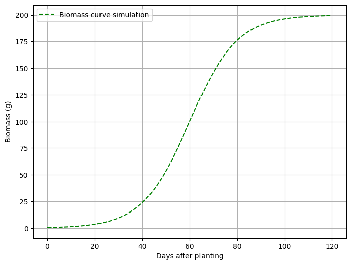
This is my biomass simulation over time. Now, let’s create a graph.
plt.figure(figsize=(8, 6))
plt.plot(days, biomass, label='Biomass curve simulation', linestyle='--', color='green')
#plt.title("Biomass curve")
plt.xlabel('Days after planting')
plt.ylabel('Biomass (g)')
plt.legend()
plt.grid(True)
plt.show()
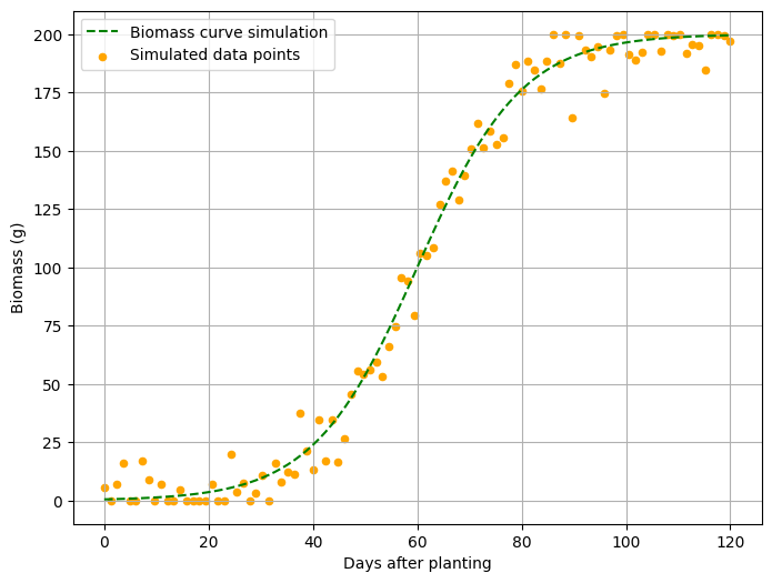
I want to add data points near the curve to resemble a real dataset. The data points should be dispersed close to the curve, so I’ll introduce some noise using the following code. I’ll add 5% noise.
noise= np.random.normal(0, max_weight * 0.05, size=days.shape)
biomass_noise= biomass + noise
biomass_noise= np.clip(biomass_noise, 0, max_weight)
and will add plt.scatter().
noise= np.random.normal(0, max_weight * 0.05, size=days.shape)
biomass_noise= biomass + noise
biomass_noise= np.clip(biomass_noise, 0, max_weight)

plt.figure(figsize=(8, 6))
plt.plot(days, biomass, label='Biomass curve simulation', linestyle='--', color='green')
plt.scatter(days, biomass_noisy, label='Simulated data points', color='orange', s=20)
#plt.title("Biomass curve")
plt.xlabel('Days after planting')
plt.ylabel('Biomass (g)')
plt.legend()
plt.grid(True)
plt.show()
Here is the full code
import numpy as np
import pandas as pd
import matplotlib.pyplot as plt

np.random.seed(42)

days = np.linspace(0, 120, 100)

max_weight= 200
growth_rate= 0.1
inflection_point= 60

biomass = max_weight / (1 + np.exp(-growth_rate * (days - inflection_point)))
biomass_curve= pd.DataFrame({'Days After planting': days, 'Biomass accumulation': biomass})

noise= np.random.normal(0, max_weight * 0.05, size=days.shape)
biomass_noise= biomass + noise
biomass_noise= np.clip(biomass_noise, 0, max_weight)

plt.figure(figsize=(8, 6))
plt.plot(days, biomass, label='Biomass curve simulation', linestyle='--', color='green')
plt.scatter(days, biomass_noisy, label='Simulated data points', color='orange', s=20)
plt.xlabel('Days after planting')
plt.ylabel('Biomass (g)')
plt.legend()
plt.grid(True)
plt.show()
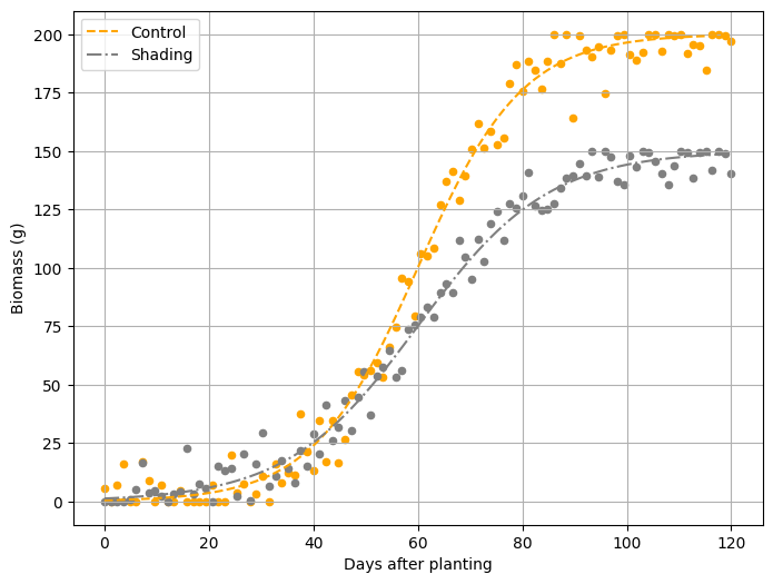
We can create two different growth curves. For example, let’s simulate two distinct biomass growth curves for each treatment (e.g., shading). Let’s proceed step by step!
First, I’ll simulate different growth patterns.
max_weight_ctrl= 200          # maximum biomass at control
growth_rate_ctrl= 0.1         # growth rate coefficient at control
max_weight_shading= 150          # maximum biomass at shading
growth_rate_shading= 0.08         # growth rate coefficient at shading
inflection_point= 60     # mid-point of growth
Second, I’ll calculate the biomass growth curve for each treatment over time using a sigmoid function.
biomass_ctrl= max_weight_ctrl / (1 + np.exp(-growth_rate * (days - inflection_point)))

biomass_shading= max_weight_shading / (1 + np.exp(-growth_rate_shading * (days - inflection_point)))
Third, I’ll add data points near each curve.
noise_ctrl = np.random.normal(0, max_weight_ctrl * 0.05, size=days.shape)
biomass_ctrl_noisy = biomass_ctrl + noise_ctrl
biomass_ctrl_noisy = np.clip(biomass_ctrl_noisy, 0, max_weight_ctrl)

noise_shading = np.random.normal(0, max_weight_shading * 0.05, size=days.shape)
biomass_shading_noisy = biomass_shading + noise_shading
biomass_shading_noisy = np.clip(biomass_shading_noisy, 0, max_weight_shading)
Let’s take a look at the simulated data.
biomass_curve = pd.DataFrame({'Days After Flowering': days, 'Biomass_ctrl': biomass_ctrl_noisy, 'Biomass_shading': biomass_shading_noisy})

print(biomass_curve)
    Days After Flowering  Biomass_ctrl  Biomass_shading
0               0.000000      5.461666         0.000000
1               1.212121      0.000000         0.000000
2               2.424242      7.106648         0.000000
3               3.636364     15.940927         0.000000
4               4.848485      0.000000         0.587966
..                   ...           ...              ...
95            115.151515    184.563015       150.000000
96            116.363636    200.000000       141.737780
97            117.575758    200.000000       149.669099
98            118.787879    199.493061       149.088625
99            120.000000    197.159604       140.203337
Finally, I’ll create a curve graph.
plt.figure(figsize=(8, 6))
plt.plot(days, biomass_ctrl, label='Control', linestyle='--', color='orange')
plt.plot(days, biomass_shading, label='Shading', linestyle='-.', color='grey')
plt.scatter(days, biomass_ctrl_noisy, color='orange', s=20)
plt.scatter(days, biomass_shading_noisy, color='grey', s=20)
plt.xlabel('Days after planting')
plt.ylabel('Biomass (g)')
plt.legend()
plt.grid(True)
plt.show()
Here is the full code.
import numpy as np
import pandas as pd
import matplotlib.pyplot as plt

np.random.seed(42)

days = np.linspace(0, 120, 100)

max_weight_ctrl= 200       # maximum biomass at control
growth_rate_ctrl= 0.1      # growth rate coefficient at control
max_weight_shading= 150       # maximum biomass at shading
growth_rate_shading= 0.08      # growth rate coefficient at shading
inflection_point= 60  # mid-point of growth

biomass_ctrl= max_weight_ctrl / (1 + np.exp(-growth_rate * (days - inflection_point)))
biomass_shading= max_weight_shading / (1 + np.exp(-growth_rate_shading * (days - inflection_point)))

noise_ctrl = np.random.normal(0, max_weight_ctrl * 0.05, size=days.shape)
biomass_ctrl_noisy = biomass_ctrl + noise_ctrl
biomass_ctrl_noisy = np.clip(biomass_ctrl_noisy, 0, max_weight_ctrl)

noise_shading = np.random.normal(0, max_weight_shading * 0.05, size=days.shape)
biomass_shading_noisy = biomass_shading + noise_shading
biomass_shading_noisy = np.clip(biomass_shading_noisy, 0, max_weight_shading)

biomass_curve = pd.DataFrame({'Days After Flowering': days, 'Biomass_ctrl': biomass_ctrl_noisy, 'Biomass_shading': biomass_shading_noisy})
print(biomass_curve)

plt.figure(figsize=(8, 6))
plt.plot(days, biomass_ctrl, label='Control', linestyle='--', color='orange')
plt.plot(days, biomass_shading, label='Shading', linestyle='-.', color='grey')
plt.scatter(days, biomass_ctrl_noisy, color='orange', s=20)
plt.scatter(days, biomass_shading_noisy, color='grey', s=20)
plt.xlabel('Days after planting')
plt.ylabel('Biomass (g)')
plt.legend()
plt.grid(True)
plt.show()
full code: https://github.com/agronomy4future/python_code/blob/main/Simulating_Crop_Growth_Over_Time_Using_a_Sigmoid_Growth_Model.ipynb

We aim to develop open-source code for agronomy ([email protected])
© 2022 – 2025 https://agronomy4future.com – All Rights Reserved.
Last Updated: 21/03/2025