df= tibble::tibble(location= rep(c("A", "B"), each= 16L), cultivar= c("CV_2", "CV_2", "CV_1", "CV_1","CV_2", "CV_2", "CV_1", "CV_1", "CV_2", "CV_2", "CV_1", "CV_1", "CV_2", "CV_2", "CV_1", "CV_1", "CV_1", "CV_2", "CV_1", "CV_2", "CV_2", "CV_1", "CV_1", "CV_2", "CV_2", "CV_2", "CV_1", "CV_1", "CV_2", "CV_2", "CV_1", "CV_1"), irrigation= rep(rep(c("Irrigation_No", "Irrigation_Yes"), 2), each= 8L), fertilizer= rep(rep(c("N1", "N0"), 4), each= 4L), rep= c(2, 3, 1, 4, 2, 3, 1, 4, 1, 2, 3, 4, 1, 2, 3, 4, 1, 2, 3, 4, 1, 2, 3, 4, 1, 4, 3, 2, 2, 4, 3, 1), yield= c(70.5, 73.5, 96.0, 100.9, 49.0, 39.2, 58.8, 68.6, 89.1, 92.1, 117.6, 108.7, 63.6, 63.6, 72.5, 84.2, 75.8, 52.4, 82.8, 67.0614, 44.1, 46.6, 52.5, 45.3, 63.3, 66.7, 78.2, 67.0, 50.3, 52.8, 65.1, 49.6))
Here is one dataset, and I’ll use facet_wrap() to create bar graphs. First, let’s summarize the data.
if(!require(dplyr)) install.packages("dplyr")
library(dplyr)

df1= df %>%
       group_by(cultivar, fertilizer, irrigation) %>%
       dplyr::summarize(
       across(
        .cols= yield,
        .fns= list(
         Mean= ~mean(., na.rm= TRUE),
         n= ~length(.),
         se= ~sd(., na.rm= TRUE) / sqrt(length(.)))),
        .groups= "drop") %>%
        as.data.frame()
print(df1)
  cultivar fertilizer     irrigation yield_Mean yield_n  yield_se
1     CV_1         N0  Irrigation_No   56.62500       4  4.705028
2     CV_1         N0 Irrigation_Yes   67.85000       4  7.243215
3     CV_1         N1  Irrigation_No   88.87500       4  5.796748
4     CV_1         N1 Irrigation_Yes   92.87500       4 12.064505
5     CV_2         N0  Irrigation_No   44.40000       4  2.022787
6     CV_2         N0 Irrigation_Yes   57.57500       4  3.515768
7     CV_2         N1  Irrigation_No   65.86535       4  4.677197
8     CV_2         N1 Irrigation_Yes   77.80000       4  7.447818
Then, I’ll create a bar graph using facet_wrap() to divide panels by irrigation.
if(!require(ggplot2)) install.packages("ggplot2")
library(ggplot2)

Fig1= ggplot(data=df1, aes(x=cultivar, y=yield_Mean, fill=fertilizer))+
  geom_bar(stat="identity", position="dodge", width=0.9) +
  scale_fill_manual(values=c("grey75","grey15"))+
  geom_errorbar(aes(ymin=yield_Mean-yield_se, ymax=yield_Mean+yield_se),
                position=position_dodge(0.9), width=0.5) +
  scale_y_continuous(breaks=seq(0,150,30), limits=c(0,150)) +
  facet_wrap(~irrigation) +
  labs(x="Cultivar", y="Grain yield") +
  theme_classic(base_size=18, base_family="serif")+
  theme(legend.position=c(0.8, 0.88),
        legend.title=element_blank(),
        legend.key=element_rect(color="white", fill="white"),
        legend.text=element_text(family="serif", face="plain",
                                 size=13, color="Black"),
        legend.background=element_rect(fill="white"),
        axis.line=element_line(linewidth=0.5, colour="black"),
        strip.background=element_rect(color="white",
                                      linewidth=0.5, linetype="solid"))

options(repr.plot.width=5.5, repr.plot.height=5)
print(Fig1)

ggsave("Fig1.png", plot= Fig1, width=5.5, height=5, dpi= 300)
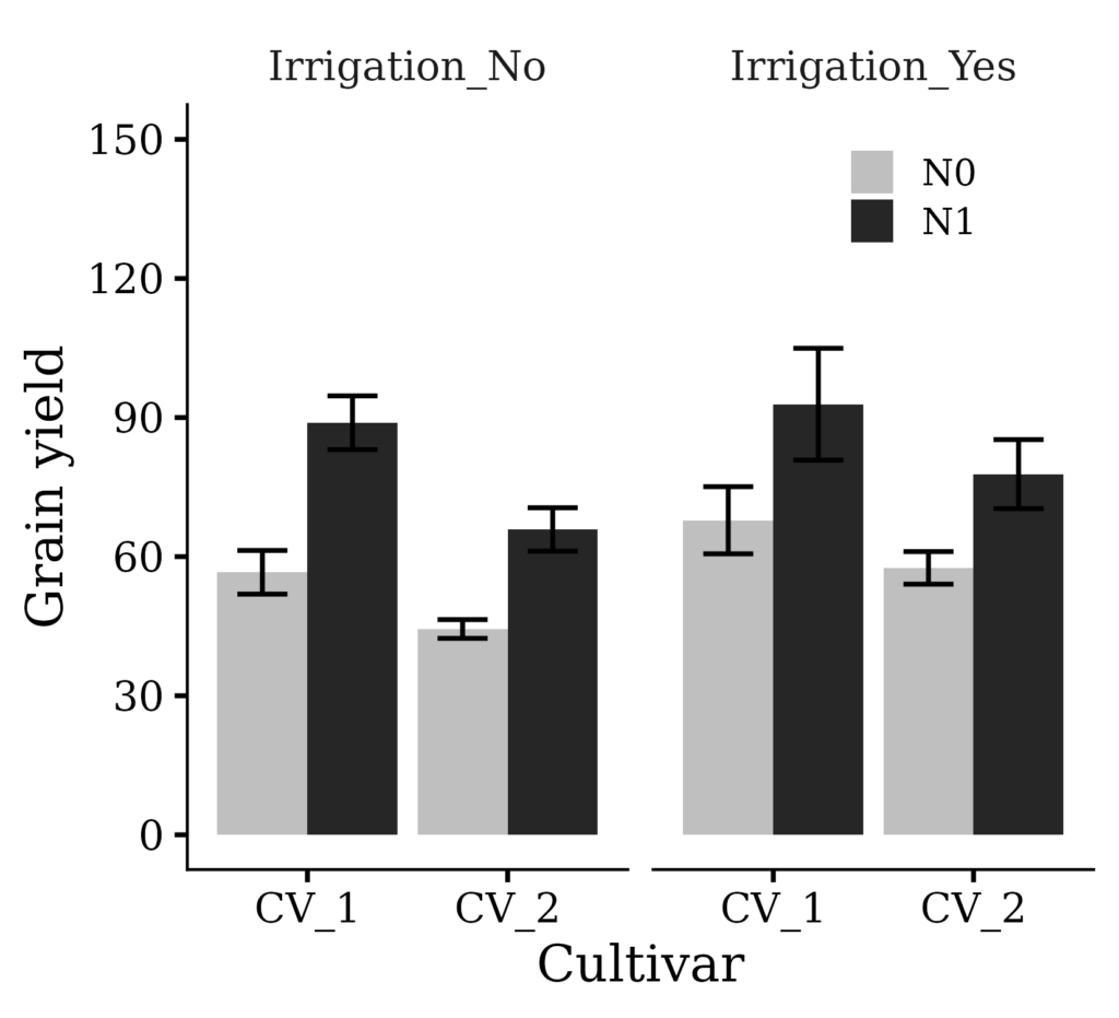
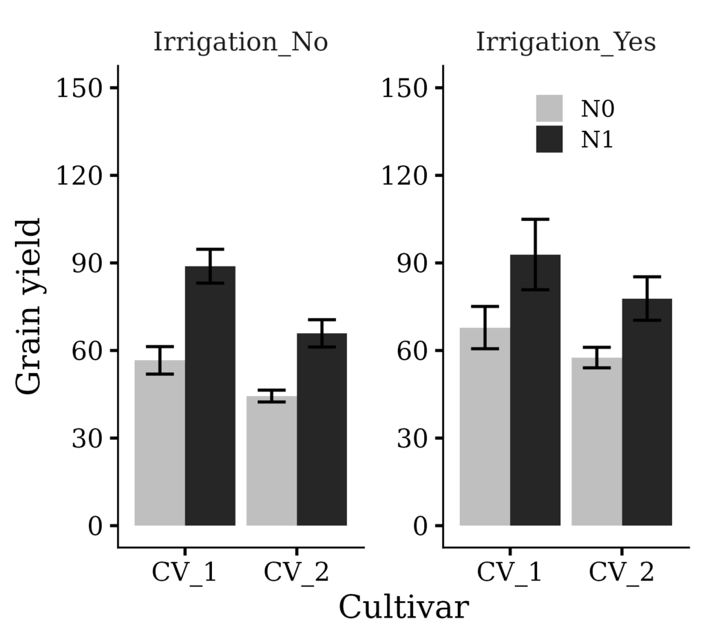
Now, I want to draw a y-axis border for the ‘Irrigation_Yes’ panel. We can achieve this simply by adding scales="free".
if(!require(ggplot2)) install.packages("ggplot2")
library(ggplot2)

Fig2= ggplot(data=df1, aes(x=cultivar, y=yield_Mean, fill=fertilizer))+
  geom_bar(stat="identity", position="dodge", width=0.9) +
  scale_fill_manual(values=c("grey75","grey15"))+
  geom_errorbar(aes(ymin=yield_Mean-yield_se, ymax=yield_Mean+yield_se),
                position=position_dodge(0.9), width=0.5) +
  scale_y_continuous(breaks=seq(0,150,30), limits=c(0,150)) +
  facet_wrap(~irrigation, scales="free") +
  labs(x="Cultivar", y="Grain yield") +
  theme_classic(base_size=18, base_family="serif")+
  theme(legend.position=c(0.8, 0.88),
        legend.title=element_blank(),
        legend.key=element_rect(color="white", fill="white"),
        legend.text=element_text(family="serif", face="plain",
                                 size=13, color="Black"),
        legend.background=element_rect(fill="white"),
        axis.line=element_line(linewidth=0.5, colour="black"),
        strip.background=element_rect(color="white",
                                      linewidth=0.5, linetype="solid"))

options(repr.plot.width=5.5, repr.plot.height=5)
print(Fig2)

ggsave("Fig2.png", plot= Fig2, width=5.5, height=5, dpi= 300)
We aim to develop open-source code for agronomy ([email protected])
© 2022 – 2025 https://agronomy4future.com – All Rights Reserved.
Last Updated: 04/22/2024