When creating graphs using data, especially those involving error bars, it is necessary to calculate the standard error by summarizing the data. There are various methods to summarize the data.
□ Utilizing R Studio for Data Grouping and Mean/Standard Error Calculation (feat ddply)
Today I will introduce a method of creating graphs all at once using stat_summary() without the need for such data summarization.
Below is an example dataset:
Genotype= c(rep(c("CV1","CV2"),each=20))
position= rep(paste(1:20),times=2)
Block= c(rep(c("I","II","III"),each=40))
number= c(2,3,3,3,3,3,4,4,4,4,4,4,4,3,3,4,3,2,2,2,
          3,3,3,3,4,3,3,3,4,5,4,3,4,5,3,3,3,2,3,1,
          1,3,4,3,2,3,3,3,4,4,5,4,3,3,3,2,3,2,2,3,
          2,3,4,3,2,3,4,4,4,4,4,4,4,3,3,3,3,2,1,1,
          2,3,3,3,2,2,5,3,4,5,4,5,4,3,2,5,4,2,2,2,
          1,3,3,3,4,3,3,4,4,4,4,3,4,3,2,1,3,2,4,2)
dataA= data.frame(Genotype,position,Block,number)
print(head(dataA,5))
  Genotype position Block number
1      CV1        1     I      2
2      CV1        2     I      3
3      CV1        3     I      3
4      CV1        4     I      3
5      CV1        5     I      3
.
.
.
Now I want to display the data as points by placing the x-axis at “position” and the y-axis at “number.”
if(!require(ggplot2)) install.packages("ggplot2")
library(ggplot2)

ggplot(data=dataA) +
  stat_summary(aes(x=as.numeric(position), y=as.numeric(number),
  fill=Genotype, shape=Genotype), geom="point",
  fun = mean, col="Black", size=5)+
  scale_fill_manual(values= c("black","red")) +
  scale_shape_manual(values= c(21,22)) +
  scale_x_continuous(breaks= seq(0,21,2),limits= c(0,21)) +
  scale_y_continuous(breaks= seq(0,5,1),limits= c(0,5)) +
  labs(fill= "Genotype", x="Position", y='Grain number') +
  theme_classic(base_size=20, base_family="serif")+
  theme(legend.position=c(0.90,0.12),,
        legend.title=element_blank(),
        legend.key.size=unit(0.5,'cm'),
        legend.key=element_rect(color=alpha("white",.05),
        fill=alpha("white",.05)),
        legend.text=element_text(size=11),
        legend.background= element_rect(fill=alpha("white",.05)),
        panel.grid.major=element_line(colour="grey90", linewidth=0.5),
        axis.line=element_line(linewidth=0.5, colour="black"))

I’ve created the graph like above.

Now I want to add error bars. So, I’ll insert the following code:
if(!require(ggplot2)) install.packages("ggplot2")
library(ggplot2)

ggplot(data=dataA) +
  stat_summary(aes(x=as.numeric(position), y=as.numeric(number),
  fill=Genotype,  shape=Genotype), geom="point", fun= mean,
  col="black", size=5)+
  stat_summary(aes(x=as.numeric(position), y=as.numeric(number),
  group=Genotype), geom="errorbar", col="Black", width=.8)+
  scale_fill_manual(values= c("black","red")) +
  scale_shape_manual(values= c(21,22)) +
  scale_x_continuous(breaks= seq(0,21,2),limits= c(0,21)) +
  scale_y_continuous(breaks= seq(0,5,1),limits= c(0,5)) +
  labs(fill= "Genotype", x="Position", y='Grain number') +
  theme_classic(base_size=20, base_family="serif")+
  theme(legend.position=c(0.90,0.12),,
        legend.title=element_blank(),
        legend.key.size=unit(0.5,'cm'),
        legend.key=element_rect(color=alpha("white",.05),
        fill=alpha("white",.05)),
        legend.text=element_text(size=11),
        legend.background= element_rect(fill=alpha("white",.05)),
        panel.grid.major=element_line(colour="grey90", linewidth=0.5),
        axis.line=element_line(linewidth=0.5, color="black"))
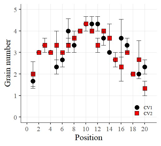
I want to connect the points with lines. So, I’ll add the following code:
if(!require(ggplot2)) install.packages("ggplot2")
library(ggplot2)

ggplot(data=dataA) +
  stat_summary(aes(x=as.numeric(position), y=as.numeric(number),
  fill=Genotype,
  shape=Genotype), geom="point", fun = mean, col="Black", size=5)+
  stat_summary(aes(x=as.numeric(position), y=as.numeric(number),
  group=Genotype),
  geom="errorbar", col="Black", width=.8)+
  stat_summary(aes(x=as.numeric(position), y=as.numeric(number),
  group=Genotype), geom="line", fun= mean, lty="dashed")+
  scale_fill_manual(values= c("black","red")) +
  scale_shape_manual(values= c(21,22)) +
  scale_x_continuous(breaks= seq(0,21,2),limits = c(0,21)) +
  scale_y_continuous(breaks= seq(0,5,1),limits = c(0,5)) +
  labs(fill= "Genotype", x="Position", y='Grain number') +
  theme_classic(base_size=20, base_family="serif")+
  theme(legend.position=c(0.90,0.12),,
        legend.title=element_blank(),
        legend.key.size=unit(0.5,'cm'),
        legend.key=element_rect(color=alpha("white",.05),
        fill=alpha("white",.05)),
        legend.text=element_text(size=11),
        legend.background= element_rect(fill=alpha("white",.05)),
        panel.grid.major=element_line(colour="grey90", linewidth=0.5),
        axis.line=element_line(linewidth=0.5, colour="black"))
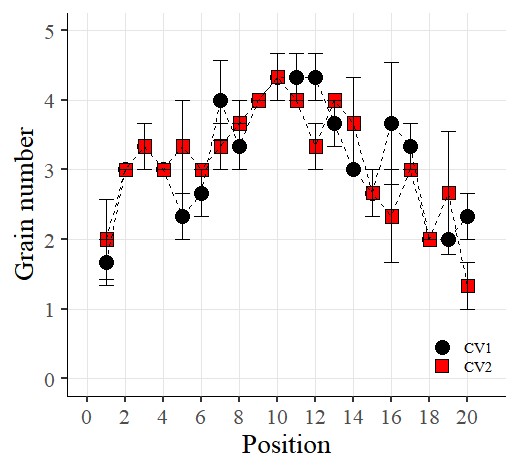
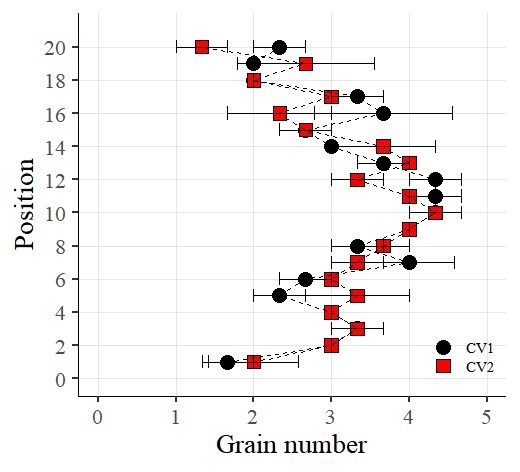
Now I want to rotate the graph. So, I’ll add the following code using coord_flip()
if(!require(ggplot2)) install.packages("ggplot2")
library(ggplot2)

ggplot(data=dataA) +
  stat_summary(aes(x=as.numeric(position), y=as.numeric(number),
  fill=Genotype,
  shape=Genotype), geom="point", fun = mean, col="Black", size=5)+
  stat_summary(aes(x=as.numeric(position), y=as.numeric(number),
  group=Genotype),
  geom="errorbar", col="Black", width=.8)+
  stat_summary(aes(x=as.numeric(position), y=as.numeric(number),
  group=Genotype), geom="line", fun= mean, lty="dashed")+
  scale_fill_manual(values= c("black","red")) +
  scale_shape_manual(values= c(21,22)) +
  scale_x_continuous(breaks= seq(0,21,2),limits = c(0,21)) +
  scale_y_continuous(breaks= seq(0,5,1),limits = c(0,5)) +
  coord_flip() +
  labs(fill= "Genotype", x="Position", y='Grain number') +
  theme_classic(base_size=20, base_family="serif")+
  theme(legend.position=c(0.90,0.12),,
        legend.title=element_blank(),
        legend.key.size=unit(0.5,'cm'),
        legend.key=element_rect(color=alpha("white",.05),
        fill=alpha("white",.05)),
        legend.text=element_text(size=11),
        legend.background= element_rect(fill=alpha("white",.05)),
        panel.grid.major=element_line(colour="grey90", linewidth=0.5),
        axis.line=element_line(linewidth=0.5, colour="black"))
© 2022 – 2023 https://agronomy4future.com