When working with data in R, there are situations where you might need to examine summarized information, such as means, standard deviations, and more. Today, I will introduce the methods that can be employed for this purpose.
Let’s start by loading a dataset.
if(!require(readr)) install.packages("readr")
library(readr)

github= paste0("https://raw.githubusercontent.com/agronomy4future/",
                "raw_data_practice/refs/heads/main/",
                "fertilizer_treatment.csv")
dataA= data.frame(read_csv(url(github),show_col_types = FALSE))
print(head(dataA, 5))
    Genotype Block variable value
1 Genotype_A     I  Control  42.9
2 Genotype_A    II  Control  41.6
3 Genotype_A   III  Control  28.9
4 Genotype_A    IV  Control  30.8
5 Genotype_B     I  Control  53.3
.
.
.
As I engage in various tasks involving this data, I aim to summarize it. Therefore, I will introduce methods applicable to such situations.
1) using plyr package
First, install and activate the package.
if(!require(plyr)) install.packages("plyr")
library(plyr)
I want to summarize the average values for the ‘Genotype’ and ‘variable’ in the given dataset “dataA”. The summarized data will be named “dataB”.
dataB= ddply(dataA, c("Genotype","variable"),
             summarise, mean=mean(value),
             sd=sd(value),
             n=length(value),
             se=sd/sqrt(n))
print(head(dataB, 5))
    Genotype    variable   mean        sd n       se
1 Genotype_A     Control 36.050  7.220572 4 3.610286
2 Genotype_A Fertilizer1 50.625  6.733684 4 3.366842
3 Genotype_A Fertilizer2 45.850  6.943822 4 3.471911
4 Genotype_A Fertilizer3 37.300  7.266820 4 3.633410
5 Genotype_B     Control 50.850 14.552548 4 7.276274
The means, standard deviations (sd), and standard errors (se) of the values are compiled for each combination of Genotype and variable.
□ Utilizing R Studio for Data Grouping and Mean/Standard Error Calculation (feat ddply)

2) using dplyr package
This time, I will demonstrate how to create the same data using the dplyr package. First, let’s install the package.
if(!require(dplyr)) install.packages("dplyr")
library(dplyr)
I will create a dataset that compiles the means, standard deviations, and standard errors of value based on Genotype and variable in the given dataset “dataA”. The summarized data will be named “dataC”.
The %>% symbol can be generated automatically by pressing Ctrl + Shift + M, which eliminates the requirement for manual typing.
if(!require(dplyr)) install.packages("dplyr")
library(dplyr)

dataC = dataA %>%
       group_by(Genotype, variable) %>%
       dplyr::summarize(
       across(
        .cols= value,
        .fns= list(
         Mean= ~mean(., na.rm= TRUE),
         n= ~length(.),
         se= ~sd(., na.rm= TRUE) / sqrt(length(.)))),
        .groups= "drop") %>%
        as.data.frame()
print(head(dataC, 5))
    Genotype    variable value_Mean value_n value_se
1 Genotype_A     Control     36.050       4 3.610286
2 Genotype_A Fertilizer1     50.625       4 3.366842
3 Genotype_A Fertilizer2     45.850       4 3.471911
4 Genotype_A Fertilizer3     37.300       4 3.633410
5 Genotype_B     Control     50.850       4 7.276274
.
.
.
No matter which package is used, the data has been summarized by means. Now, let’s proceed to create a bar graph using this summarized mean data.
if(!require(ggplot2)) install.packages("ggplot2")
library(ggplot2)
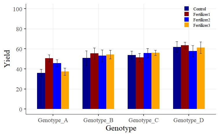
Fig1= ggplot(data=dataC, aes(x=Genotype, y=value_Mean, fill=variable))+
geom_bar(stat="identity",position="dodge", width= 0.7) +
geom_errorbar(aes(ymin= value_Mean-value_se,
ymax=value_Mean + value_se),
position=position_dodge(0.7), width=0.2, color='Black') +
scale_fill_manual(values= c ("dark blue", "darkred", "blue",
"orange")) +
scale_y_continuous(breaks = seq(0,100,20), limits = c(0,100)) +
labs(x="Genotype", y="Yield") +
theme_classic(base_size=20, base_family="serif")+
theme(legend.position=c(0.90,0.9),,
legend.title=element_blank(),
legend.key.size=unit(0.5,'cm'),
legend.key=element_rect(color=alpha("white",.05),
fill=alpha("white",.05)),
legend.text=element_text(size=11),
legend.background= element_rect(fill=alpha("white",.05)),
panel.grid.major=element_line(colour="grey90", linewidth=0.5),
axis.line=element_line(linewidth=0.5, colour="black"))
options(repr.plot.width=9, repr.plot.height=5)
print(Fig1)
ggsave("Fig1.png", plot= Fig1, width=9, height= 5, dpi= 300)
Since you used windows(), the graph will be displayed in a new window.
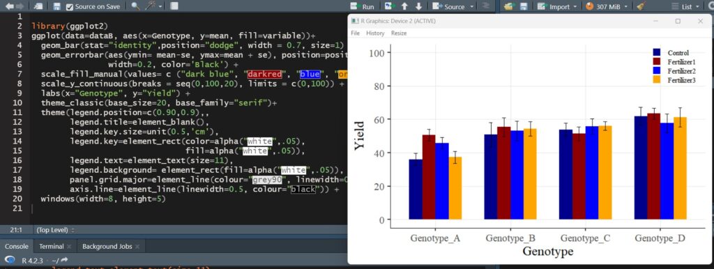
A bar graph with standard errors included has been successfully plotted.
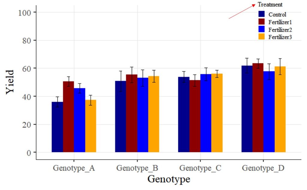
Tip 1 > If you want to change legend titles:
In the above graph, you used the legend.title = element_blank() code to hide the legend title. Now, I want to display the legend title as “Treatment”.
First, I will change the code from legend.title = element_blank() to legend.title = element_text(face= "plain", family= "serif", size= 12, color= "Black"). Additionally, I will include name= "Treatment" in the scale_fill_manual(values= c("dark blue", "darkred", "blue", "orange")) code. In other words, the modified code will be scale_fill_manual(name= "Treatment", values= c("dark blue", "darkred", "blue", "orange")).
The complete code is as follows:
if(!require(ggplot2)) install.packages("ggplot2")
library(ggplot2)

Fig2=ggplot(data=dataC, aes(x=Genotype, y=value_Mean, fill=variable))+
  geom_bar(stat="identity",position="dodge", width= 0.7) +
  geom_errorbar(aes(ymin= value_Mean-value_se,
  ymax=value_Mean + value_se),
  position=position_dodge(0.7), width=0.2, color='black') +
  scale_fill_manual(name="Treatment",
  values= c("dark blue", "darkred", "blue", "orange")) +
  scale_y_continuous(breaks = seq(0,100,20), limits = c(0,100)) +
  labs (x="Genotype", y="Yield") +
  theme_classic(base_size=20, base_family="serif")+
  theme(legend.position=c(0.90,0.9),,
        legend.title= element_text(face= "plain", family="serif",
        size= 12, color= "black"),
        legend.key.size=unit(0.5,'cm'),
        legend.key=element_rect(color=alpha("white",.05),
        fill=alpha("white",.05)),
        legend.text=element_text(size=11),
        legend.background= element_rect(fill=alpha("white",.05)),
        panel.grid.major=element_line(colour="grey90", linewidth=0.5),
        axis.line=element_line(linewidth=0.5, colour="black"))

options(repr.plot.width=9, repr.plot.height=5)
print(Fig2)

ggsave("Fig2.png", plot= Fig2, width=9, height= 5, dpi= 300)
Tip 2 > If you want to change legend labels:
Now, I want to change the legend label ‘Fertilizer 1 – 3’ to ‘Nitrogen,’ ‘Phosphorus,’ and ‘Potassium.’ How can I achieve this? While there are various methods to change variable names, for now, I’ll make the changes directly in the provided codes.
□ How to Rename Variables within Columns in R?
In the scale_fill_manual() function, I will add some code as shown below.
scale_fill_manual(name="Treatment",
       values= c("dark blue", "darkred", "blue", "orange"),
       breaks=c("Control","Fertilizer1","Fertilizer2","Fertilizer3"),
       labels=c("Control", "Nitrogen","Phosphorus","Potassium")) +

We aim to develop open-source code for agronomy ([email protected])
© 2022 – 2025 https://agronomy4future.com – All Rights Reserved.
Last Updated: 11/13/2020