I have corn yield data (Mg/ha) that I want to visualize. First, let’s upload the data.
import pandas as pd
import requests
from io import StringIO

github="https://raw.githubusercontent.com/agronomy4future/raw_data_practice/main/grain_yield_map.csv"
response=requests.get(github)
df=pd.read_csv(StringIO(response.text))

df.head(5)
	Latitude	Longitude	GY
0	12.15725	-106.14035	16.248
1	12.15724	-106.13994	26.703
2	12.15724	-106.13954	16.569
3	12.15723	-106.13911	21.451
4	12.15722	-106.13871	19.107F
First, I’ll create yield distribution data.
<strong># to open library</strong>
import numpy as np
import pandas as pd
import scipy.stats as stats
import matplotlib.pyplot as plt
from pylab import rcParams
import seaborn as sns

<strong># to calculate mean and standard deviation</strong>
df_mean= np.mean(df["GY"])
df_std= np.std(df["GY"])

<strong># to calculate probability density function</strong>
df_pdf= stats.norm.pdf(df["GY"].sort_values(), df_mean, df_std)

<strong># to draw normal distribution (with histogram) gragh</strong>
plt.plot(df["GY"].sort_values(), df_pdf, color= "Black")
sns.histplot(data= df["GY"], color= "Black", bins= 70, stat= "probability", alpha= 0.3)

plt.xlim([0,50])
plt.ylim([0,0.1])
plt.xlabel("Grain yield (Mg/ha)", size= 15)
plt.ylabel("Frequency", size= 15)
plt.grid(True, alpha=0.3, linestyle="--")
plt.rcParams["figure.figsize"]= [7,5]
plt.rcParams["figure.dpi"]= 500
plt.show()
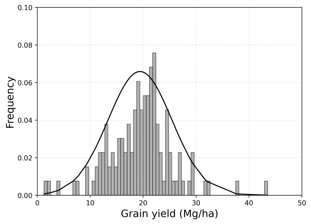
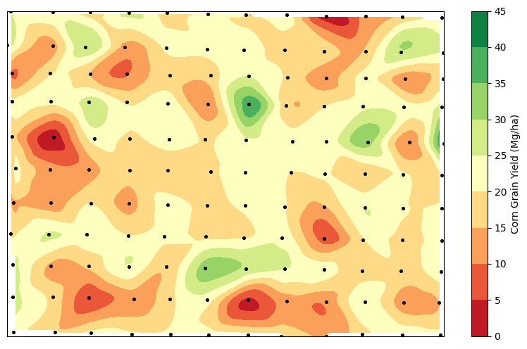
Now, we can see that the general grain yield varies from 10 to 30 Mg/ha, with some outliers. I’ll create a yield map to visualize this variation.
import matplotlib.pyplot as plt
import numpy as np
from scipy.interpolate import griddata

<strong># Extract the data</strong>
latitude = df['Latitude']
longitude = df['Longitude']
p_concentration = df['GY']

<strong># Define grid for interpolation</strong>
grid_x, grid_y = np.mgrid[latitude.min():latitude.max():100j, longitude.min():longitude.max():100j]

<strong># Interpolate the data to a grid</strong>
grid_z = griddata((latitude, longitude), p_concentration, (grid_x, grid_y), method='cubic')

<strong># Define the levels for a simpler contour plot</strong>
levels = list(range(0, 50, 5))

<strong># Create the plot with the specified levels and remove axis numbers</strong>
plt.figure(figsize=(10, 6))
contour = plt.contourf(grid_y, grid_x, grid_z, levels=levels, cmap='RdYlGn')
plt.colorbar(contour, label='Corn Grain Yield (Mg/ha)')

<strong># Add scatter points</strong>
plt.scatter(longitude, latitude, c='black', s=7)

<strong># axis</strong>
plt.xticks([])
plt.yticks([])

plt.show()
<strong># Full code</strong>
import pandas as pd
import requests
from io import StringIO

import matplotlib.pyplot as plt
import numpy as np
from scipy.interpolate import griddata

github="https://raw.githubusercontent.com/agronomy4future/raw_data_practice/main/grain_yield_map.csv"
response=requests.get(github)
df=pd.read_csv(StringIO(response.text))

latitude = df['Latitude']
longitude = df['Longitude']
p_concentration = df['GY']

grid_x, grid_y = np.mgrid[latitude.min():latitude.max():100j, longitude.min():longitude.max():100j]

grid_z = griddata((latitude, longitude), p_concentration, (grid_x, grid_y), method='cubic')

levels = list(range(0, 50, 5))

plt.figure(figsize=(10, 6))

contour = plt.contourf(grid_y, grid_x, grid_z, levels=levels, cmap='RdYlGn')

plt.colorbar(contour, label='Corn Grain Yield (Mg/ha)')
plt.scatter(longitude, latitude, c='black', s=7)

plt.xticks([])
plt.yticks([])

plt.show()
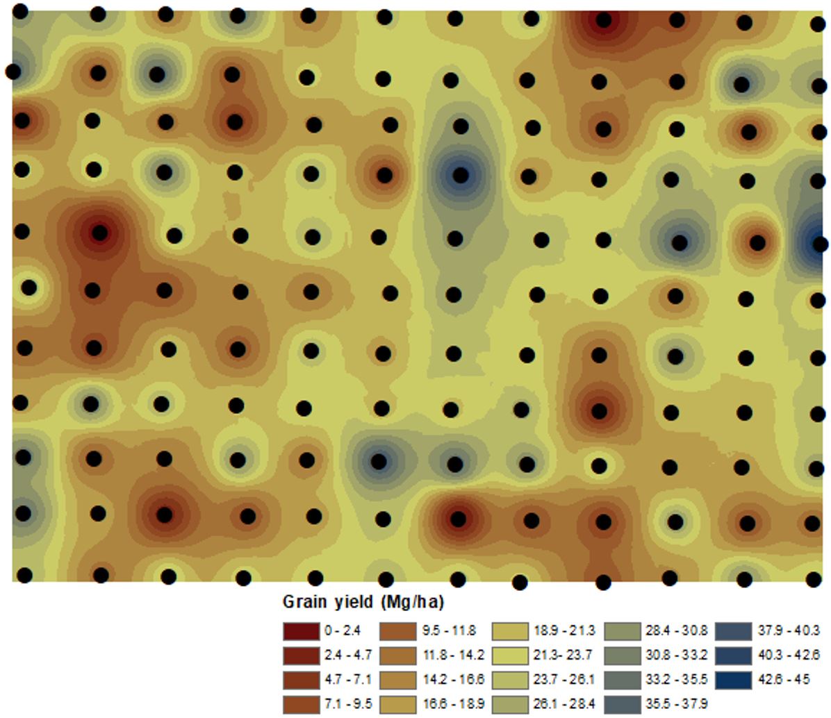
If you have the ArcGIS program, you can create a more detailed GIS map.