오늘은 데이터 사이에 있는 값을 예측하기 위한 선형 보간법 (Linear Interpolation) 에 대해 설명하겠습니다. 예를 들어, 현장에서 데이터를 수집할 때 매일 데이터를 수집할 수는 없을 것입니다. 그래서 우리는 일정한 간격 (매주, 격주, etc.,) 으로 데이터를 수집합니다. 그러나 데이터를 제시할 때는 일별로 표시해야 할 경우가 발생 합니다. 예를 들어, 질소 비료 시비량이 0kg/ha, 30kg/ha, 60kg/ha, 120kg/ha 일 때 반응하는 작물의 수확량 차이를 조사한다고 가정해 보겠습니다. 0부터 120까지의 각 질소 비료량에서 수확량 차이를 나타내야 한다면 어떻게 데이터를 추정할 수 있을까요? 이런 상황에서 우리는 보간법 공식을 사용할 수 있습니다.
데이터를 가지고 예시를 들어 보겠습니다.
sulphur=c(0,5,10,12,15,20,24,26,30,35)
yield=c(4.1,6.2,7.5,8.2,8.8,9.5,10.5,10.4,10.1,10)
dataA=data.frame(sulphur,yield)

print(dataA)
   sulphur   yield
1  0         4.1
2  5         6.2
3  10        7.5
4  12        8.2
5  15        8.8
6  20        9.5
7  24        10.5
8  26        10.4
9  30        10.1
10 35        10.0
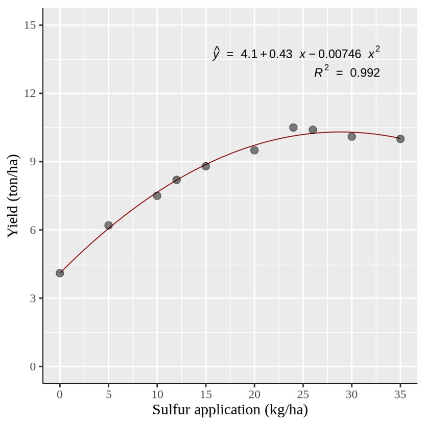
황 (Sulphur) 은 작물의 성장, 영양분 흡수, 품질 향상 등 여러 측면에서 중요한 역할을 합니다. 그리고 이는 일반적으로 황산칼리 (SOP) 비료 형태로 사용됩니다. 이제 이 데이터를 바탕으로 각기 다른 SOP 양에 대한 최종 작물 수확량을 그래프를 만들어 보겠습니다.
if(!require(ggplot2)) install.packages("ggplot2")
library(ggplot2)
if (require("ggpmisc") == F) install.packages("ggpmisc")
library(ggpmisc)

ggplot(data=dataA, aes(x=sulphur, y=yield))+
  stat_smooth(method='lm', linetype=1, se=FALSE,
  formula=y~poly(x,2, raw=TRUE), size=0.5, color="dark red") +
  geom_point(alpha=0.5, size=4) +

#Equation
 stat_poly_eq(aes(label= paste(..eq.label.., sep= "~~~")),
              label.x=0.9, label.y=0.9,
              eq.with.lhs= "italic(hat(y))~'='~", eq.x.rhs= "~italic(x)",
              coef.digits=3, formula=y~poly(x,2, raw=TRUE), parse=TRUE, size=5)+
# R-squared
 stat_poly_eq(aes(label=paste(..rr.label.., sep= "~~~")),
              label.x=0.9, label.y=0.85, rr.digits=3,
              formula=y~poly(x,2, raw=TRUE), parse=TRUE, size=5) +

  scale_x_continuous(breaks = seq(0,35,5), limits = c(0,35)) +
  scale_y_continuous(breaks = seq(0,15,5), limits = c(0,15)) +
  labs(y="Yield (ton/ha)", x="Sulfur application (kg/ha)") +
  theme_classic(base_size=18, base_family="serif")+
  theme(axis.line=element_line(linewidth=0.5, colour="black")) +
  windows(width=5.5, height=5)
이제 위와 같은 이차 회귀 그래프를 만들었습니다. 그러나 특정 황 (Sulfur) 양에서 각 데이터 포인트를 표시해야 할 경우에는 어떻게 해야 할까요?
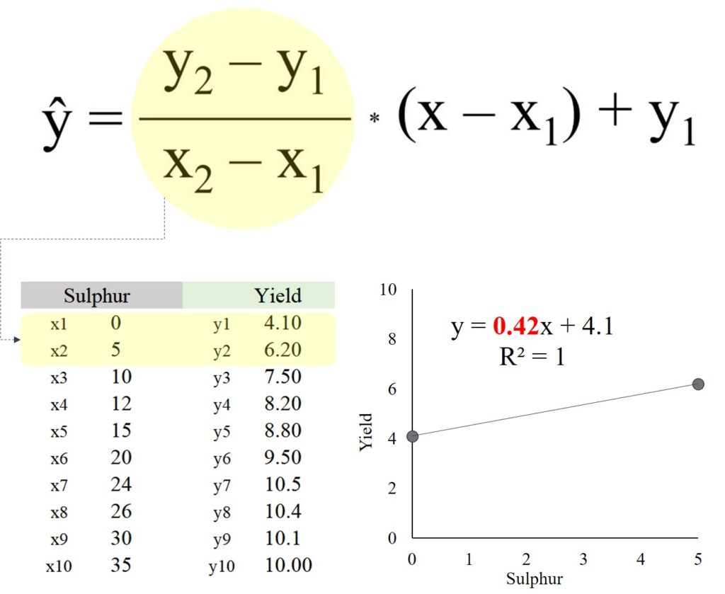
이를 위해 보간 (interpolation) 공식을 사용할 수 있으며, 해당 식은 다음과 같습니다:
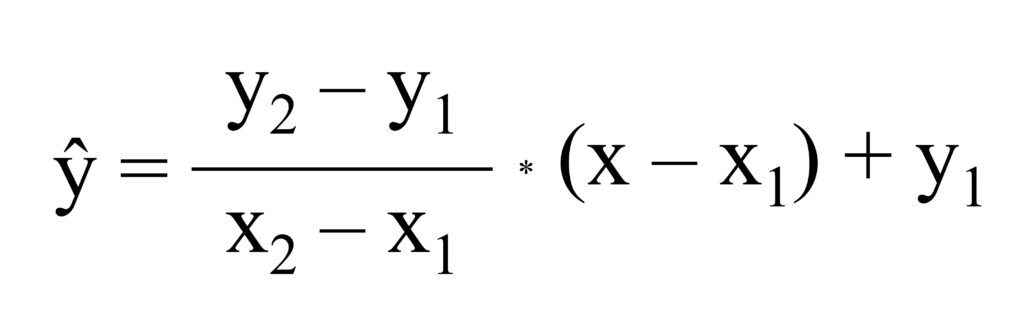
공식이 조금 까다로워 보일 수 있지만, 원리를 이해하면 식은 간단합니다. 아래 엑셀 데이터를 가지고 이야기 해 봅시다.
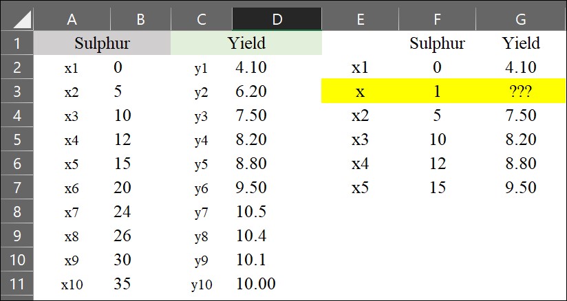
이제 황 (Sulfur) 시비량이 1 kg/ha일 때의 수확량 (yield)을 추정하고자 합니다. 이를 위해 간단한 interpolation 공식을 사용할 수 있습니다.
y= ((6.20 - 4.10) / (5 - 0)) * (1 - 0) + 4.10 = 4.52
황 (Sulfur) 시비량이 1 kg/ha일 때 수확량은 4.52 Mg/ha로 계산됩니다. 하지만 이렇게 하나하나 계산하는 것은 시간이 많이 걸리는 작업이므로, 엑셀에서 interpolation 공식을 가장 쉽게 적용하는 방법을 소개하겠습니다.
1) 기울기 계산
아래 계산식을 다시 한번 생각해 봅시다.
(y2 - y1) / (x2 - x1) = ((6.20 - 4.10) / (5 - 0)) = 0.42
사실, 이 공식은 두 데이터 포인트 사이의 기울기(slope)를 계산하는 것입니다. 따라서 먼저 엑셀에서 각 데이터 사이의 기울기를 계산해야 합니다. 이를 위해 =SLOPE() 함수를 사용할 수 있습니다.
= slope (y range, x range)
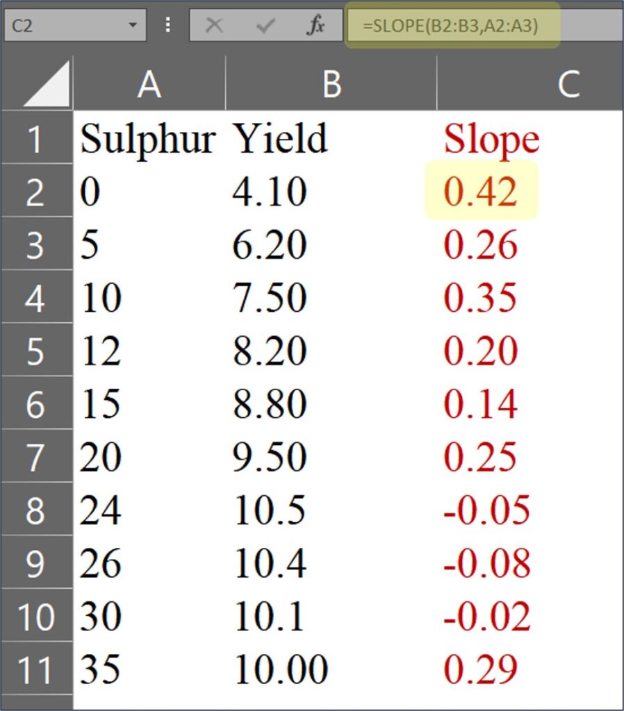
마지막 데이터인 0.29 는 10.00 / 35 ≈ 0.29 로 계산됩니다. 이유인 즉, 마지막에는 x2, y2 데이터가 존재하지 않기에 아래와 같이 계산 될 것 입니다.
(y2 - y1) / (x2 - x1) = ((100) / (35)) = 0.29
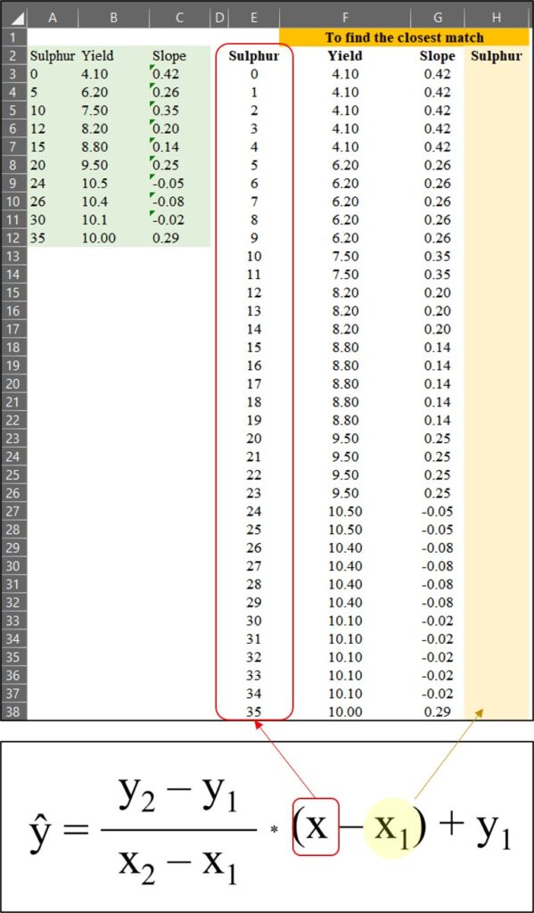
2) 가장 근접한 값 찾기
이제 황 (Sulfur) 시비량 데이터를 1에서 35까지 확장한 뒤, 원래 데이터와 비교하여 가장 가까운 값을 찾아 보겠습니다.
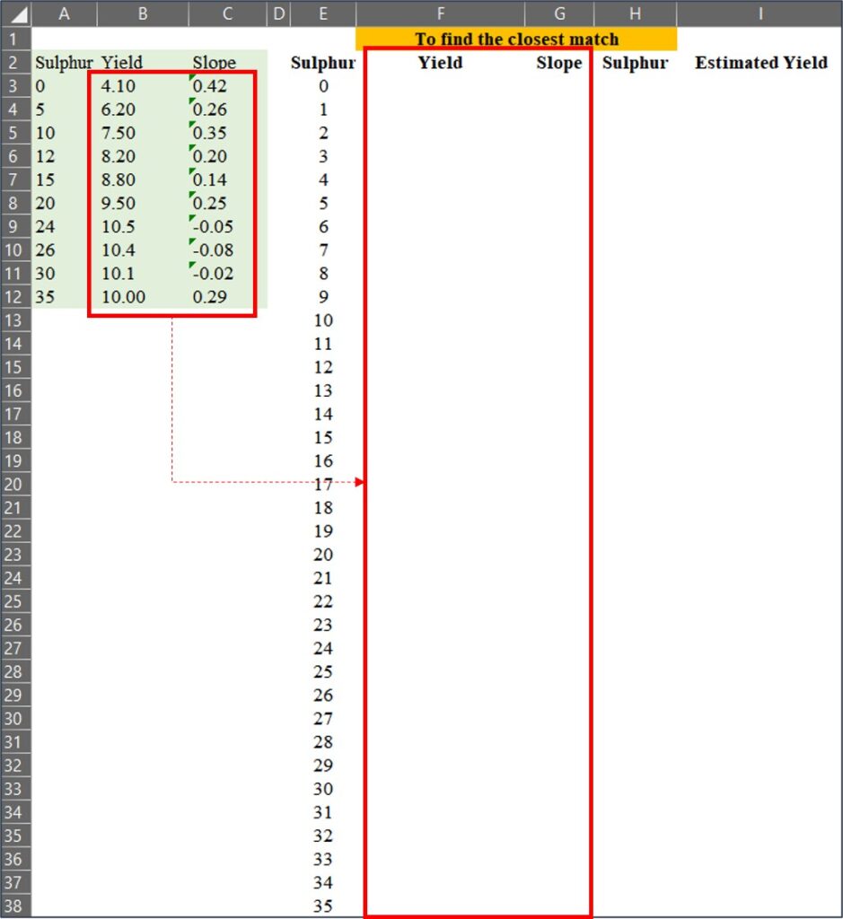
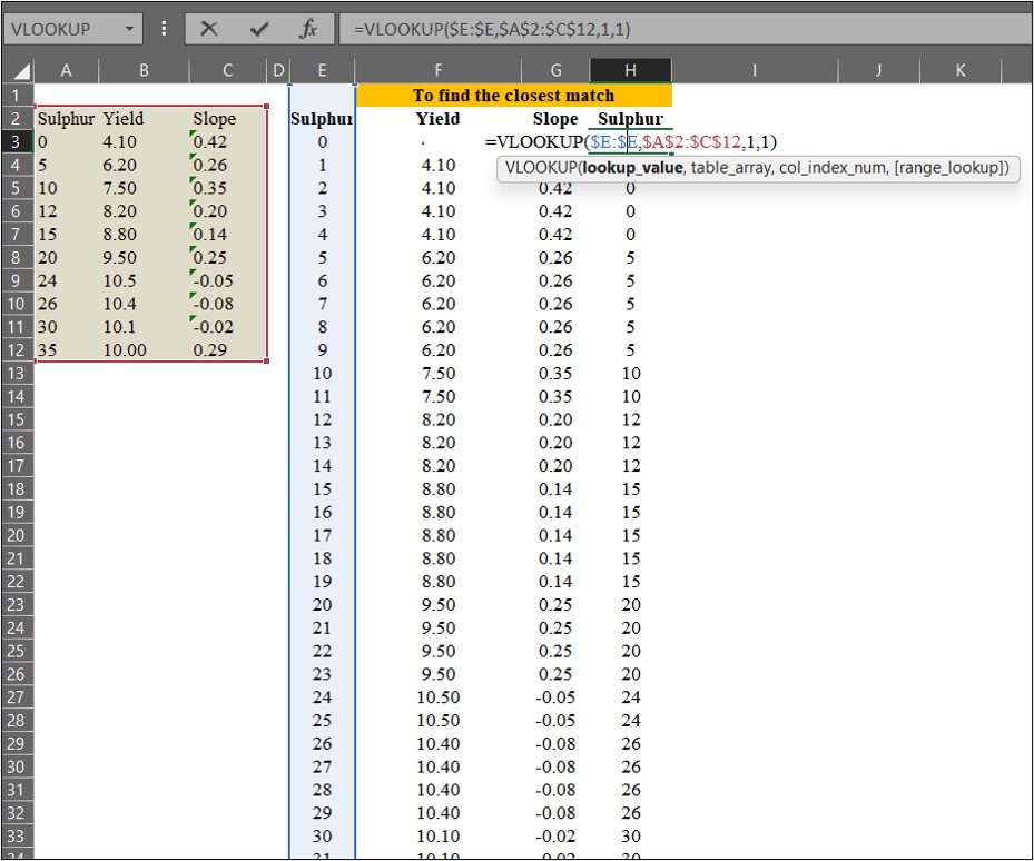
우리는 =VLOOKUP() 함수를 사용하여 데이터를 매칭할 수 있습니다. 이때, Range_lookup을 TRUE (또는 1) 로 설정하면 가장 가까운 값을 찾고, FALSE (또는 0) 로 설정하면 정확한 값을 찾습니다.
=VLOOKUP() 함수를 사용하여 확장된 황 (Sulfur) 시비량 데이터 에서 원래 데이터의 수확량 (Yield)과 기울기 (Slope) 값을 매칭해 보겠습니다.
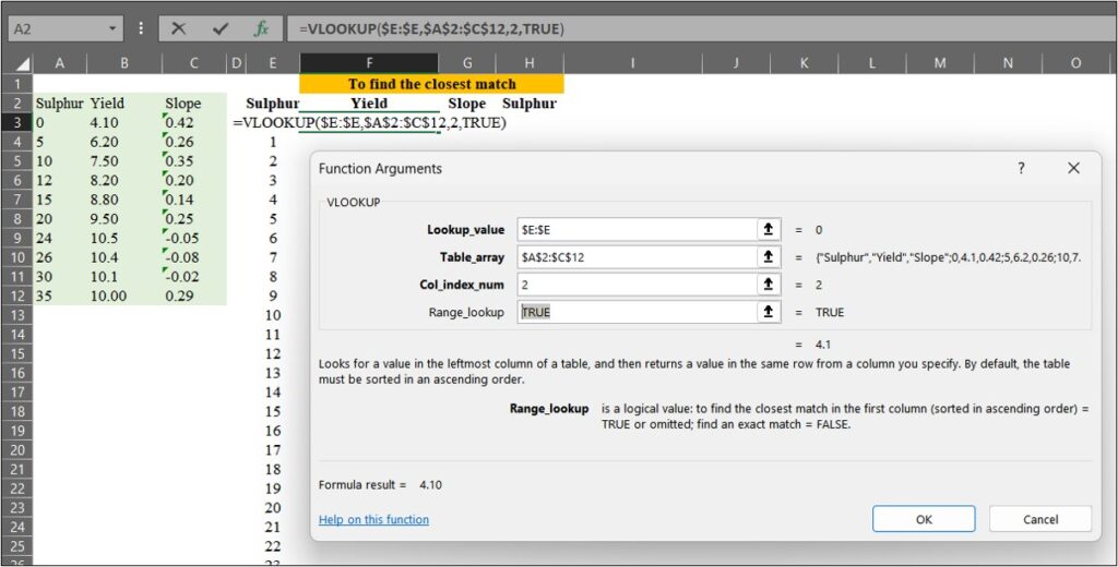
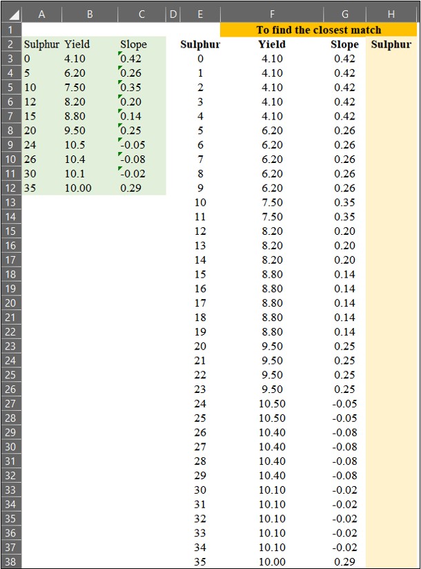
다음으로, 황 (Sulfur) 값이 있는 H 열에서 가장 가까운 값을 찾겠습니다. 이 과정은 아래의 공식과 관련이 있습니다.
3) 예측값 계산
마지막으로, interpolation 공식을 사용하여 예측값을 계산하겠습니다.
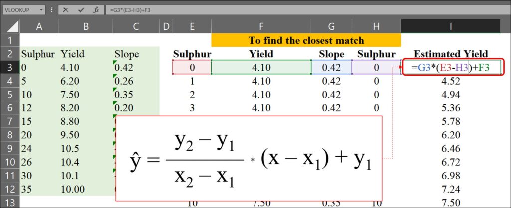
0에서 35까지의 각 황(Sulfur) 시비량에 대한 예상 수확량을 다음과 같이 계산했습니다.
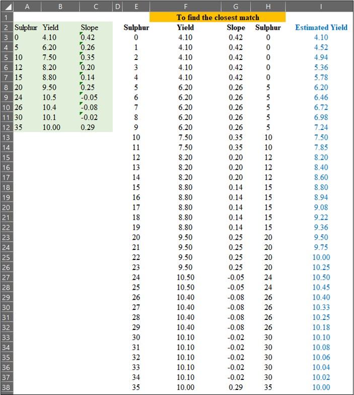
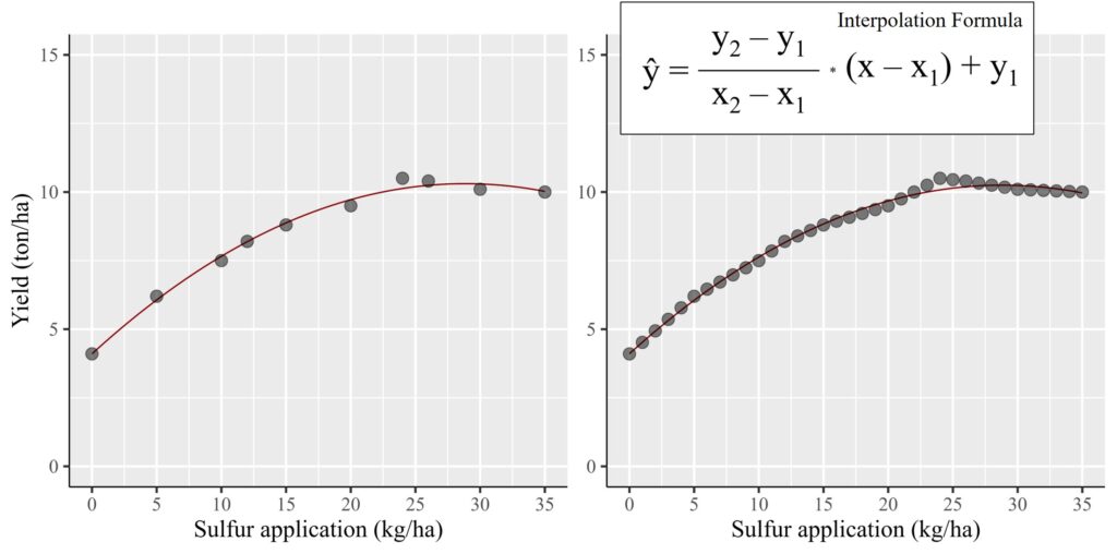
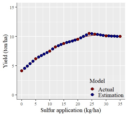
이제 각 황(Sulfur) 시비량에 대한 예상 수확량 계산을 완료했습니다. 파란색 데이터는 예측된 (보간된) 데이터를 나타내고 빨간색 데이터는 실제 측정된 데이터를 나타냅니다.
     Sulphur   Yield    Slope         Estimated.Yield
1    <mark style="background-color:rgba(0, 0, 0, 0)" class="has-inline-color has-vivid-red-color">0         4.1      0.4200000     4.100</mark>
2    <mark style="background-color:rgba(0, 0, 0, 0)" class="has-inline-color has-vivid-cyan-blue-color">1         4.1      0.4200000     4.520</mark>
3    <mark style="background-color:rgba(0, 0, 0, 0)" class="has-inline-color has-vivid-cyan-blue-color">2         4.1      0.4200000     4.940</mark>
4    <mark style="background-color:rgba(0, 0, 0, 0)" class="has-inline-color has-vivid-cyan-blue-color">3         4.1      0.4200000     5.360</mark>
5    <mark style="background-color:rgba(0, 0, 0, 0)" class="has-inline-color has-vivid-cyan-blue-color">4         4.1      0.4200000     5.780</mark>
6    <mark style="background-color:rgba(0, 0, 0, 0)" class="has-inline-color has-vivid-red-color">5         6.2      0.2600000     6.200</mark>
7    <mark style="background-color:rgba(0, 0, 0, 0)" class="has-inline-color has-vivid-cyan-blue-color">6         6.2      0.2600000     6.460</mark>
8    <mark style="background-color:rgba(0, 0, 0, 0)" class="has-inline-color has-vivid-cyan-blue-color">7         6.2      0.2600000     6.720</mark>
9    <mark style="background-color:rgba(0, 0, 0, 0)" class="has-inline-color has-vivid-cyan-blue-color">8         6.2      0.2600000     6.980</mark>
10   <mark style="background-color:rgba(0, 0, 0, 0)" class="has-inline-color has-vivid-cyan-blue-color">9         6.2      0.2600000     7.240</mark>
11   <mark style="background-color:rgba(0, 0, 0, 0)" class="has-inline-color has-vivid-red-color">10        7.5      0.3500000     7.500</mark>
12   <mark style="background-color:rgba(0, 0, 0, 0)" class="has-inline-color has-vivid-cyan-blue-color">11        7.5      0.3500000     7.850</mark>
13   <mark style="background-color:rgba(0, 0, 0, 0)" class="has-inline-color has-vivid-red-color">12        8.2      0.2000000     8.200</mark>
14   <mark style="background-color:rgba(0, 0, 0, 0)" class="has-inline-color has-vivid-cyan-blue-color">13        8.2      0.2000000     8.400</mark>
15   <mark style="background-color:rgba(0, 0, 0, 0)" class="has-inline-color has-vivid-cyan-blue-color">14        8.2      0.2000000     8.600</mark>
16   <mark style="background-color:rgba(0, 0, 0, 0)" class="has-inline-color has-vivid-red-color">15        8.8      0.1400000     8.800</mark>
17   <mark style="background-color:rgba(0, 0, 0, 0)" class="has-inline-color has-vivid-cyan-blue-color">16        8.8      0.1400000     8.940</mark>
18   <mark style="background-color:rgba(0, 0, 0, 0)" class="has-inline-color has-vivid-cyan-blue-color">17        8.8      0.1400000     9.080</mark>
19   <mark style="background-color:rgba(0, 0, 0, 0)" class="has-inline-color has-vivid-cyan-blue-color">18        8.8      0.1400000     9.220</mark>
20   <mark style="background-color:rgba(0, 0, 0, 0)" class="has-inline-color has-vivid-cyan-blue-color">19        8.8      0.1400000     9.360</mark>
21   <mark style="background-color:rgba(0, 0, 0, 0)" class="has-inline-color has-vivid-red-color">20        9.5      0.2500000     9.500</mark>
22   <mark style="background-color:rgba(0, 0, 0, 0)" class="has-inline-color has-vivid-cyan-blue-color">21        9.5      0.2500000     9.750</mark>
23   <mark style="background-color:rgba(0, 0, 0, 0)" class="has-inline-color has-vivid-cyan-blue-color">22        9.5      0.2500000     10.000</mark>
24   <mark style="background-color:rgba(0, 0, 0, 0)" class="has-inline-color has-vivid-cyan-blue-color">23        9.5      0.2500000     10.250</mark>
25   <mark style="background-color:rgba(0, 0, 0, 0)" class="has-inline-color has-vivid-red-color">24        10.5    -0.0500000     10.500</mark>
26   <mark style="background-color:rgba(0, 0, 0, 0)" class="has-inline-color has-vivid-cyan-blue-color">25        10.5    -0.0500000     10.450</mark>
27   <mark style="background-color:rgba(0, 0, 0, 0)" class="has-inline-color has-vivid-red-color">26        10.4    -0.0750000     10.400</mark>
28  <mark style="background-color:rgba(0, 0, 0, 0)" class="has-inline-color has-vivid-cyan-blue-color"> 27        10.4    -0.0750000     10.325</mark>
29   <mark style="background-color:rgba(0, 0, 0, 0)" class="has-inline-color has-vivid-cyan-blue-color">28        10.4    -0.0750000     10.250</mark>
30   <mark style="background-color:rgba(0, 0, 0, 0)" class="has-inline-color has-vivid-cyan-blue-color">29        10.4    -0.0750000     10.175</mark>
31   <mark style="background-color:rgba(0, 0, 0, 0)" class="has-inline-color has-vivid-red-color">30        10.1    -0.0200000     10.100</mark>
32   <mark style="background-color:rgba(0, 0, 0, 0)" class="has-inline-color has-vivid-cyan-blue-color">31        10.1    -0.0200000     10.080</mark>
33   <mark style="background-color:rgba(0, 0, 0, 0)" class="has-inline-color has-vivid-cyan-blue-color">32        10.1    -0.0200000     10.060</mark>
34   <mark style="background-color:rgba(0, 0, 0, 0)" class="has-inline-color has-vivid-cyan-blue-color">33        10.1    -0.0200000     10.040</mark>
35   <mark style="background-color:rgba(0, 0, 0, 0)" class="has-inline-color has-vivid-cyan-blue-color">34        10.1    -0.0200000     10.020</mark>
36   <mark style="background-color:rgba(0, 0, 0, 0)" class="has-inline-color has-vivid-red-color">35        10.0     0.2857143     10.000</mark>
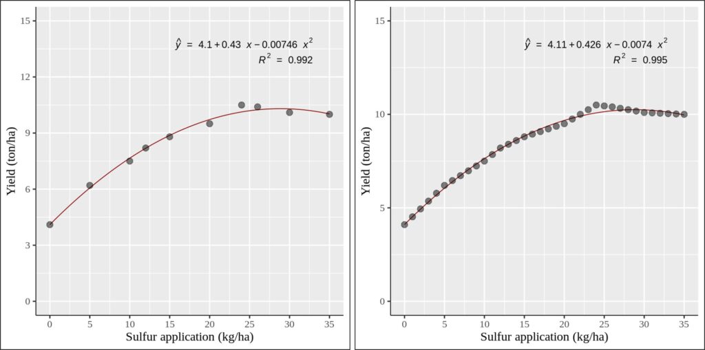
비교를 시각적으로 확인하기 위해 두개의 그래프를 그려 보겠습니다. 왼쪽 그래프는 실제 데이터를 가지고 그래프를 그렸고, 오른쪽 그래프는 보간된 (예측된) 데이터를 가지고 그래프를 그렸습니다. 통계적 결과 (기울기 및 R²) 가 크게 변하지 않는 것을 확인 할 수 있는데 이는 보간된 데이터가 실제 데이터의 범위 내에 존재하기 때문입니다.
이것이 보간 (interpolation) 기법을 사용하여 중간 데이터를 예측하는 방법입니다.독립 변수의 전체 범위에 대해 종속 변수를 표현해야 하는 경우, 이 보간 기법을 활용하여 신뢰할 수 있는 값을 추정할 수 있습니다.
■ R 을 이용하여 중간 데이터 값을 예측
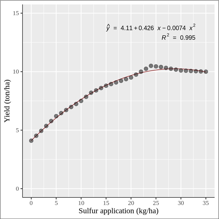
이제 보간법의 원리를 이해했다면, 앞에서 처럼 단계별로 계산할 필요 없이 R을 이용하여 간편하게 계산할 수 있습니다. 아래 코드를 참조해 주세요.
sulphur= c(0,5,10,12,15,20,24,26,30,35)
yield= c(4.1,6.2,7.5,8.2,8.8,9.5,10.5,10.4,10.1,10)
dataA= data.frame(sulphur, yield)
<strong># Install and load the zoo package</strong>
if(!require(zoo)) install.packages("zoo")
library(zoo)

<strong># Create a sequence for the complete range of sulphur</strong>
full_range= seq(min(dataA$sulphur), max(dataA$sulphur))

<strong># Interpolate the values for yield</strong>
yield_interp= na.approx(dataA$yield, x= dataA$sulphur, xout= full_range)

<strong># Combine the results into a new data frame</strong>
df_interp= data.frame (sulphur= full_range, yield= yield_interp)

head (df_interp, 3)
sulphur yield
0       4.10
1       4.52
2       4.94
.
.
.

tail (df_interp, 3)
sulphur yield
33      10.04
34      10.02
35      10.00
if(!require(ggplot2)) install.packages("ggplot2")
library(ggplot2)
if(!require(ggpmisc)) install.packages("ggpmisc")
library(ggpmisc)

ggplot(data=df_interp, aes(x=sulphur, y=yield))+
  stat_smooth(method='lm', linetype=1, se=FALSE,
              formula=y~poly(x,2, raw=TRUE), size=0.5, color="dark red") +
  geom_point(alpha=0.5, size=4) +

#Equation
 stat_poly_eq(aes(label= paste(..eq.label.., sep= "~~~")),
              label.x=0.9, label.y=0.9,
              eq.with.lhs= "italic(hat(y))~'='~", eq.x.rhs= "~italic(x)",
              coef.digits=3, formula=y~poly(x,2, raw=TRUE), parse=TRUE, size=5)+
# R-squared
 stat_poly_eq(aes(label=paste(..rr.label.., sep= "~~~")),
              label.x=0.9, label.y=0.85, rr.digits=3,
              formula=y~poly(x,2, raw=TRUE), parse=TRUE, size=5) +

  scale_x_continuous(breaks = seq(0,35,5), limits = c(0,35)) +
  scale_y_continuous(breaks = seq(0,15,5), limits = c(0,15)) +
  labs(y="Yield (ton/ha)", x="Sulfur application (kg/ha)") +
  theme_classic(base_size=18, base_family="serif")+
  theme_grey(base_size=18, base_family="serif")+
  theme(axis.line=element_line(linewidth=0.5, colour="black"))+
  windows(width=5.5, height=5)
Full code: https://github.com/agronomy4future/r_code/blob/main/Predicting_Intermediate_Data_Points_with_Linear_Interpolation_in_Excel_and_R.ipynb
■ R 패키지: interpolate()
얼마전 저는 중간 데이터 값을 쉽게 계산하기 위해 새로운 R package; interpolate() 를 개발 했습니다.
sulphur= c(0,5,10,12,15,20,24,26,30,35)
yield= c(4.1,6.2,7.5,8.2,8.8,9.5,10.5,10.4,10.1,10)
dataA= data.frame(sulphur, yield)

if(!require(remotes)) install.packages("remotes")
if (!requireNamespace("interpolate", quietly = TRUE)) {
    remotes::install_github("agronomy4future/interpolate", force= TRUE)
}
library(remotes)
library(interpolate)

result= interpolate(dataA, x="sulphur", y="yield", group_vars= NULL)

print (result)
   sulphur  yield category
1        0  4.100        0
2        1  4.520        1
3        2  4.940        1
4        3  5.360        1
5        4  5.780        1
6        5  6.200        0
7        6  6.460        1
8        7  6.720        1
9        8  6.980        1
10       9  7.240        1
11      10  7.500        0
12      11  7.850        1
13      12  8.200        0
14      13  8.400        1
15      14  8.600        1
16      15  8.800        0
17      16  8.940        1
18      17  9.080        1
19      18  9.220        1
20      19  9.360        1
21      20  9.500        0
22      21  9.750        1
23      22 10.000        1
24      23 10.250        1
25      24 10.500        0
26      25 10.450        1
27      26 10.400        0
28      27 10.325        1
29      28 10.250        1
30      29 10.175        1
31      30 10.100        0
32      31 10.080        1
33      32 10.060        1
34      33 10.040        1
35      34 10.020        1
36      35 10.000        0
이 코드는 자동으로 interpolation 을 계산할 뿐만 아니라, 각 데이터가 실제 데이터 (0) 인지 보간된 데이터(1) 인지 구분하여 표시합니다. 자세한 내용은 아래 게시물을 참고해 주세요.
■ [R package] An easy way to use interpolation code to predict in-between data points
We aim to develop open-source code for agronomy ([email protected])
© 2022 – 2025 https://agronomy4future.com – All Rights Reserved.
Last Updated: 01/03/2025
Your donation will help us create high-quality content.
PayPal @agronomy4furure / Venmo @agronomy4furure / Zelle @agronomy4furure